Fonts & Typefaces

How To Create A Type Hierarchy & Why You Need One

Creating a type hierarchy may not be the “sexiest” aspect of graphic design, but type hierarchies play an integral role in communicating and honoring the message your design aims to convey. They’re one of the simplest and most effective ways to organize your graphic designs, especially if your project contains

Read More »

Beyond Typed Text: How to Add a Personal Touch with Hand Lettering

Nothing compares to the neatness and readability of typed letters, but sometimes your message needs a bit more of a personal and artistic touch. That’s where hand lettering comes in. Hand lettering is a fantastic creative outlet, but it’s also a beautiful way to personalize your homemade cards, scrapbook pages,

Read More »

13 Type Terms You Need To Know (But Probably Don’t)

Typography has its own unique lexicon filled with strange-sounding terms and confusing distinctions. While you may be familiar with basics like “baseline” and “x-height”, terms like “gadzook”, “quaint”, and “tittle” may be new to your vocabulary. So without further ado, here are 13 typography terms you probably don’t know (but

Read More »

Typography 101: Understanding Typeface Anatomy and Its Impact

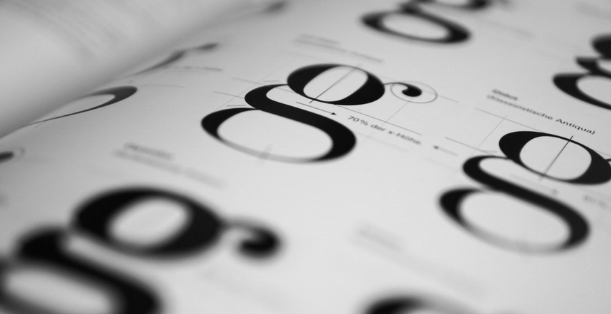
The key to understanding typography and type design is to understand what characteristics make each typeface similar or different. The differences can be glaringly obviously or quiet and subtle, but they all lie in each typeface’s unique anatomy. But before we start dissecting the letter, we want to correct a

Read More »

History of Typography: Rockin’ Rococo

The Rococo period was short but notorious. But before we dig too deeply into this opulent era, let’s recap what we learned in our last installment. Going For Baroque The transition into Modern type spanned across two major artistic periods: the Baroque and the Rococo. The Baroque era was one

Read More »

Comic Sans: Is It Really That Bad?

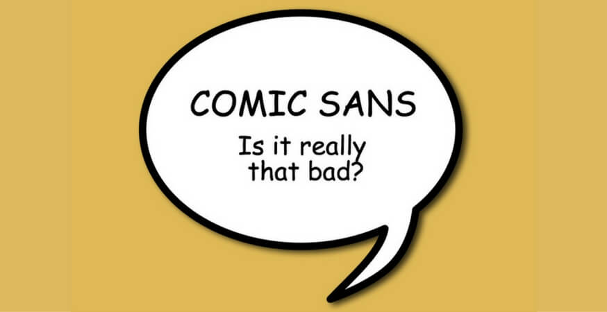
Comic Sans: the world’s most simultaneously loved and hated font. Graphic designers especially love to hate on Comic Sans, and it’s easy to understand why. Everyone and their mother has used Comic Sans at some point in their lives, and chances are, they’re using it inappropriately. Unless you are or

Read More »

DIY Weddings: Choosing your Wedding Typography

Printing and preparing your own wedding invitations is one of the simplest ways to save money when planning your wedding. But as easy as it is to create your own wedding stationery, choosing fonts can be a daunting task. It’s not as easy as simply selecting your favorite font –

Read More »

History of Typography: If It’s Not Baroque, Don’t Fix It

Finally! The age of “Modern type” has arrived. (Or at least, almost modern.) The transition into Modern type began in the 17th and 18th centuries and spanned two artistic eras: the Baroque period, which stretched from roughly 1600-1750, and the shorter (though no less influential) Rococo period, which lasted from

Read More »

Buy More Paper, Save More Dough

5% OFF $500+

with code 500SALE

Up to 25% OFF

with REWARDS

FREE SHIPPING

ORDERS OF $179+