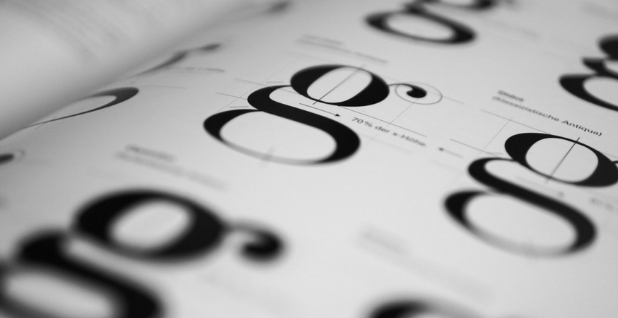
Typography has its own unique lexicon filled with strange-sounding terms and confusing distinctions. While you may be familiar with basics like “baseline” and “x-height”, terms like “gadzook”, “quaint”, and “tittle” may be new to your vocabulary.
So without further ado, here are 13 typography terms you probably don’t know (but should!).
1. Body
 The term “body” originally referred to the physical block of character – the one used to physically print ink onto paper. Nowadays, “body” simply refers to the imaginary, invisible area that surrounds each glyph.
2. Ligature
 Have you ever seen one of those weird characters that looks like two letters morphed into one? These characters are connected by something called a ligature.
Ligatures allow for greater flow and readability and are more visually pleasing. They’re not very common in the 21st century, but they appear frequently in older printed publications.
3. Gadzook
 A gadzook is the connecting piece that attaches two characters together in a ligature. It’s not originally part of either letter – it only exists in a ligature.
4. Quaint
 A quaint is an antiquated glyph or character embellishment that aims to recall the typographic preferences and tendencies of decades and centuries past. It doesn’t serve a purpose, aside from looking pretty.
5. Diacritics
 Diacritics are any ancillary mark or design added to a letter, such as an accent.
6. Pica & Point
A pica is a typographic unit of measure. It corresponds to 1/72nd of a foot, or 1/6th of an inch, and it contains 12 points. A computer pica is the standard unit of measure in contemporary printing.
A point is another typographic unit of measure. It corresponds to 1/12th of a pica, or roughly 1 pixel on a computer screen set to 100% zoom. Points help us determine font size (technically called “point size”).
7. Contextual
 Ever see your word processor turn 3/4 into ¾? That’s because your typeface includes contextual features.
Contextual features occur in OpenType fonts. These features understand the context in which they are used, and will automatically insert or substitute new or alternate glyphs when appropriate.
8. Kerning
 Kerning refers to the horizontal space between specific letters. It’s an important aspect of graphic design because it plays a pivotal role in readability.
9. Tracking
![]() Tracking also refers to the horizontal space between characters, but it’s not to be confused with kerning. When you make a tracking change, it alters the space between all characters, whereas kerning only affects the horizontal spacing between two adjacent characters.
Tracking also refers to the horizontal space between characters, but it’s not to be confused with kerning. When you make a tracking change, it alters the space between all characters, whereas kerning only affects the horizontal spacing between two adjacent characters.
10. Monospaced
 Monospaced typefaces are designed so that every character occupies the same width, regardless of normal proportions. For example, an “m”, which is typically a wide character, will occupy the same width as the letter “i”, which is typically a narrow character.
11. Proportional
 In contrast to monospaced typefaces, proportional typefaces feature characters that are designed to respect normal proportions. For example, in a proportional typeface, “m” will be wider than “i”.
12. Swash
 A swash is any elegant extension on a letterform. Like quaints, swashes are purely aesthetic.
13. Tittle
 You know that little dot on your “i’s” and “j’s”? Well, they have an official, technical name, and that name is “tittle”. Who knew?
Type Terminology
Like any field, typography is full of strange terminology and odd names for things you never thought deserved or needed their own label. Learning professional jargon is never fun (though names like “tittle” certainly make it a little easier), but it’s helpful to understand lexical minutiae when working with typefaces.
For more information on the components of a letter, check out our blog post on the Anatomy of a Letter.
Sources
“Type Glossary“. Typography Deconstructed. 2010.
“Glossary“. FontShop. 2015.


