
Creating a type hierarchy may not be the “sexiest” aspect of graphic design, but type hierarchies play an integral role in communicating and honoring the message your design aims to convey. They’re one of the simplest and most effective ways to organize your graphic designs, especially if your project contains a lot of body copy. Practicality is sexy, right?
What is a Type Hierarchy?
A “type hierarchy” is a system for organizing type within your design project. It establishes an order of importance, and ultimately helps your design effectively communicate its intended message.
The key to creating a type hierarchy is to create visual contrast. More on that later – I promise it’s easier than it sounds.
Why Do You Need a Type Hierarchy?
If the promise of effective communication isn’t convincing enough for you, type hierarchies also:
- Help your reader easily scan and navigate the written content in your design.
- Direct readers to more important aspects of your message, regardless of that message’s position on the page.
- Visually convey where to look on the page, and in what sequence one should take in your message.
How To Establish a Type Hierarchy
If you’ve never established a type hierarchy before, it may seem like a daunting process. Never fear – it’s easy. Just follow these steps:
1. Read your content.
Read your content carefully and pick out the key elements of your message. Try putting yourself in the place of the reader; approaching your content with “fresh” eyes will help you identify any inconsistencies in the message or blanks that need to be filled in by your design.
2. Determine the most important components of your message.
Decide which aspects of the message you wish to emphasize in your design. You can emphasize these elements using your type hierarchy, by creating special graphic elements, or by using design principles like the rule of thirds, alignment, and repetition to direct your reader’s eye.
3. Establish 3-4 levels of type hierarchy.
Most design projects don’t need more than three or four levels of type hierarchy. Of course, there are no limits if you feel your design requires more to effectively honor its message.
There are three levels of type hierarchy you should keep in mind when establishing yours:
- Primary Type: Primary type has the most visual weight. Its purpose is to bring readers into the design. Primary type commonly describes main headers or display quotations.
- Secondary Type: Secondary type refers to any type that is not the main body content, but which is also not primary type; for example, subheadings, captions, and navigational elements like tables of contents.
- Tertiary Type: Tertiary type is your main body copy. Readability matters most here.
There is also “art type”, which refers to visual, graphic elements such as banners and logos.

4. Choose your tertiary or body type.
Readability matters most when it comes to choosing a typeface for your body copy. Once you’ve selected the most important typeface in your hierarchy, you can being your search for secondary and primary type, where there’s a little more room for creativity.
5. Play around!
Now comes the fun part – choosing your primary and secondary typefaces. There are a number of different design elements you can play around with when establishing your type hierarchy (keep reading to find out what they are), so settle in and play around until you find the right balance and sense of organization and flow within your design.
Creating a Type Hierarchy Using Common Design Elements
There is no shortage of typographic customizations you can use to create the right type hierarchy. Use one of the following design elements or combine multiple to create an intricate, well-crafted design.
Size
Changing font size is the most common method of establishing a type hierarchy. Larger type is more likely to attract attention, but using size to create a hierarchy is about more than just size – it’s also about scale. Remember that different typefaces scale differently, so be sure to rely on visual cues rather than simply adjusting the font size.
Pro Tip: Start by choosing the right size for your body copy, and then concentrate on choosing the right size for your headings and other elements.

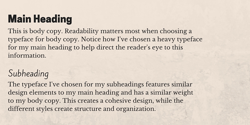
Weight
Thicker styles tend to denote more importance, so try using a bolder weight for titles, headings, or other copy you want to emphasize.
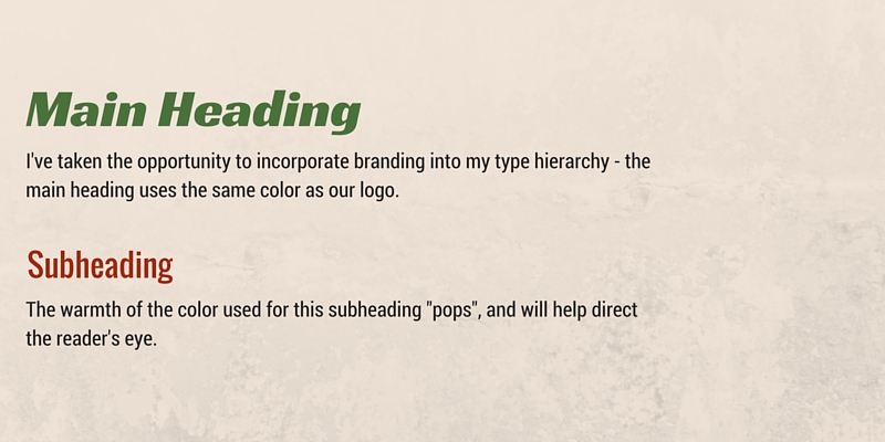
Color
Incorporating color into your type hierarchy is a great way of branding your design.
If you don’t have to worry about branding, you can use color to affect the mood and feel of your design. In this case, try choosing your colors using psychological principles.
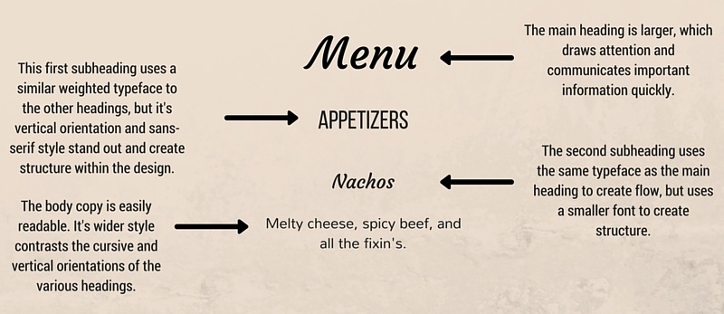
Position
The relationship between where your design elements, including your type, are located can help draw your reader’s eye to certain elements you might want to emphasize. Changing the orientation by rotating your text vertically, for example, will draw attention to that text.
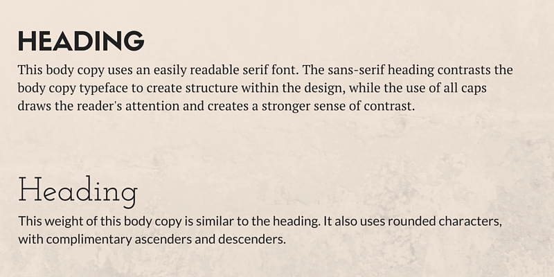
Typeface Choice
Using a different typeface is the second most commonly used method of establishing a type hierarchy, but it’s a little more complicated that simply choosing a new font. You have to make sure you choose a complimentary font that works well with your body copy, but which also honors and maintains the integrity of your message. Here are some tips for doing so:
- Use a serif typeface in combination with a sans-serif. Which style you choose to use for your body copy will depend on your message.
- Look for typefaces with different weights, but with similar tones and feelings, such as similarly rounded shapes, similar x-heights, or similar ascenders and descenders.
Case
All caps will draw your reader’s attention, but they can also diminish readability, so we recommend using them for headings and titles rather than extended copy.
Combine Different Style Elements
Try combining different elements of style to create your type hierarchy.
In this example, I’ve used complimentary font styles that feature just enough differentiation to create a sense of structure throughout the design.
Get Creative!
You can use any combination of style elements to create your type hierarchy, from something as simple as using a larger font to something as complicated as using a different color, increasing the weight, and choosing an entirely new typeface. As long as you honor your message, the possibilities are limitless!