When you’re working on a new design for print, typeface choice may not always the first thing on your mind. Often, the overall concept of your design, as well as other important factors like color, images, and graphics come first. But when you’re designing for print, readability should be one of your primary concerns – and that means prioritizing typeface choice.
When selecting a typeface, there are two key characteristics designers should keep in mind:
- Legibility: Legibility is a measure of clarity. How easily can one letter be distinguished from another?
- Readability: Readability refers to how the letters and characters of a typeface interact to compose words, sentences, and paragraphs.
Your choice of typeface should be clear and easy to read, and it should also be in line with your (or your client’s) brand identity. The wrong choice can easily undermine both the tone and message of your design, and if your design can’t be read, your message will be lost.
Serif or Sans Serif?
Some theorists claim that only serif fonts should be used when designing for print, while sans serif fonts should be reserved for designs that will be viewed on a screen.
Serifs have historically been credited with helping the eye travel across a line of text, which increases readability and the improves the reading speed of long passage of text. But this doesn’t mean that sans serif fonts can’t be used for print – many sans serif fonts are just as legible, and they may even do a better job of complimenting your brand identity. In some cases, the simplified letterforms of a sans serif typeface may actually be easier to read at smaller sizes.
As a guideline, here’s when we recommend using a serif vs. a sans serif typeface:
- Serif: Books, newspapers, magazines, or other publications with lengthy blocks of text.
- Sans serif: Brochures, annual reports, captions, headings, charts and graphs, or shorter blocks of text.
What Makes a Legible Typeface?
When selecting a typeface for readability, look for these characteristics:
- Similar character widths: If the width of the characters in your chosen typeface varies too widely, it’ll be harder for the eye to read your text according to its natural rhythm.
- Medium height-to-width ratio: When letters are compressed (as in, a greater height-to-width ratio), the features that comprise legibility (such as stems, bars, and loops) also get compressed, which makes them harder to identify.
- Medium x-height: The larger the x-height, the denser and more difficult the type will appear.
- Consistent stroke weight: Extreme differences in stroke weight, especially for serif fonts, can hinder readability.
- Counter size: Large counters will slow the reader’s eye.
Not sure what some of these terms mean? Get to know the anatomy of a letter.
The Best Typefaces for Print
Ready to choose a typeface? Let’s start with the best options, in no particular order:
Century Gothic
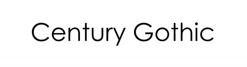
This sleek and modern-looking sans serif typeface was created in 1991 for monotype imaging. It’s neat and easy to read, which makes it especially versatile for print design, but it’s especially ideal for headlines because it’s easy to read from a long distance.
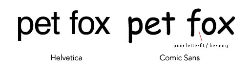
Helvetica

Since its introduction in 1957, graphic designers have gone crazy over Helvetica. It’s versatility has earned this sans serif typeface an exalted place in the hearts of designers around the world, It’s clean and easy to read, and it’s also very versatile, making it one of the most commonly-used fonts, especially for detailed information and body copy.
Garamond
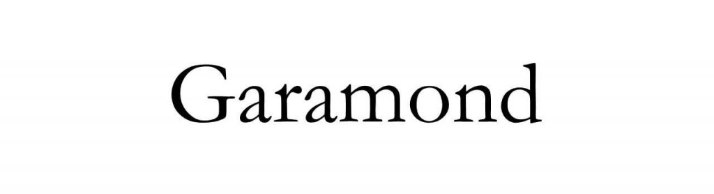
This elegant yet easy-to-read serif font has a long history. Originally cut by a French typographer named Garamont in in the 16th century, the Garamond you’ll see in most word processors today isn’t actually a true Garamond – this Garamond was actually cut by another designer named Jean Jannon. (If you’re designing in Adobe, the Adobe Garamond is a true Garamond.) How did Jannon’s typeface get attributed to Garamond? It went “missing” (in other words, it was completely ignored) for about 200 years, and when it was “discovered” in 1825, it was attributed to Garamont.
Today’s Garamond offers many variations to choose from, making it a classic and versatile typeface for your print design. It’s a great choice for headings as well as body copy.
Learn more about the history of Garamond in our series on the history of typography.
Times New Roman
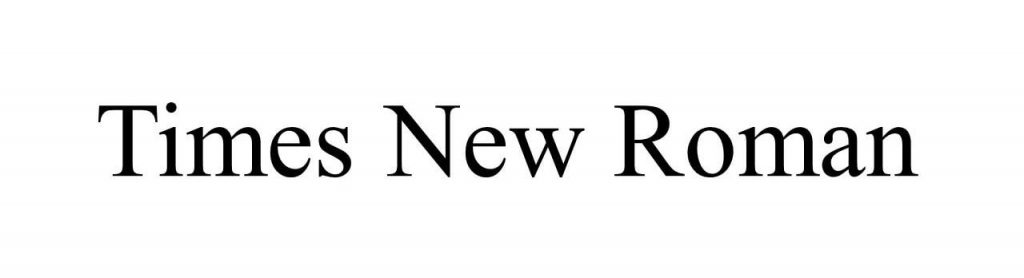
Originally designed for the British newspaper “The Times” (hence the name “Times New Roman”), this typeface is a standard choice for body text. Some designers feel that Times New Roman has been overused, but its highly legible and is always a practical, trustworthy choice.
If you’re looking for a similar serif style, try using Garamond or Baskerville; if you’re looking for the sans serif equivalent of Times New Roman, go with Arial.
Worst Typefaces for Print
Whatever you do, don’t use these typefaces in your print designs:
Comic Sans
This illustrious typeface was originally designed to fill the speech balloons of everyone’s favorite Microsoft Office helper, Microsoft Bob. It quickly became popular for other uses, particularly with younger audiences because of its childlike appearance. So why exactly do designers hate Comic Sans? There are two main reasons:
- There is no italic variant, unless you have Comic Sans Pro, which was released in 2011.
- Poor kerning. Comic Sans has uneven default kerning, which means that some letters are spaced further apart than others. This disturbs the natural flow of the eye, which negatively impacts readability.
Impact

This heavy typeface was designed in 1965 to (surprise!) make an impact. And while it does succeed on that front, Impact’s ultra-thick strokes and compressed letters make it exceedingly difficult to read.
Become a Font of Knowledge
Learn more about typography with our design resources: