Finally! The age of “Modern type” has arrived. (Or at least, almost modern.) The transition into Modern type began in the 17th and 18th centuries and spanned two artistic eras: the Baroque period, which stretched from roughly 1600-1750, and the shorter (though no less influential) Rococo period, which lasted from 1720-1770. But before we dive too deeply into the first rumblings of the coming typographic transformation, let’s review what we’ve learned so far.
The Highlights
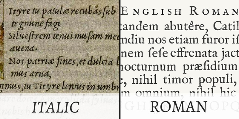
By now, we should all know that Johannes Gutenberg opened the first printing press in 1450 and that the first Italian press was opened shortly after in 1465, leading to the development of Roman and Italic type. This was a big deal.
Fast forward to the year 1515. King Francois I, the king of France, was the first monarch to appoint an official printer, thereby launching the tradition of a royal printing works. The first royal printer was a man named Geofroy Tory, and he had a student named Garamont. Garamont’s type styles moved away from the ornamental calligraphy of the early French typefaces towards a more refined, readable typeface. In fact, Garamont cut a typeface in 1520 that is arguably the typographical highlight of the 16th century. Check out the full story before we move on.
Going For Baroque
The Baroque era was one of the most influential artistic periods in human history, spawning visual artists like Rembrandt, Caravaggio, and Bernini, as well as composers to the tune of Bach, Handel, and Vivaldi. Artistic expression was characterized by abundant detail, strong contrast between dark and light (called “chiaroscuro”), bright colors, and emotional drama. Typography was no exception.
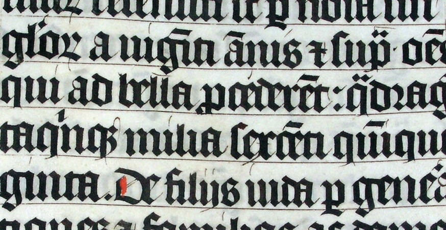
In the Baroque era, typography entered a transitional period between the old Venetian type style and the new Modern style. This transitional style was defined by a few unique attributes:
- Enlarged x-height (the distance between the baseline of a glyph and the top of a lower-case letter).

- Ascenders were reduced to cap height (an ascender is the part of a letter that extends above x-height, while cap height refers to the maximum height of a flat upper-case letter, such as “H”).
- More vertical stress, with a higher contrast between thick and thin strokes.
- Little or no bracketing on serifs (brackets are the curved connections between a stem and a serif).
In addition to changing letterforms, pages became whiter with wider margins. All of these changes allowed typefaces to appear larger and therefore more legible, while simultaneously allowing for more economical composition.
Other typographical features common to the Baroque period were ornate borders and typographical flourishes – not so great for readability, but certainly in line with the prevailing artistic trends.

The King’s Roman
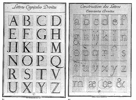
Everyone’s favorite king, King Louis XIV, commissioned a typeface that was exclusive to the French Royal Printing House. His typeface, called “the King’s Roman”, is credited to a typecutter called Philippe Grandjean, but Grandjean worked closely with mathematicians, philosophers, and a variety of other academics to create a typeface that was based on mathematics rather than calligraphy.
The resulting King’s Roman was unique for its totally rational approach to typography. Letterforms were placed onto a grid of 64 main squares, which was then subdivided into 2034 squares (foreshadowing the digital letter design of contemporary times). As a result of this approach, the King’s Roman featured even greater contrast between thick and thin strokes.
Across the Channel
Typography in Baroque England was largely dominated by two figures: William Caslon and John Baskerville.
Caslon
Caslon was both a gunsmith and a typographer (definitely an odd combination). His typefaces were heavily influenced by Dutch type, which was very popular in England at the time.
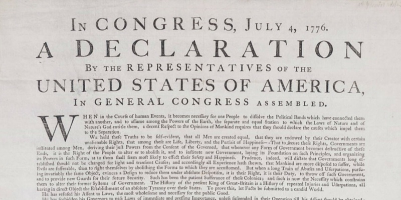
Caslon’s typefaces were notably used for the first printed version of the Declaration of Independence, and are still widely used today. He also had a significant impact on England’s second major player – John Baskerville.
Baskerville
You might recognize the name “Baskerville” from your font list. Sadly, the font associated with his name in modern software isn’t actually Baskerville’s typeface, but it is a revival of it.
John Baskerville had a profound impact on the development of Modern typefaces. His typefaces were greatly admired by Benjamin Franklin, who actually brought them back to the United States (which at that point was a newly created republic), and used them for publishing most federal documents. Talk about a legacy.
Next Stop
Next in our journey through the history of typography, we explore the Rococo era – the second major era in the development of modern type. And it’s a fun one, so stay tuned!
Keep Reading
Part 1 – Humble Beginnings
Part 2 – Italian Inspiration
Part 3 – French Connection
Sources
Ayiter, Elif. “The Masters of Typography.” The History of Visual Communication.
“Type Design in the French Renaissance.” Graphic Design History. 2011.