
The Rococo period was short but notorious. But before we dig too deeply into this opulent era, let’s recap what we learned in our last installment.
Going For Baroque
The transition into Modern type spanned across two major artistic periods: the Baroque and the Rococo.
The Baroque era was one of the most influential artistic eras, characterized by lavish detail, strong contrast, bright colors, and emotional drama. It also spawned a new transitional type style featuring typographical features more in line with the typefaces we are familiar with today, such as enlarged x-height, more vertical stress, and little or no bracketing.

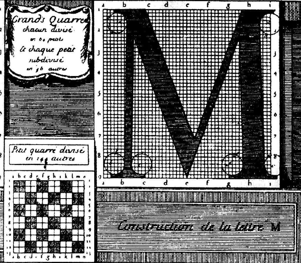
In addition to more legible type, the Baroque period also saw the development of the first typeface based solely on mathematics, called the King’s Roman. This rational approach to typography continued through the Rococo era.
Check out the full post for a complete review.
Ready, Set, Rococo
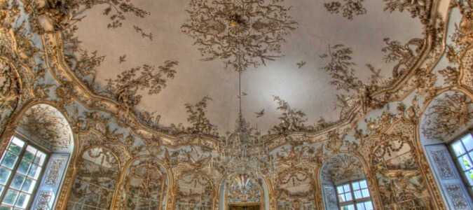
The Rococo era originated in Paris in the early 18th century, and was soon adopted throughout the rest of France and other European countries. At its outset, the Rococo style was a reaction against Baroque design, typified by the palace of Versailles.
Rococo design is characterized by its lighter style of ornamentation, delicate curves, shell forms, and natural shapes. Asymmetrical designs were also very popular, as were light pastels, ivory white, gold, and mirrors.
One man stands out amongst the rest of the Rococo’s typesetters and designers: Pierre Simon Fournier.
Fournier Rocks Rococo 1720-1770
Pierre Simon Fournier was the son of type founder Jean Claude Fournier. He was influenced by the cleaner styles of Grandjean’s King’s Roman, but his typefaces were mostly decorative in line with the Rococo style.
Fournier made a couple of significant contributions to typography:
- He pioneered the concept of a type family.
- He’s rumored to have created 60,000 punches for 147 typefaces of his own design.
- Around 1737, he introduced a standardized type measurement (King’s Roman, anyone?) using a table of proportions called the French pouce – a now non-existent unit of measurement slightly longer than an inch. Fournier’s point system created punches on a scale of 72 points to a pouce instead of the standard height-to-paper measurement.
Two years after he created his measurement system, Fournier established his own type foundry. The rest is history.
Out of Rococo and into Modern Type
The final transition into Modern type is credited to two (or three) men – a Frenchman named François-Ambroise Didot and his son Firmin, and an Italian named Giambattista Bodoni. Firmin Didot and Bodoni’s typefaces so closely resemble each other that opinion is strongly divided over which one actually ushered in Modern type.
Let’s look at Firmin Didot’s dad first.
François-Ambroise Didot
About 40 years after Fournier created his point system, François-Ambroise Didot revised it. François-Ambroise adjusted the body size of each glyph to the legal standard of measurement in place in France at the time – the “royal foot”. This system of measurement soon became the standard for type measurement – an important development.
Firmin Didot
Enter François-Ambroise’s son, Firmin. Firmin’s typefaces were characterized by extreme contrast between thick and thin strokes, hairline serifs, and the vertical stress of the letters – all characteristics common to many of today’s typefaces.
Firmin worked closely with Bodoni, and both are credited with the establishment of Modern (also known as “Didone”) type.
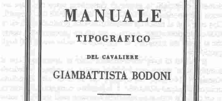
Bodoni
Bodoni was also inspired Fournier’s typefaces, as well as those created by John Baskerville. Known for his technical refinement, Bodoni designed 298 typefaces, many of which were available in a variety of sizes.
Bodoni was one of the first typographers to create typefaces in multiple sizes, allowing for greater subtlety of spacing. His style was plain and unadorned, and along with Firmin Didot, Bodoni created a type style called “New Face”, known for its contrast between thick and thin strokes.
What’s So Special About Modern Type?
Modern typefaces are known for their elegance, and aren’t especially well suited for extended text because of their vertical emphasis. Robert Bringhurst, a contemporary poet and typographer, describes the difference between Modern type and its Renaissance predecessors well:
[Modern] letters can be extraordinarily beautiful, but they lack the flowing and steady rhythm of the Renaissance forms. It is that rhythm which invites the reader to enter the text and read. The statuesque forms of [Modern] letters invite the reader to stand outside and look at the letters instead.
For this reason, today’s eponymous Bodoni and Didot fonts are best suited for display rather than body copy.
Next Stop: Neoclassicism and the Enlightenment
In our next installment, we’ll follow the history of typography through its Neoclassical and Enlightenment evolution, including the development of the steam-powered press and the first sans-serif typeface!
Stay tuned!
Keep Reading
Part 1 – Humble Beginnings
Part 2 – Italian Inspiration
Part 3 – French Connection
Part 4 – If It’s Not Baroque, Don’t Fix It!
Sources
“A Brief History of Type Part Four: Modern (Didone)”. I Love Typography. May 30, 2008.
Bringhurst, Robert. “The Elements of Typographic Style”. October, 2004.
Counterspace Typography Timeline.
Meggs, Philip B. “Rococo Graphic Design”. Encyclopedia Britannica. April 3, 2014.
“Rococo Style”. Encyclopedia Britannica.