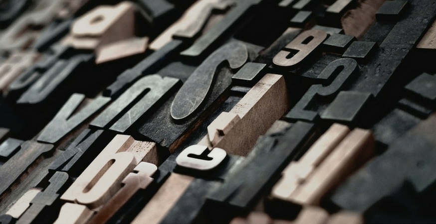
The key to understanding typography and type design is to understand what characteristics make each typeface similar or different. The differences can be glaringly obviously or quiet and subtle, but they all lie in each typeface’s unique anatomy. But before we start dissecting the letter, we want to correct a common typographical misconception.
Font versus Typeface
Many people incorrectly use the words “font” and “typeface” interchangeably. A font and a typeface are not the same thing, and chances are when you say “font”, you really mean “typeface”.
A typeface is really more like a font family. “Font family” is technically an HTML term so it only applies to digital design, but both terms refer to a set of one or more fonts composed of characters that share common design features. A “font”, then, refers to the individual style of a particular typeface. It helps to visualize it:
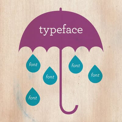
Think of these design features like members of your own family – there are certain common characteristics that set your family apart from others’. A typeface is like your family name, while fonts are more like each individual member of your family. For example, Helvetica is a typeface, but Helvetica in 8 pt. is a different font than 16 pt. Helvetica, and bold Helvetica is a different font than italic Helvetica. Make sense?
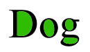
Body Parts
Just like people, letters have different body parts. It’s the minor differences in how these body parts are designed that gives us different typefaces. Here are some of the most important components:
Aperture
The opening at the bottom of a character.

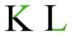
Apex
The point at the top of a character where two strokes meet.

Arm/Leg
A horizontal stroke not connected at one end. Arm strokes are on the top half of the letter, while leg strokes are on the bottom.
Ascender
An upward vertical stroke that extends above the x-height of lowercase letters. Not sure what x-height is? Keep reading.

Baseline
The line on which characters sit, like invisible lined paper.
Bowl
A curved stroke that creates a fully or partially enclosed space.

Counter
The technical name for the enclosed space created the bowl (the ones you used to color in as a kid).
Crossbar
A horizontal stroke.

Descender
The opposite of an ascender – a vertical stroke that travels below the baseline.

Finial
A tapered or curved end.

Hairline
The skinnier strokes seen in serif typefaces.

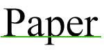
Serif
“Feet”, or extended strokes, located at the end of vertical or horizontal strokes in serif typefaces. Sans serif typefaces lack these feet.

Shoulder
A curved stroke extending from a stem.

Spur
A small projection from a curved stroke, similar to a serif but not originating at the end of a stroke.

Stem
The primary vertical stroke of a letter.

Tail
A commonly decorative descending stroke.

Terminal
The end of a stroke that does not end in a serif.

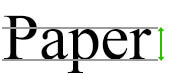
X-Height
The height of a lower case letter.
Study Up!
If you want to design your own typeface, understanding the tiny components of each glyph is essential. If you’re not a typeface fanatic, understanding the minor differences can help you identify the perfect typeface for your project, from the simplest wedding invitation to the most complicated graphic design project.