Comic Sans: the world’s most simultaneously loved and hated font. Graphic designers especially love to hate on Comic Sans, and it’s easy to understand why. Everyone and their mother has used Comic Sans at some point in their lives, and chances are, they’re using it inappropriately.
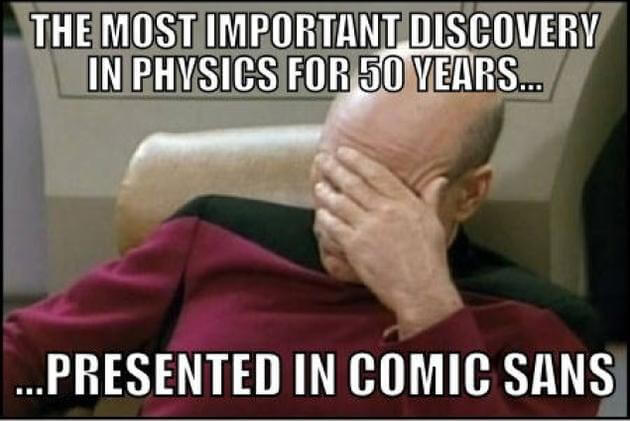
Unless you are or were a designer, you probably aren’t concerned with how the minutiae of a certain typeface contributes to the overall look, feel, and meaning of your design. But the entire field of typography has developed based on these minor distinctions, so when a designer sees a serious message printed in Comic Sans, who could blame them for cringing?
Let’s dig a little deeper.
History of Comic Sans
Comic Sans, officially known as Comic Sans MS, was designed by Vincent Connare and released in 1994 by Microsoft Corporation. It’s been a standard typeface in all Windows operating systems since Windows 95.
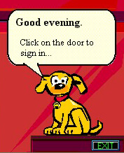
Comic Sans was originally developed to fill the speech balloons of everyone’s favorite Microsoft Office helper, Microsoft Bob. When Connare saw that Microsoft was using Times New Roman, he created Comic Sans as a friendly, more appropriate alternative.
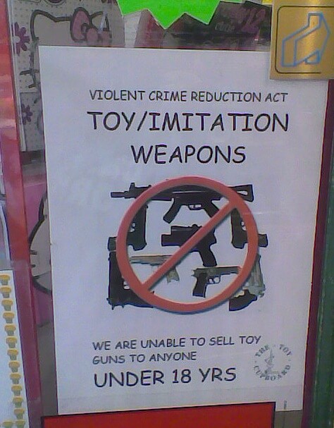
Comic Sans quickly became popular for other uses, especially for younger audiences because of its childlike appearance. But then everyone started printing with it, even hospitals and police stations – not exactly the best fit for a serious message – bringing us to where we are today.
What’s Wrong with Comic Sans?
If you aren’t a trained designer, there’s not really anything objectively wrong with Comic Sans. However, there are a few technical failings that contribute to designers’ contempt for the typeface:
- There is no italic variant. Comic Sans Pro, released in 2011, includes an italic variant.
- Poor kerning. “Kerning” refers to the appropriate spacing of separate letters. Comic Sans has uneven default kerning, so some letters are spaced further apart than others. This disturbs the flow of reading.

Most designers also consider Comic Sans to be a poor imitation of handwritten letters. Indeed, when you compare other fonts created with the same goal, you can certainly see why designers would feel this way.
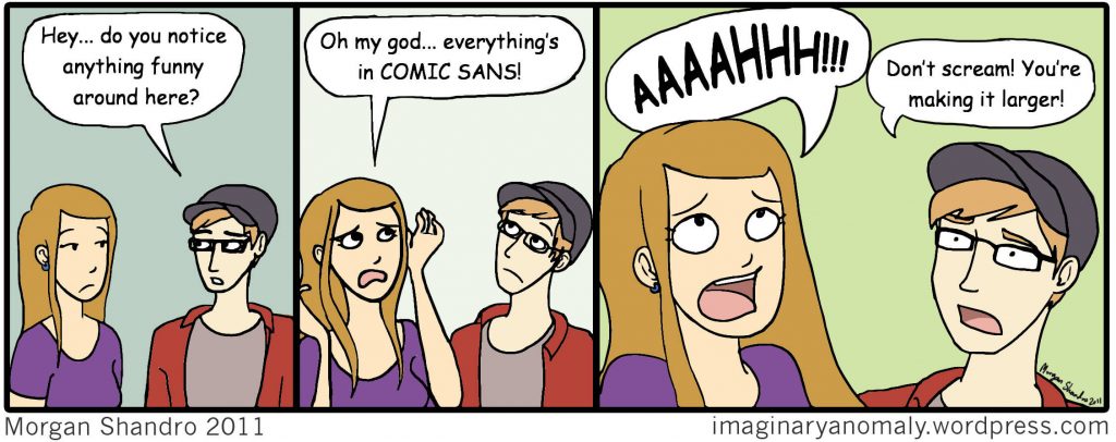
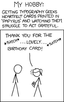
The main reason why designers (and a lot of other people) hate Comic Sans is simply because it has been so wildly overused and misused. Compared to the typical serif and sans serif fonts that come pre-installed in your word processing software, Comic Sans provides a refreshingly friendly or otherwise “interesting” option. Put simply, Comic Sans is cute. Don’t want to bore your employees with a plain presentation? Comic Sans. Want your poster to catch the eye of that passerby? Comic Sans. It’s everywhere. There is no escape.
No typeface is created equal. They are all suited for different uses, and a skilled graphic designer will be able to navigate those differences and choose the perfect typeface for the project at hand. And with a few simple tips, non-designers can do the same. No need to resort to Comic Sans!
When Can I Use Comic Sans?
There are a few times when Comic Sans is an appropriate choice:
- If your audience is under 11 years old. Parents don’t count. If you’re a teacher or a childcare worker, go ahead and use all the Comic Sans you want. Of course, this is not a hard and fast rule (see right).
- If you’re designing a comic. After all, this is what Comic Sans was created for. However, you can easily find tons of other, better, less-hated options for your speech balloons and captions. This list is a good place to start.
- If your client asks for it. Go ahead and suggest other options, but if your client is dead set on Comic Sans, swallow your pride and use it.
What Can I Use Instead?
Choosing Comic Sans isn’t the worst thing you could do. But there are an almost infinite number of better choices out there. Here are some good options:
If You Want Something “Friendly”
There’s no denying that Comic Sans is cuter and more familiar than something like Times New Roman. If you’re looking for something that is still friendly, cute, and well-suited to younger audiences, SF Cartoonist Hand is a great option.
If You Want Something With a Serif
Serif and “fun” are not mutually exclusive. HVD Comic Serif combines Comic Sans’s casual nature with a slightly more formal serif. It may not retain that handwritten look, but it is certainly more exciting than its formal serif cousins.
If You’re Printing Something Serious
If you’re designing something with a serious message, do not use Comic Sans. I repeat: DO NOT USE COMIC SANS.
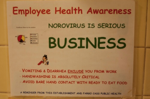
That goes for professional presentations, posters, documents, websites, headings, banners, portfolios, resumes, and basically anything that’s not directed towards an audience of children. A serif font might be more appropriate. Check out this list of popular serif fonts for inspiration.
If Readability Is Your Main Concern
If you are tempted to use Comic Sans because it’s more readable, try Laconic. Like Comic Sans, Laconic is sans serif, but it has better kerning and more uniform letters.
If you still aren’t sure which typeface is best-suited to your needs, check out our list of dos and don’ts for choosing a typeface.
The Moral of the Story
There’s really nothing seriously wrong with Comic Sans, but there are tons of better and more appropriate options out there. Even Comic Neue is better.
And if you just can’t stand to use a different font because you love Comic Sans so much, mark your calendars for the first Friday in July. Thanks to some Dutch radio broadcasters, that Friday is Comic Sans Day. So get your party hats on and get those invitations ready to send – in Comic Sans, obviously.
Take the Pledge
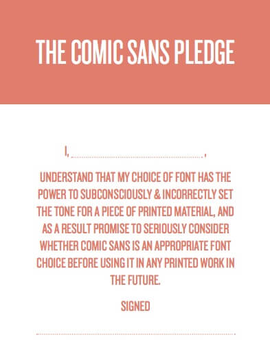
If you love, hate, or love to hate Comic Sans, but are confident in your ability to determine when is or isn’t an appropriate time to use it, take the pledge.
Sources
Culbertson, Melissa. “Ditch That Font: Alternatives to Comic Sans.” Blog Clarity. June 16, 2014.
“What Is Wrong With Comic Sans?” Graphic Design Stack Exchange. September 2014.

