There are many ways to dress up your type design, such as combining typefaces or adjusting styles and sizes, but one of the simplest ways to add some extra oomph to your type is to reverse it.
“Reversed type” is simply a light colored typeface printed or otherwise set against a dark background, like white text on a black background.
It’s often easier for your printer to simply print the dark background surrounding the lighter colored type, especially if your type is white or the same color as your paper. That’s why reversed type is also called “knocked out” type – as if the unprinted type were knocked out from its dark background.

What is Reversed Type Used For?
Reversing your type is a great way to emphasize specific text; however, reversed type can be less readable, which may obscure your message. Keep reading to learn how to use reversed type without compromising legibility. Reversed type should complement your design and its message, not overwhelm your reader’s eye.
Using reversed type is also limits the number of typefaces you’ll need to create your type hierarchy. Instead of introducing a new typeface for your headlines, footers, or block quotations, try simply reversing the type. That way, you can use the same typeface and create a uniform look while also creating structure and organization within your design.
7 Tips for Using Reversed Type
Reversed type can be harder to read than normal type. Follow these tips to make sure your reversed type is a total knockout:
1. Use reversed type sparingly
Use knocked out type for emphasis only, such as for headlines or block quotations. To be sure your audience doesn’t inadvertently miss the information you’ve included in your reversed type, it helps to repeat important content in the next line of text.
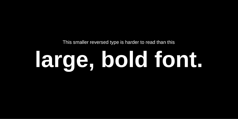
2. Use a larger font
When you print, the dark ink of your background can spread into the white or light colored area of your reversed type. 10 pt. fonts or above work best, but if you want to use a smaller font, your printer might be able to accommodate it. Bolding or increasing the weight of your typefaces can also help.
3. Use sans serif fonts
Serif typefaces can lose legibility when you print, just like smaller fonts.
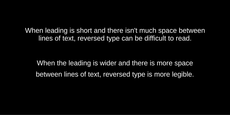
4. Increase leading
More space between lines of texts improves readability, as does wider letter spacing and proper kerning.
5. Use wide margins
Wide margins also increase legibility.
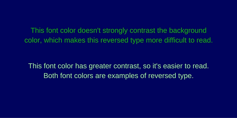
6. Contrast is your friend
Ensure that there is enough contrast between the light color of your typeface and the dark color of your background.
7. Don’t use reversed type for body copy
Extended reversed type is hard to read.
Reverse Typography
Reversed type is eye-catching, and it’s a great way to switch up your type design and introduce a new element into your type hierarchy. And with our tips for using reversed type in your graphic designs, you won’t need to worry about compromising legibility.