
Humans have an innate tendency to organize images and design elements into logical groups. The design principle of proximity formalizes this natural inclination and is a valuable tool for helping graphic designers arrange information in a way that can be easily communicated to readers.
What is the Principle of Proximity?
The principle of proximity suggests that designers should visually group similar or related items together to emphasize their relationship. On the flipside, unlike or unrelated items should be spaced further apart to emphasize their lack of relationship.
Why Do We Need the Principle of Proximity?
Grouping like items and separating unlike items reduces design clutter, allowing designers to create a more organized layout with a clearer information hierarchy. As such, proximity has a significant impact on your design’s readability, as well as the quality of the experience your reader has when viewing your design.
How To Implement the Principle of Proximity
We already unconsciously group like items together, so using the proximity principle is mostly a matter of simply being conscious of your groupings.
The principle of proximity is easy to implement. Here’s how:
1. Grouping
Grouping is the cornerstone of the proximity principle. Organizing similar information and separating dissimilar information improves the readability of your design, and it also creates white space between your groups.


Take this business card for example. While separating my contact information like you see in the first figure occupies the full canvas, arranging my contact information like I’ve done in the second figure more clearly communicates the important information by grouping it together in logical chunks.
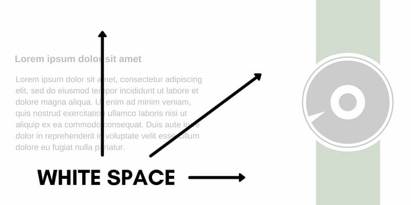
2. Embrace White Space
“White space”, also known as “negative space”, refers to the areas of your design that do not contain content. Basically, white space is the space between grouped elements in your designs. These spaces prevent your design from appearing over-crowded, and they help guide your reader’s eye towards key information by contributing to your visual hierarchy.
Learn more about using white space in your graphic designs.
3. Create a Visual Hierarchy
Grouping like elements together and creating white space will help you build a visual hierarchy within your design. Your visual hierarchy will organize relevant information and improve your design’s flow and readability.
Contrast and typeface choice can also help you establish a visual hierarchy.
4. Use a Grid
Grids give you a guideline for where to place grouped elements within your design. They also ensure that you leave an appropriate amount of white space between design elements.
Tips for Using the Principle of Proximity
There are a couple of things you can do to make the most of proximity in your designs:
- Create obvious groups using shapes, borders, and appropriate spacing.
- Use proximity in combination with other design principles like contrast, white space, and alignment to add visual interest to your designs.
- Resist the temptation to fill your entire canvas – this can make your information hard to read and understand, and it probably won’t look as good either.
- Use sub-groups to break up larger sections of copy.
- Place captions close to images to emphasize their relationship.
The Golden Rule of Design
If you’re trying to decide between clear communication and “exciting” design, always choose clear communication. Your message – not how it appears – is what really matters.
Close Call
Grouping similar elements and separating unlike elements improves the readability of your design, so don’t be afraid to let your design elements get a little cozy!
Read More
Check out the rest of our Design Principles series:
Part 1: Alignment
Part 2: Consistency & Repetition
Part 3: Gestalt Theory
Part 4: Rule of Thirds
Part 5: Balance
Part 6: White Space
Part 7: Proximity (you’re here!)
Part 8: Contrast
Discover the basic building blocks of any design! Learn more about the Elements of Design.