
We all know that rules are meant to be broken, but like Picasso said, we need to learn the rules before we can break them.
“Learn the rules like a pro, so you can break them like an artist.” – Pablo Picasso
The “rule of thirds” is one of the most well-known compositional principles. It applies to every form of design, from graphic design to photography to painting and even scrapbooking and card making. But before you get all excited to break the rule of thirds, let’s talk about what it actually is.
What Is the Rule of Thirds?
The rule of thirds helps designers and artists compose their creations. It’s based on the principle that the human eye inherently prefers to see balance and movement in design and art and gives artists and designers a guideline for achieving them.
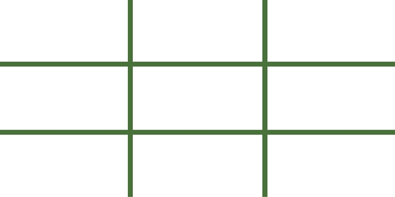
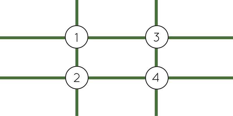
Divide your canvas into 9 equal parts by imagining or even overlaying a grid that features three equally sized columns and three equally sized rows. It should look something like this:
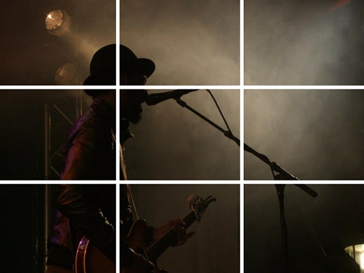
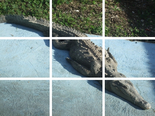
Placing important compositional elements on the intersections of the horizontal and vertical lines, sometimes called “power points” or “crash points”, will help create that elusive sense of balance and movement and ultimately result in a more polished, cohesive composition.
Why Use the Rule of Thirds?
The rule of thirds is the most well-known compositional tool for a reason. It’s simple but profoundly effective, and can help improve the overall look at feel of your designs by:
- Adding balance and complexity without being overwhelming or confusing.
- Discouraging you from simply locating your focal point smack in the middle of your page or canvas.
- Creating a sense of direction within your composition by helping to direct your reader or viewer’s eye where you want it to go.
How Can You Use the Rule of Thirds?
Start composing your design by asking yourself two questions:
- What are your major points of interest? This could include things like logos, people, photographs, scrapbook embellishments, quotations, copy, or any other focal point.
- Where should you place them? The rule of thirds can help you answer this question.
There are a few simple ways you can use the rule of thirds to help decide where to place your major points of interest.
1. Place focal points or major points of interest on or near power points.
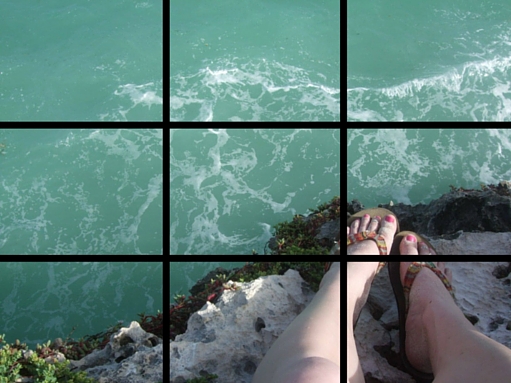
2. If your composition involves images of people, align their bodies with the vertical lines and their eyes with a horizontal axis.
3. Locate your horizon line or other major horizontal design elements along one of the horizontal lines. Aligning a horizon line along the top horizontal third of your composition can create a better sense of balance.

4. Create flow within your design by allowing linear features and design elements to extend into other sections.
Using the Rule of Thirds in Graphic Design
Designers should remember that the most popular, eye-catching power point is the top left intersection. With this in mind, it might be a good idea to place critical information or your main focal point on this power point. Following this, the most attention-grabbing power points are (in order) the bottom left, the top right, and lastly the bottom right.
Designers can also use the rule of thirds to crop and scale their design elements properly.
Breaking the Rule of Thirds
You don’t need to be exact when using the rule of thirds. Think of the rule of thirds as more of a guideline, and don’t worry if your focal points don’t exactly match up with the power points or axes.
The main goal of the rule of thirds is to encourage artists and designers not to locate their subjects or focal points right in the centre of their canvas. But if you have a good enough reason to break the rule of thirds, by all means, go ahead ahead and break it! Here are a few good excuses:
- You’re aiming to create a sense of symmetry. People like symmetry as much as they like balance and movement, so opting to create symmetry by breaking the rule of thirds is a perfectly valid design decision.

- You want to create a certain emotional resonance within your design. Centered focal points can feel aggressive and confrontational, so if that’s what you’re going for, consider centering your focal point instead of following the rule of thirds.
- You’re taking a photo using a shallow depth of field. In this case, the shallow depth of field creates dimension.

Rule of Thumb
Captain Jack Sparrow said it right when he said that rules are more like guidelines than actual rules. He may have been referring to the pirate code, but the same principle applies to the rule of thirds. Using the rule of thirds will help you create more visually interesting, balanced compositions, but if you’re specific project calls for you to break the rule, don’t hesitate to do so!
Check out the rest of our Design Principles series:
Part 1: Alignment
Part 2: Consistency & Repetition
Part 3: Gestalt Theory
Part 4: Rule of Thirds (you’re here!)
Part 5: Balance
Part 6: White Space
Part 7: Proximity
Part 8: Contrast
Discover the basic building blocks of any design! Learn more about the Elements of Design.