
When it comes to graphic design, empty space is anything but wasted space. In fact, the empty spaces in your compositions play a pivotal role in the success of your designs.
In the last installment of our Design Principles series, we will explore the power of white space (also known as negative space), and how you can harness white space to improve your designs. But before we dig in, we need to talk about what white or negative space actually is.
What is White Space?
White space refers to the areas in your design that do not contain content, including the larger spaces between design elements and the tiny spaces between letters. It doesn’t have to be white.
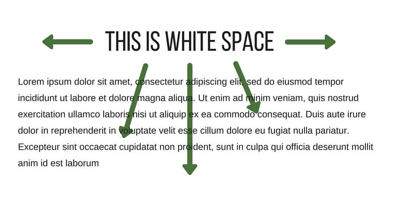
Areas that contain content are called “positive space”, while areas that contain no content are called “negative space”. The terms “negative space” and “white space” are synonymous.
Types of White Space
Different types of white space describe its different uses and purposes.
There are two main distinctions: macro and micro white space, and active and passive white space.
Macro
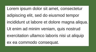
The empty spaces between core design elements, such as columns, paragraphs, and graphic elements.
Micro
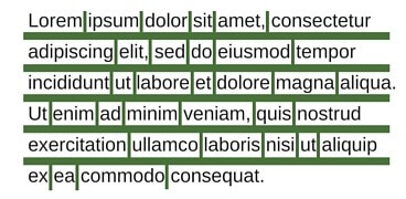
The spaces between smaller elements, such as letters (technically called “kerning”) or line spacing (referred to as “leading”).
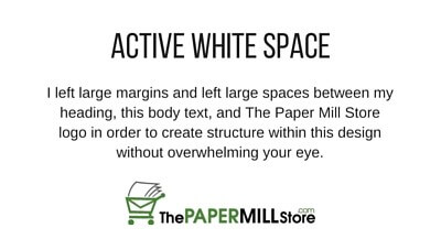
Active
Active white space is negative space you’ve made a conscious effort to include in order to create emphasis or structure within your design. Active white space can draw your reader’s eye to a certain focal point, and it helps create flow within your design.
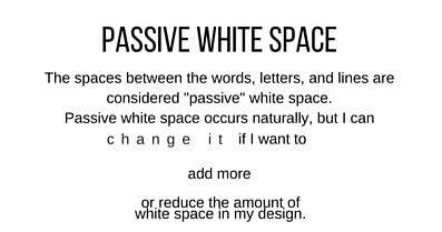
Passive
Passive white space occurs naturally. Kerning and leading are both examples of passive white space, and you can manually alter both to add or reduce white space.
Why Do You Need White Space?
Picture yourself at a crowded party. It’s hard to get around, and it’s even harder to find your friends. The same principle applies in graphic design – the more crowded your design is, the harder it will be to understand. That’s where white space comes in.
Negative space serves a number of very important purposes in your graphic designs. White space can:
- Enhance readability: If your design is too cluttered, it won’t be readable and the focus will be taken away from your message. Macro white space ensures that your text doesn’t have to compete with other design elements, while micro white space ensures that your text is easily readable.

- Simplify your design: Negative space breaks your design elements down into discrete chunks so you don’t overwhelm your reader’s eye. This makes it easier for them to process the information you’re presenting.
- Create texture: White space adds dimension to your designs, especially when related to type.
- Complete your image: The human eye has a natural tendency to see closed shapes. When a shape or element is incomplete, white space can help you reader unconsciously fill it in.

- Add a sense of luxury: Taking a “less is more” approach by incorporating more white space can create the sensation of luxury or sophistication. Think of graphic design like fine dining – your plate may seem empty, but the minimalistic presentation only serves to highlight the dish’s unique flavors. This billboard by Apple is a great example of how white space can add a sense of luxury.

How To Incorporate White Space
Incorporating white space is about more than just leaving parts of your design empty. If white space is ineffectively used, it can actually do more to harm your design than help it. When integrating white space in your designs, keep these tips in mind:
- Keep it consistent. Inconsistently applied white space may appear careless, while properly aligned elements can make your design feel cohesive and sophisticated.
- Measure your margins. Margins that are too wide may create the sensation of wasted space, while margins that are too narrow can make your design seem overly crowded.
- Asymmetrical white space can make your design feel more dynamic and interesting.
- Use white space as positive space, like you see in this United States Air Mail stamp. Instead of using color for the text and to create the image of the airplane, this stamp uses colors as the background and allows the content of their design to stand out in bright white relief.

- Line spacing matters. If your lines of text are too close together or too far apart, they can be difficult to read.
- Think about your typeface. If you don’t have much space to work with but have a lot of text to include, a lighter typeface can help you create white space without sacrificing readability. Newspapers often use lighter typefaces to compensate for tight spacing requirements.

Don’t Be So Negative
Negative space, or white space, is an integral component of good graphic design. Without white space, your design may seem disorganized and cluttered, so don’t be afraid to leave empty spaces in your designs!
Read More
Check out the rest of our Design Principles series:
Part 1: Alignment
Part 2: Consistency & Repetition
Part 3: Gestalt Theory
Part 4: Rule of Thirds
Part 5: Balance
Part 6: White Space (you’re here!)
Part 7: Proximity
Part 8: Contrast
Discover the basic building blocks of any design! Learn more about the Elements of Design.