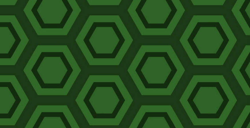
Consistency is the uniform use of an element or style, and repetition involves (surprise!) repeating the same elements or styles within a single composition or across multiple pages. They may not seem sexy or exciting, but they’re important aspects of effective graphic design.
Consistency and repetition aid readability and comprehension, and they also help unify your designs across multiple pages or mediums. For example, if you’re designing a promotional pack containing flyers, brochures, posters, and sample packaging, consistency and repetition will help you create a cohesive design that unites all the disparate elements of your promotional pack.
Quick Ways To Achieve Consistency and Repetition
Here are some quick way to achieve consistency and repetition using simple design elements:
- Use the same typeface hierarchy for headlines, subheadings, or body copy across different designs.
- Apply the same color scheme across your designs.
- Place distinctive visual elements such as logos or product shots in similar locations.
- Proper alignment also aids in visual comprehension.
Using similar typefaces, colors, and layouts is an easy way to stay consistent, but one of the best ways to achieve consistency is to use a grid.
Grids
A grid is a simple tool that helps guide the placement of visual elements on your page. Like alignment, a grid is a largely invisible structure. Have you ever looked at a poster and thought “yeah, sweet grid”? Probably not. But chances are, you’d notice if that poster didn’t use a grid.
Before we dig into how to create and use a grid, let’s go over some basic grid terminology.
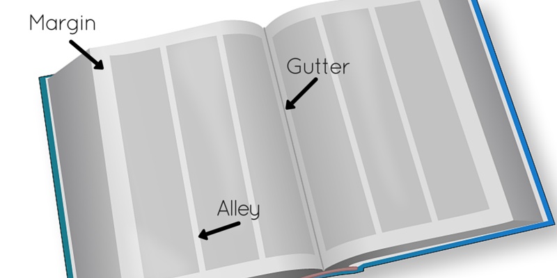
Grid Terminology
Margins: Margins define the outside boundary of your page.
Alleys: When you divide the interior space of your design into uniform parts such as columns, alleys are the white space that exists between these elements.
Gutter: The gutter is the inside page margin of a two-page or two-panel spread.
How To Define A Grid
Don’t be afraid that using a grid locks you in to a boring design. A single grid can be configured in a number of ways – the only limit is your creativity.
The style of grid you use ultimately depends on your content, text, and visual elements:
- Content. Is your content text-heavy, or are there a lot of smaller visual elements?
- Text. How is your text broken up? Are there longer paragraphs like an essay, or are there several smaller articles like a newsletter? How many headings or subheadings do you have? Are there any block quotations?
- Visual Elements. How many graphics are there? Are they small or large? Are there logos? What color are your visual elements?
Your grid can contain as many parts as necessary, from something as simple as two columns to 16 squares!
Tips For Using Grids
The type of grid you use and how you incorporate your elements will ultimately depend on your design, but we can offer a few tips to help get you started.
- If you have lots of text and no graphics, you can use a simpler grid with fewer grid parts. If your design is more complex, you’ll need more grid parts.
- Text-heavy designs often use a column-based grid to aid readability; however, columns are not necessary for smaller articles like you’d see in a newsletter.
- Even-numbered grids can appear stiff. Three columns add some visual interest without making your columns too narrow.
- Elements can occupy more than one grid unit, especially if they’re images or other visual elements.
- You can use multiple grids within a single design. For example, you could use three columns of text on the top ¾ of your page, but use two grid parts for two photographs on the bottom ¼ of your page.

Repeat After Me
Consistency need not be boring! In fact, consistency is key to creating a readable, attractive design. You can easily achieve consistency by repeating certain styles and elements such as fonts, colors, and images, but using a grid is a simple, straightforward way to achieve consistency within your design.
Read More
Check out the rest of our Design Principles series:
Part 1: Alignment
Part 2: Consistency & Repetition (you’re here!)
Part 3: Gestalt Theory
Part 4: Rule of Thirds
Part 5: Balance
Part 6: White Space
Part 7: Proximity
Part 8: Contrast
Discover the basic building blocks of any design! Learn more about the Elements of Design.