Have you ever heard the term “gestalt” and thought “what the heck does that mean?!”? You’re not alone.
The term “gestalt” is thrown around in a lot of different contexts, but its meaning is particularly relevant to graphic designers. Don’t be thrown off by its name – gestalt principles are easy to follow, and they’ll make a significant difference to the outcome of your design.
What Does “Gestalt” Mean?
Gestalt is defined as “an organized whole that is perceived as more than the sum of its parts”.
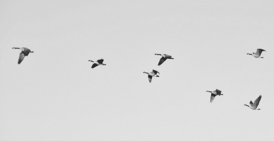
Not sure what that means? Think about geese flying in the sky. Geese fly in a unique V formation, but that V is made up of discrete parts (the individual geese). So in this case, the V is the “gestalt” – the sum of the individual parts, or rather, the sum of the individual geese. See? Not as complicated as it seems.
What Does Gestalt Have To Do With Design?
Gestalt principles describe how viewers group different objects and elements together into a single, coherent whole if disparate elements are arranged in a particular way.
In short, understanding and incorporating gestalt principles helps your design feel clear, cohesive, and complete.
Where Do Gestalt Principles Come From?
Gestalt theory originated in Germany (surprise!). There were many important figures involved in the development of gestalt theory, but one of the major players was Rudolf Arnheim.
In 1954, Arnheim wrote a book called “Art and Visual Perception: A Psychology of the Creative Eye”. In this book (which is one of the must-have art books of the 20th century), Arnheim outlined several gestalt principles of design. That’s what well be talking about today.
6 Major Gestalt Principles
There are several gestalt principles you can (and should) keep in mind when you’re creating a new design, but here are six of the most influential (and most effective) gestalt principles.
1. Similarity
When elements look similar, viewers naturally group them together as part of a pattern or group. As such, similarity is used to create a single design element, illustration, or message out of multiple separate elements.
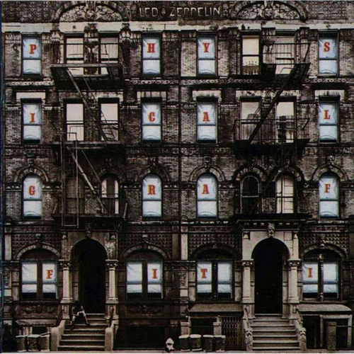
BLed Zeppelin Physical Graffiti Gestalt Theory Similarity Graphic Designreaking similarity, which is called “anomaly”, draws attention to the dissimilar element. This is a great way to create a focal point.
You can create similarity using a number of design elements, such as:
- Color
- Texture
- Shape
- Size
- Value
- Typefaces and font styles
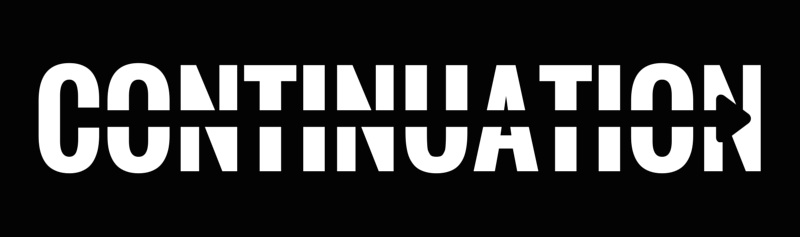
2. Continuation
Continuation refers to the eye’s natural tendency to follow continuous figures like lines, paths, or curves. Continuation is a great way to draw your viewer’s eye towards a focal point.
You can easily create continuation using an arrow (or anything that points). If there are images of people or animals in your design, you can incorporate continuation by making sure they are looking in the direction of your focal point.
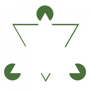
3. Closure
Closure is based on the human eye’s natural tendency to see closed shapes. When an object is incomplete or the interior space of a particular design element is not fully enclosed, the viewer unconsciously completes the shape.
Graphic designers often use closure in stenciled artwork and logo design.
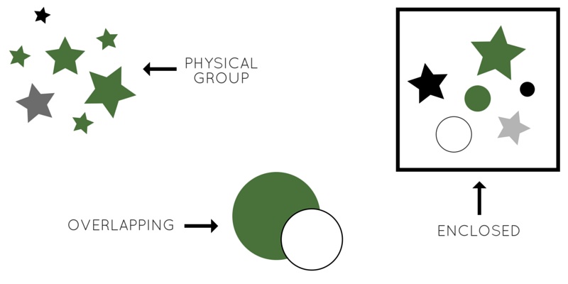
4. Proximity
Proximity refers to closely or compactly arranging separate elements to create a group. Proximity works especially well if your elements are similar, but similarity is not required.
You can use the principle of proximity in a number of ways:
- Physically grouping textures, shapes, colors, or any other common element. Grouped elements don’t need to be the same size or shape, as long as they have some common design feature.
- Overlapping shapes or other design elements.
- Using lines or shapes to surround or enclose separate elements.
5. Figure/Ground
In order to understand the figure/ground principle, we must first understand what figure and ground are:
- “Figure” refers to the element in focus. This includes typography!
- “Ground” is the background on which the figure rests.
All design elements are either figure or ground, and understanding the relationship between the two is a key component of good design.
“Figure/ground” gestalt principles are based on the eye’s tendency to see and separate objects from their surrounding background. Depending on how you arrange and balance figure and ground, you can direct your audience’s eye towards specific focal points and use these elements to communicate or complement your message.
6. Symmetry & Order
According to the gestalt principle of symmetry and order, a visual composition should not try to create disorder. Disorder forces the viewer to concentrate (consciously or unconsciously) on locating the missing element instead of understanding the message you’re communicating.
The best way to compose a symmetrical design is to use grids to create balance. Check out our post on using grids in graphic design to learn how to create symmetry and order in your designs.
Gestalt in the Name of Good Design!
Gestalt principles may sound foreign and confusing, but they’re surprisingly easy to incorporate into any design project. Chances are you’ve already been unconsciously using them in your designs, but now that you know what they are and how to identify them, you can use gestalt principles to create cohesive designs that are sure to impress even the pickiest of clients.
Read More
Check out the rest of our Design Principles series:
Part 1: Alignment
Part 2: Consistency & Repetition
Part 3: Gestalt Theory (you’re here!)
Part 4: Rule of Thirds
Part 5: Balance
Part 6: White Space
Part 7: Proximity
Part 8: Contrast
Discover the basic building blocks of any design! Learn more about the Elements of Design.