
In the next instalment of our ongoing blog series on the principles of graphic design, we’re taking a look at one of the most important design principles: contrast.
Employing contrast adds visual interest to your designs, and it also helps communicate your message. Like alignment, you probably won’t notice contrast if it’s executed properly, but you’ll certainly notice if a design doesn’t incorporate contrast or incorporates it poorly. So without further ado, let’s jump in:
What Is Contrast?
Contrast is officially defined by Wikipedia as “the difference in visual properties that make an object (or its representation in an image) distinguishable from other objects in the background”. Put simply, “contrast” refers to two elements which are different from each other. But contrast isn’t as simple black and white – there are varying degrees of contrast, and the amount you use is ultimately dependent on your design and your client’s preferences.
Why Is Contrast so Important?
Without contrast, your design may appear one-dimensional, boring, and unclear. Here are three reasons why contrast is a critical component of good design:
- Grabs attention: Contrast creates an impact that is more likely to grab and hold your reader’s eye. Reversed type is a great example of contrast.
- Organization: Contrast clarifies the purpose of your design and enhances readability by creating a visual hierarchy.
- Focal point: In conjunction with other principles such as alignment, proximity, and white space, contrast can help emphasize the focal point of your design.
How to Employ Contrast
When you think of contrast, a few obvious examples may spring to mind: black and white, big and small, textured and smooth, and thick and thin. There are many ways beyond these choices to employ contrast in your designs, including:
- Color
- Size
- Shape
- Type
- Texture
- Alignment
Let’s take a closer look at each of these methods for incorporating contrast.
1. Color
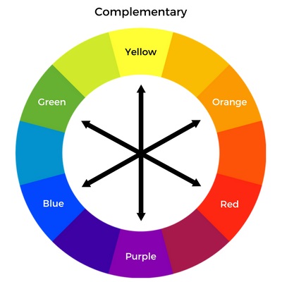
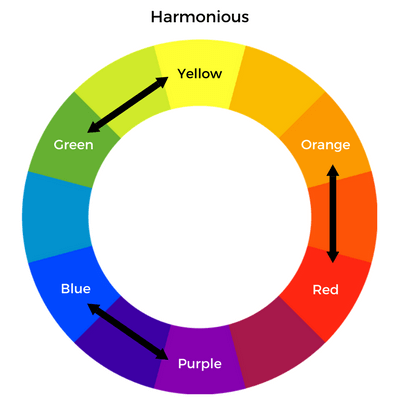
The most common way to incorporate contrast is by using color. Complementary colors (across from each other on the color wheel), such as blue and orange or yellow and purple, have high contrast, while harmonious colors (beside each other on the color wheel), such as red and orange, have low contrast.
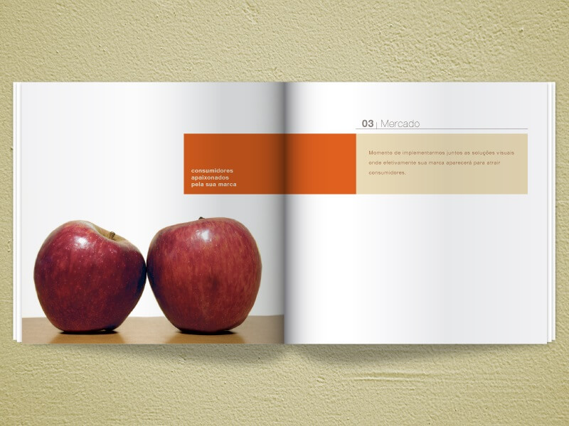
This brochure effectively incorporates high and low contrast. The red apples and orange text frame highly contrast the stark white background, but because they are harmonious colors, the red and orange hues offer less contrast when compared to each other.
Establishing the right balance when using contrasting colors is key to creating an attractive and effective design; if the contrast is too stark, you risk overwhelming or irritating your reader’s eye and compromising your message, but if the contrast is too weak, your design may appear monotone and uninteresting and not catch their eye at all.
Though they have high contrast, the relationship between complementary colors is appealing to and won’t strain the eye. If your design relies on harmonious colors, create contrast using tints (adding white) and shades (adding black).
2. Size
Using size to create contrast helps establish the key elements in your design by leading the viewer’s eye towards larger objects – a larger design element is naturally emphasized and is more likely to draw the eye than a smaller element. Size contrast is especially helpful for designs that are text-heavy or if you’re working with a limited color palette.
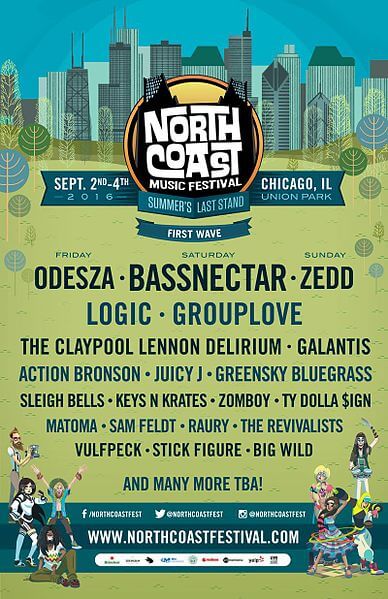
This poster for the North Coast Music Festival uses differently-sized type to create contrast. The festival’s headliners are listed in a larger font size in order to draw the eye and attract attention, while additional acts are listed in a smaller font size.
3. Shape
Varying the shapes used in your design can also create contrast. If your design contains a lot of circular elements, encase your focal point in a square border, or use a bold sans serif typeface. If your design is text-heavy, try inserting a circular image or quote between columns of text.
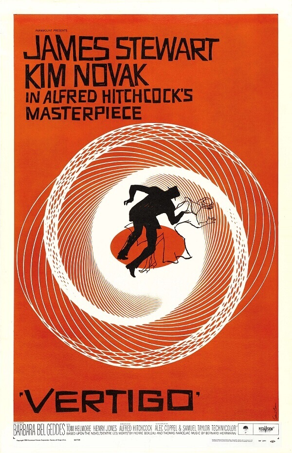
This movie poster employs contrasting shapes. The circular design contrasts the square type, as well as the relatively angular silhouette in the center of the poster.
4. Type
Contrasting colors, sizes, and shapes can all be applied to type.
When using type in your designs, you never want to use the same typeface or font for the entire design. Titles, headings, quotes, and body copy should all utilize different (read: contrasting) styles to create a type hierarchy and clarify your message. Not sure how to vary your type? Here are some ideas:
- Use different colors for titles and headings.
- If you want to use the same typeface for headings and body copy, make the headings bold or italicized. Using the same typeface adds consistency, but adjusting the style adds contrast that will aid in readability.
- Pair a serif with a sans serif typeface, or a block typeface with a script.
- Use all caps for titles and headings to make them stand apart from body copy.
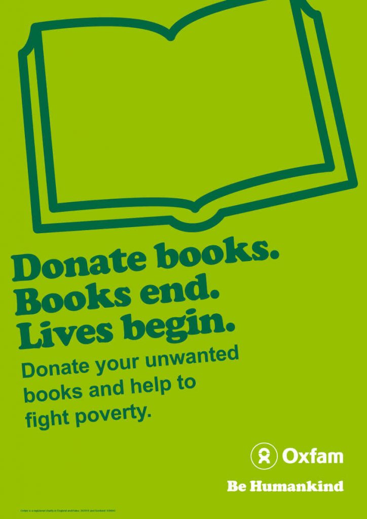
This Oxfam poster features a relatively monochromatic color palette, but achieves contrast using different type styles. The larger tagline uses a thicker serif typeface, while the call to action utilizes a clear, slightly smaller sans-serif typeface.
5. Texture
Texture can be incorporated into your designs in a number of ways:
- Use a subtly textured background.
- Repeat elements to create a pattern.
- Print finishes such as Letterpress or embossing add tactile texture to printed projects.
- Print on papers with toothy finishes such as linen, felt, or even smooth.
Combining textures adds subtle contrast to your design, especially for printed projects. Try pairing a smooth sans serif typeface with a textured background, or layer opaque boxes over top of textured elements to create a sense of three-dimensionality. You could also use large patterns in conjunction with detailed patterns.
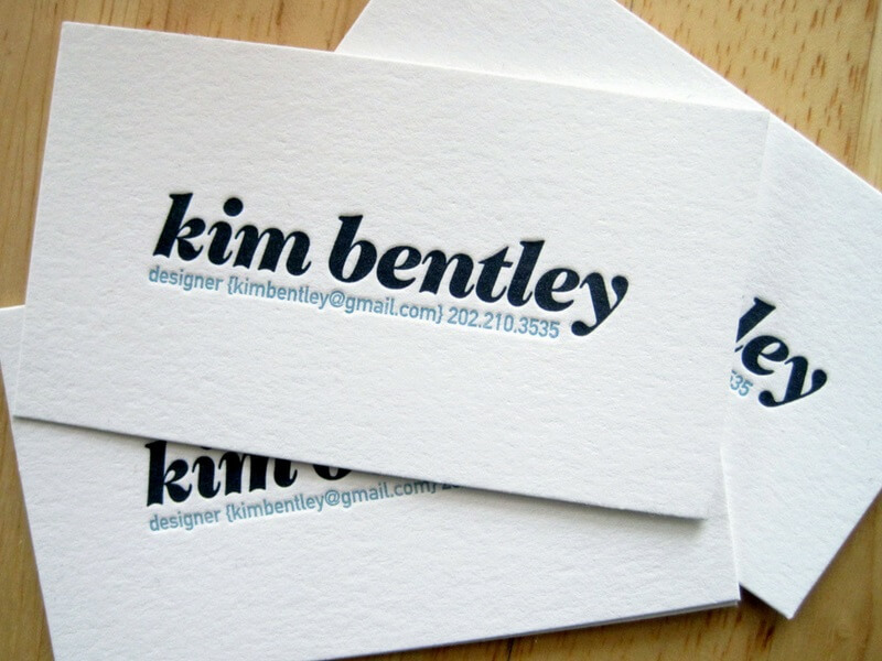
For printed projects, print finishes like varnishes and lamination offer high contrast when used with uncoated or textured papers. This business card uses Letterpress printing to incorporate subtle texture:
6. Alignment
Using alignment to create contrast is a daring and unconventional design choice. Having text or another design element out of alignment certainly draws the reader’s eye, but it may appear too out of place and appear unattractive as a result, so be careful and tread lightly.
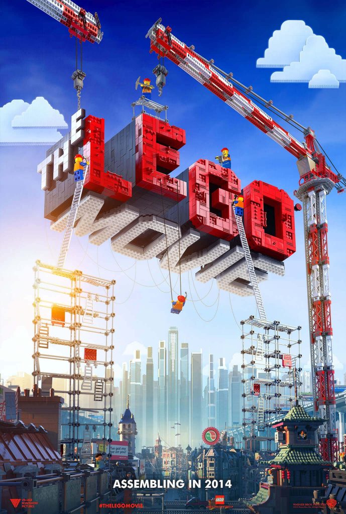
In this poster for the Lego Movie, some letters are misaligned to create a subtle contrast that helps emphasize the tactile, kinetic nature of the toy.
Creative Contrast
Contrast is integral to creating a design that will attract your reader’s eye and effectively communicate your message.
Read More
Check out the rest of our Design Principles series:
Part 1: Alignment
Part 2: Consistency & Repetition
Part 3: Gestalt Theory
Part 4: Rule of Thirds
Part 5: Balance
Part 6: White Space
Part 7: Proximity
Part 8: Contrast (you’re here!)
Discover the basic building blocks of any design! Learn more about the Elements of Design.