
What’s the first you think of when you think of “balance”? Perhaps a balance beam, or even that pesky yoga pose you can’t seem to hold no matter how much you practice? Whatever springs to mind first, chances are it doesn’t have to do with graphic design.
People naturally and unconsciously seek balance in their lives – and in the media they consume. Ensuring your designs are balanced is an integral part of good graphic design. This is because balance helps direct your reader’s eye and communicate your intended message, while not having balance can actually obscure your message.
What is Balance?
“Balance” refers to the distribution of visual weight within your design. It’s all about achieving visual and psychological equilibrium using different design elements.
Here are a couple more definitions you should know before we dig in:
- Visual Weight: The perceived “weight” of an object, relating to how much that particular element attracts a viewer’s eye.
- Visual Direction: The perceived direction of a visual element, or the way a viewer would imagine it moving, if it could move.
Balance can occur around a vertical or horizontal axis.
Types of Balance
There are four main types of balance: symmetrical, asymmetrical, radial, and crystallographic.
Symmetrical Balance
Symmetrical balance requires the even placement of identical visual elements. Essentially, one half of your canvas is an exact, mirrored replica of the adjacent half.
Symmetrical balance achieves balance through repetition, and as such appears the most stable and orderly, but isn’t always the most interesting arrangement.
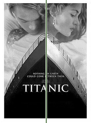
Notice how the Titanic movie poster is almost identical on either side of the center axis. The faces that point in different directions create interest while maintaining symmetrical balance.
Asymmetrical Balance
Asymmetrical balance achieves balance through contrast, often by balancing elements of similar or equal weights rather than creating an identical mirrored image. For example, several smaller elements will balance out one larger element.
Asymmetrical balance is more “felt” than seen, and helps to create a sense of movement or tension within your design.
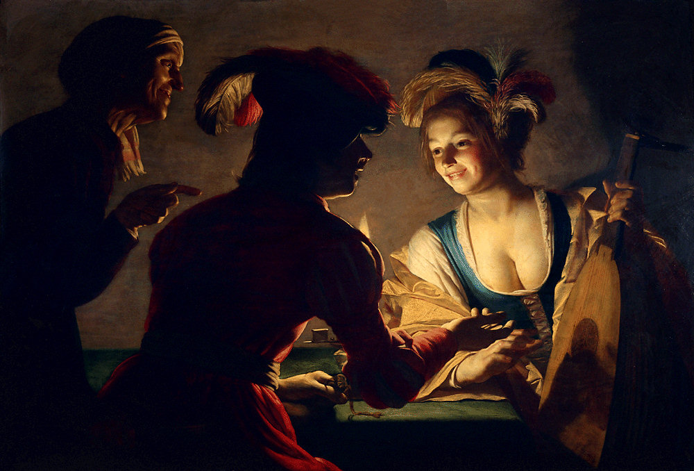
In this painting by Gerrit van Honthorst, the artist creates balance by using heavily contrasting darks and lights.
Radial Balance
Radially balanced designs feature images and design elements emitting from a single focal point, almost like spokes on a wheel.
Radial balance creates a strong focal point wherever your “spokes” converge.
While not an example of graphic design, the stained glass window at Notre Dame Cathedral in Paris, France, is an excellent example of radial design.

Crystallographic Balance
Also known as “mosaic” balance, crystallographic balance involves creating a grid pattern and achieving balance by repeating elements of equal weight all over your design.
There is no distinct focal point for crystallographically balanced designs, but using a grid is one of the best ways to organize your project. Get our tips for using grids in graphic design, or learn how to grids can benefit your scrapbook layouts.
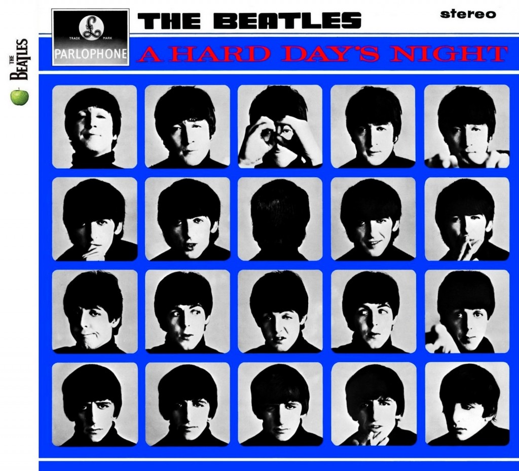
The Beatles’ album artwork for A Hard Day’s Night perfectly exemplifies crystallographic balance.
Breaking The Rules
Don’t be afraid to cut loose a little! Though balance is a key component of good graphic design, you may choose to avoid a balanced final product in order to evoke a certain emotion.
A lack of balance is a great way to create a sense of movement or tension within your design.
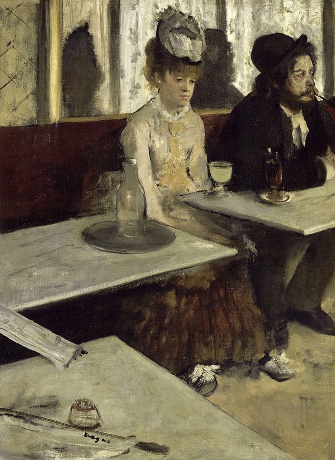
In this painting by Edgar Degas, the two figures on the right side of the canvas heavily outweigh the empty space on the left side. The darker male figure, situated farthest from the center axis, is somewhat balanced by the lady in white closer to the center, but Degas’s choice to leave the left side of the canvas blank creates a sense of tension and imbalance that perfectly encapsulates the melancholy on the woman’s face.
How To Achieve Balance
There are a number of techniques you can use to create a sense of balance in your designs.
- Color: Brighter colors have more visual weight than neutral tones.
- Value: Like color, value can communicate visual weight. The lighter the shade, the less visual weight it carries; conversely, darker colors are heavier.
- Shape: “Harder” shapes like squares seem heavier than “softer” shapes like circles.
- Lines: A thicker line will appear heavier than a thinner one.
- Size: The larger the design element, the more visual weight it will carry.
- Position: The farther something is from your main horizontal or vertical axis, the heavier it will appear. Similarly, an isolated item appears heavier.
- Texture: Complex textures have more visual weight than simple textures.
Good Design Hangs in the Balance
While you don’t need to create a balanced design to create a good design, balance is a key component for creating a visually harmonious design that effectively communicates or honors your intended message.
Read More
Check out the rest of our Design Principles series:
Part 1: Alignment
Part 2: Consistency & Repetition
Part 3: Gestalt Theory
Part 4: Rule of Thirds
Part 5: Balance (you’re here!)
Part 6: White Space
Part 7: Proximity
Part 8: Contrast
Discover the basic building blocks of any design! Learn more about the Elements of Design.