
Whether you’re a graphic designer or paper crafter, choosing a typeface can be a daunting task. It’s easy to get lost in the labyrinthine world of font families and styles, so we’ve created a list of simple dos and don’ts to help you choose the most appropriate typeface.
What is a Typeface?
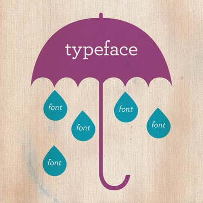
“Font” and “typeface” are often used synonymously, but they aren’t the same thing. Before we get started on choosing the most appropriate typeface, we want to explain the difference between the two.
Typeface
A typeface, also known as a font family, is a set of one or more fonts composed of characters that share common design features.
Font
A font is the specific size, weight, and style of a typeface. For example, Arial is a typeface, but its different styles, such as bold, italic or different sizes, are fonts.
Typeface Dos
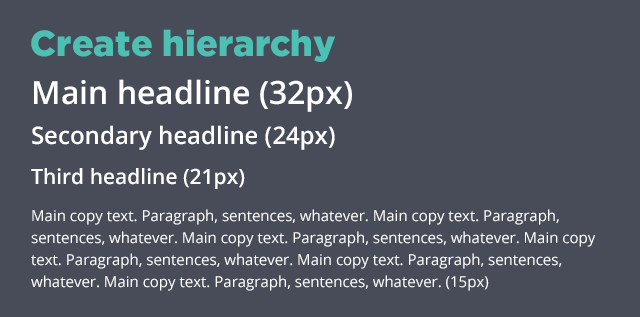
Do create a font hierarchy.
Create a rough plan for your document or design project before you get started. That way, you can figure out how many typefaces and font styles you’ll need for your titles, subtitles, headings, and body copy.
Font hierarchies direct the reader’s eye and help them understand your project’s structure. Adjusting your typeface’s spacing, size, weight, and color can help you create a font hierarchy that will establish an order of importance within your document or project.
Do consider the intent of the project.
Every typeface was created for a specific reason. Fonts like Cooper Black were designed for signage and probably aren’t ideal for body copy or scrapbook journaling. Luckily, most popular typefaces have detailed outlines and reviews that can tell you whether that typeface is appropriate for your project.
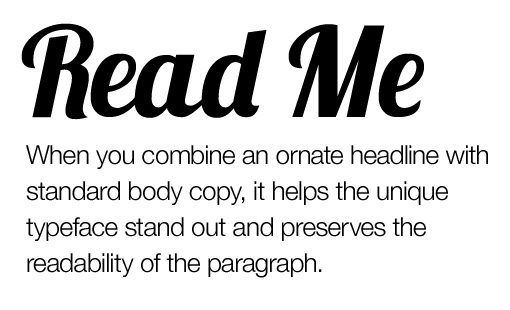
Do use typefaces with big personalities in small doses.
When it comes to flashy typefaces, a little really does go a long way. High-personality typefaces are often referred to as “Display” typefaces, and are best used in moderation and in large sizes.
Display typefaces are perfect for titles and headings, but do not function well for body copy. Not only will overusing your Display typeface dilute its novelty and aesthetic pleasure, but it will also be hard to read in large doses.
Typeface Don’ts
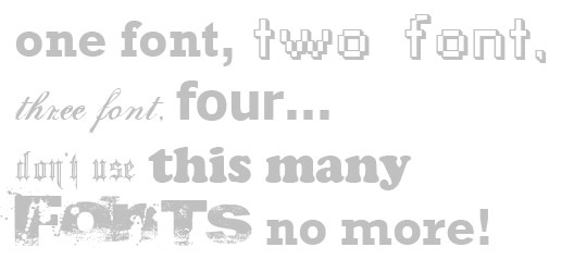
Don’t restrict yourself to one font.
Determine how many typefaces to use when you create your font hierarchy. Try not to exceed three fonts – if you do, you run the risk of overcomplicating your design. Instead, use one typeface for your titles and headings and one for your body copy. If you still need more variation, experiment with different sizes and styles.
Don’t be afraid of classic combinations.
Classic typefaces and combinations are classic for a reason! Opting for a tried and true choice may lose some “edge”, but your message will be clear. Always choose clarity over excitement. Check out this list of 20 perfect font combinations to get started.
Don’t sacrifice appropriateness for personal preference.
We all have our favorite typeface. It can be tempting to use it as often as possible, but our favorite typeface is seldom the most appropriate choice. Choose typefaces that were designed for the purpose you are using them for and which conform to the aesthetics that your audience expects. If you’re creating a brochure for an insurance company, a font like Papyrus or Playbill likely isn’t appropriate.
To Do or Not To Do?
There’s a typeface for every project, from promotional brochures and point-of-sale displays to scrapbooking pages and homemade cards. Now that you know some of the basic dos and don’ts of selecting a typeface, you can rest assured knowing that you can choose the most appropriate typeface for every project.