Graphic design is about more than just placing text and elements and choosing typefaces and color palettes. Like any field, there are best practices and principles you can (and should!) follow to make sure you put forth your best work every time.
There are eight graphic design principles that can help improve your designs, and we’ll talk about each one in turn. These principles aren’t even limited to graphic design – keeping them in mind can even help improve your scrapbook pages and homemade cards! For now, let’s focus on a simple one: alignment.
What is Alignment?
Alignment refers to placing text and other design elements on a page so they line up. It helps to create order, organize your elements, create visual connections, and improve the readability of your design.
Alignment is largely invisible – chances are, you don’t look at a design and think “wow! That poster is really well aligned!”, but you’d certainly notice if that poster had poor alignment. Think about it like you think about the alignment of your car wheels – when they’re properly aligned you enjoy a smooth ride, but you definitely notice when your car starts pulling to one side.
Types of Alignment
There are several types of alignment, and the type you use will ultimately depend on your design.
Here are some of the most common formats:
Horizontal Alignment
If something is horizontally aligned, that means that either the left or right (or both!) margins are equal. Horizontal alignment can apply across an entire page or in columns.
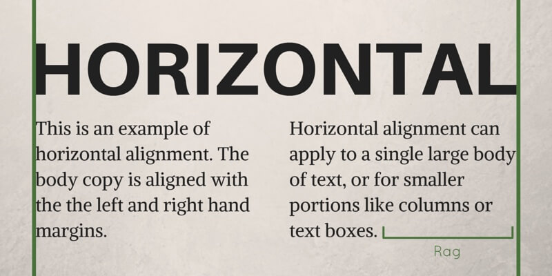
Horizontally aligned items can be flush with the left or right margins. Just remember to keep an eye on “rag” (the white space left at the end of a left justified line of text) – too much rag can create a sense of visual misalignment and hinder the readability and visual appeal of your design.
Vertical Alignment
In vertical alignment, your text or other design elements are lined up with the top and/or bottom margins of the page.
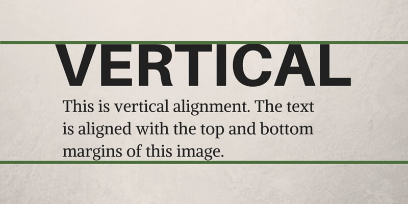
Like horizontal alignment, vertical alignment can apply to the whole page or portions of it.
Edge Alignment
Edge alignment occurs when your text and design elements are lined up with each other’s top, bottom, or side edges.
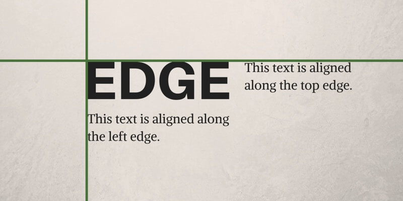
Unlike horizontal or vertical alignment, edge alignment isn’t affected by the page margin.
Center Alignment
Center alignment is exactly what it sounds like – your elements are aligned along a central axis.
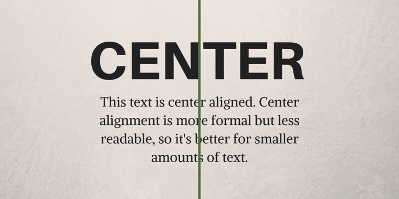
Center alignment is a little more formal, which is why you often see it on things like wedding invitations. Center alignment isn’t ideal for large bodies of text because it’s also less readable; each line of text starts in a different place, so your eye doesn’t follow the words as easily or naturally.
Visual/Optical Alignment
Sometimes, an element can be properly aligned based on measurements, but it appears misaligned because of the design of the specific element. This is particularly common with rounded elements like circular shapes or large, curly letters.
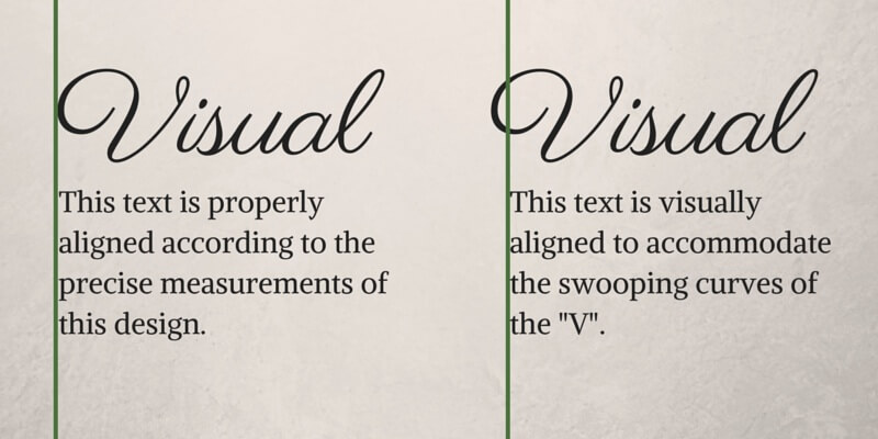
Visual or optical alignment occurs when something looks properly aligned, but may not necessarily be properly aligned according to the precise measurements of your design. Alignment is all about the visual, so if something appears misaligned, don’t be afraid to move it to where it looks like it should be.
Breaking Alignment
Picasso had it right attitude: “Learn the rules like a pro, so you can break them like an artist”. After all, what good are the rules if you can’t break them once in awhile? Alignment helps make your design look more organized and professional, but if your design benefits from breaking or using a different type of alignment, go for it!
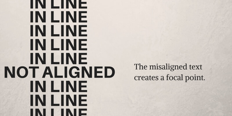
Breaking alignment for a specific element can help create a focal point and draw attention to a particular aspect of your design. It can also help create contrast (another principle we’ll talk about later).
Alignment Tips
Alignment may seem straightforward, but there are a few things you should keep in mind:
- Poor alignment can be worse than no alignment at all. Check out these examples and you’ll understand exactly why. It’s like putting raisins in your cookies – sometimes, it’s better to have no cookies at all (sorry if you actually like raisins in your cookies).
- Consider your content. Left horizontal alignment is the most common for a reason – because that’s how we read. If you have a large amount of text left alignment is the way to go, but if you only have a little bit of text (say a business card, invitation, or flyer), you could try using right or center alignment instead.
- Use a grid. Most design tools or software allow you to enable grid overlays, and some can even snap your elements onto your grid. However, visual alignment is more important than precise alignment, so if something looks off, don’t be afraid to forget the grid.
- If your text includes a quotation mark, let it hang.
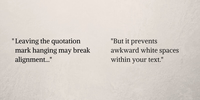
Aligning or nesting your quotation marks along the same edge leaves an awkward white space within your text, while letting it hang will improve optical flow and readability.
The Bottom Line
Properly aligning your design is an easy way to make your project look more polished and professional, but breaking alignment when it’s appropriate can help create a focal point and demonstrate your creative genius. It’s all about understanding your project, its content, and your client, and creating a design that suits their needs.
Don’t worry too much about staying inside the lines! How your design looks and feels is what’s important, and sometimes that means breaking alignment or prioritizing visual alignment over precise measurements.
Read More
Check out the rest of our Design Principles series:
Part 1: Alignment (you’re here!)
Part 2: Consistency & Repetition
Part 3: Gestalt Theory
Part 4: Rule of Thirds
Part 5: Balance
Part 6: White Space
Part 7: Proximity
Part 8: Contrast
Discover the basic building blocks of any design! Learn more about the Elements of Design.
Sources
Bear, Jacci Howard. “How To Use The Principle Of Alignment In Page Layout.” About.com.
Bear, Jacci Howard. “Alignment Brings Order to Chaos.” About.com.


