Over the past few months, we’ve been exploring Principles of Design like alignment, balance, the rule of thirds, and white space. But there’s more to design than just these principles – designers also need to consider the elements of design.
What’s the difference? Keep reading to find out.
What are the Elements of Design?
The elements of design are the basic units of a work of art or design, while the principles of design are used to organize these elements.
Think of it this way: if the elements are Lego pieces, the principles are what you decide to build with them.
There are seven commonly accepted elements of design. Here they are:
1. Line
Line creates division and hierarchy within a design, and can help direct a reader’s eye towards specific information or a chosen focal point.
A line can be made in two ways:
- As a linear mark created using a pen, brush, or other digital tool between two connected points. This is called “actual” line.
- As an edge created when two shapes meet, known as “implied” line.

Other characteristics of line include:
- Weight: How thick or thin is the line?
- Direction: Does the line travel vertically, horizontally, diagonally, or is it curved? Different directions inspire different feelings; for example, a diagonal line may provoke feelings of movement or direction, while a horizontal line may connote a sense of rest and relaxation.
2. Shape and Form
A shape is formed when a two-dimensional line encloses an area. Shapes are often geometric, like circles, triangles, and squares, but can also be organic, such as plants and animals. Simple shapes are more easily understood than complicated ones.
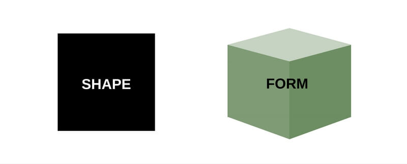
In contrast, “form” refers to a three-dimensional object that exhibits both volume and thickness. Forms within designs are still two-dimensional, but appear three-dimensional as a result of light and shading.
3. Direction
Sometimes referred to as “flow”, direction defines how your eye moves across the page or over a particular design. Our eyes naturally flow from the top left of a page to the bottom right, and the most effective designs often take advantage of this natural flow.
You can create flow within your design by arranging your elements in a way that will naturally encourage your readers’ eye to travel in your desired direction. Gestalt theory, white space, and alignment can all help you create flow within your design. Take this movie poster for example:

The text on this poster begins in the top left corner and travels downward to the bottom right, taking advantage of the way our eyes naturally move across a page or design.
Different directions can also inspire different reactions from your readers. For example, a design that directs a reader’s eye horizontally may suggest calmness and stability, while vertical direction may suggest balance and formality.
4. Texture
Texture refers to the surface quality of a shape. It can be tactile or purely visual.
Texture creates a more dynamic, visually interesting experience, and it can also add depth to your designs. Learn more about using texture in your graphic designs.
An easy way to add subtle texture to your printed design projects is to use a textured paper. Choose your texture and check out our selection:
Felt
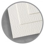
Felt texture is subtle, and is commonly used for printed brochures and covers.
Vellum
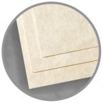
Not to be confused with translucent vellum, vellum textured paper appears smooth but has a fine texture.
Linen
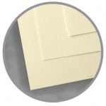
Linen paper mimics the look and feel of linen cloth. It’s commonly used for personal and business correspondence, wedding stationery, and homemade greeting cards.
Smooth
Smooth paper is suitable for any use, from personal stationery to business correspondence, and even marketing and promotional materials.
5. Color
Color can have a significant impact on the look, feel, and readability of your design. Color choice can also influence how a reader perceives your design by creating a particular mood or feeling.
When you’re choosing a color palette for your design, keep these three properties of color in mind:
- Hue: The name of a color denotes its hue. For example, “red”, “crimson”, “blue” and “aquamarine” are all hues.
- Saturation: Also referred to as “chroma”, saturation indications the intensity or purity of a color. Saturation ranges from pure (100% saturation) to gray (0% saturation).
- Value: The lightness or darkness of a color. A color can be “tinted” by adding white, or “shaded” by adding black.
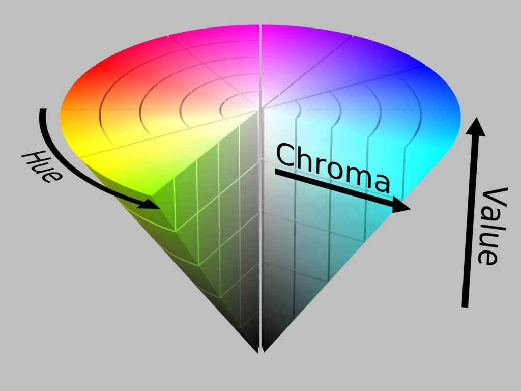
Read our introduction to color theory for more information.
6. Value
Value refers to the lightness or darkness, otherwise known as “tone”, of a color. Low key values are mostly dark, while high key values are bright or washed out.
7. Space/Perspective
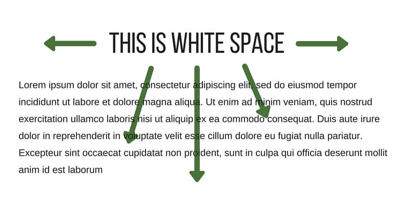
Space refers to the area in which a design is organized. It can be positive or negative. Learn more about using negative space, also known as “white space”, in your designs.
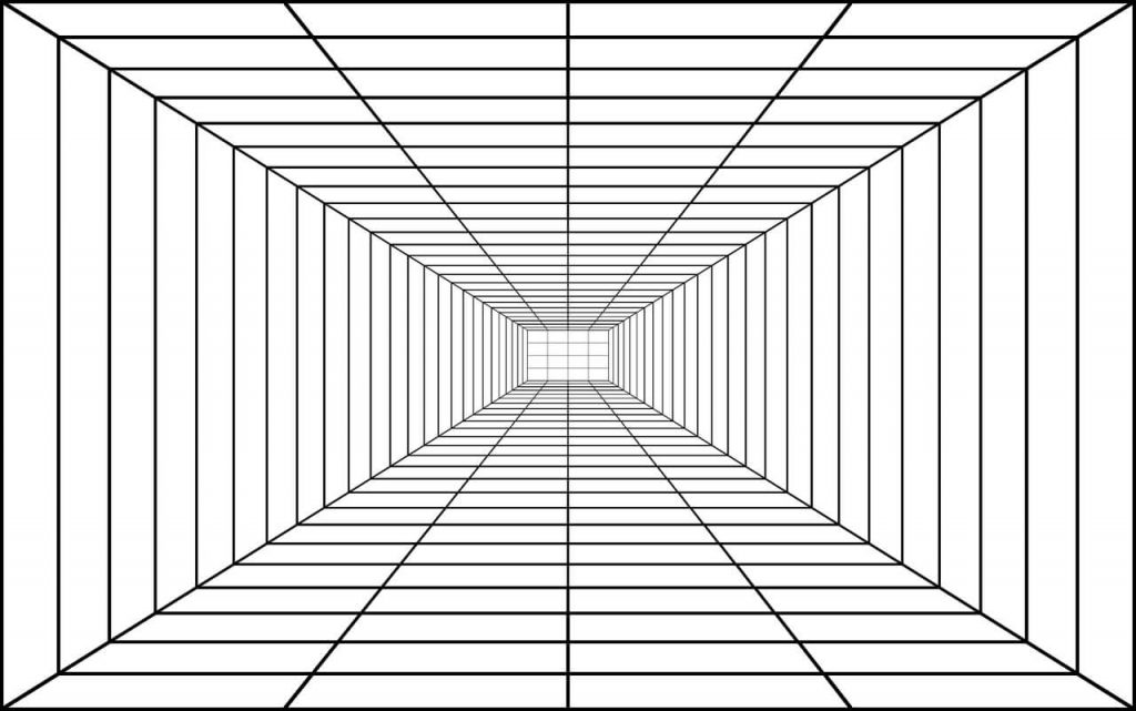
In contrast, “perspective” indicates depth. It’s created by arranging two-dimensional objects in a way that mimics and recreates the way they would appear in the three-dimensional world.
Elementary!
Without the elements of design, there would be no design at all. These elements are the basic building blocks of any design, and what you choose to do with them is up to you – and how you choose to employ the principles of design.
Read More
Check out the rest of our Design Principles series:
Part 1: Alignment
Part 2: Consistency & Repetition
Part 3: Gestalt Theory
Part 4: Rule of Thirds
Part 5: Balance
Part 6: White Space
Part 7: Proximity


