
Do you know the difference between a font and typeface? What about the difference between a raster and a vector? If you don’t, never fear. Every industry has its jargon, and graphic design is no exception. There’s even jargon within the jargon – a web designer operates according to an entirely different lexicon than a print designer.
There are some terms that every graphic designer needs to know. Don’t think a web designer needs to care about basis weight or paper finish? Think again. Next time you pitch your design concept to a prospective client, your paper choice could be that one special touch that gets you the job.
So, let’s get down to business.
1. Basic Size
“Basic size” refers to the size of a sheet of paper before it’s cut down to its “cut size”, whereas cut size is the size of sheet that you purchase. For example, the cut size of your average sheet of printer paper is 8.5” x 11”, but its basic size is actually twice as wide.

And just to confuse you even more, basic size differs for every basis weight. Not sure what basis weight is? Keep reading.
2. Basis Weight
Basis weight, also known as “paper grade” or “paper density” refers to the weight of one ream (or 500 basic size sheets of paper) in pounds. A particular paper’s basis weight is dependent on its basic size, and basic size is different for every basis weight.
Different basis weights are suited for different projects. If you aren’t sure what basis weight you should use, check out our handy infographic on picking the perfect paper.
For a full description of exactly what basis weight is and how you calculate it, check out this post.

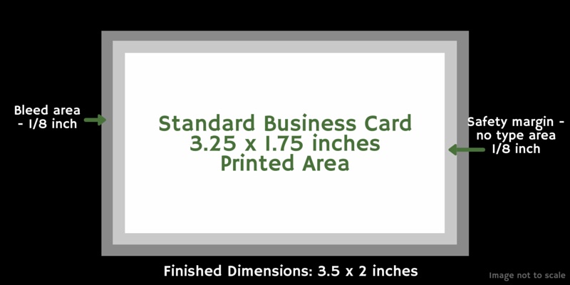
3. Bleed
If your project is printed using a press, your design will be printed multiple times onto a large sheet of paper and then trimmed down to size. Bleed ensures that your design occupies the entire printed area without resulting in a plain, unprinted border. That’s why if you want any element of your design to extend beyond the printable margin, you need to incorporate a bleed.
Make sure you leave a wide enough bleed, or you might be charged more for printing.
If you’re designing in Adobe Photoshop, Illustrator, or InDesign, it’s easy to add a bleed. Just follow this tutorial.
4. CMYK vs. RGB
Gone are the days of the simple color wheel. Designers make difficult color decisions every day, but the most important one is simple: should you use CMYK or RGB?
Simply put, you should use CMYK for any design you intend to print, and RGB for any design that’s solely for digital use. If you’re printing your design, find out which color mode your printer prefers before you submit your design.
Check out our full explanation of the differences between CMYK and RGB.
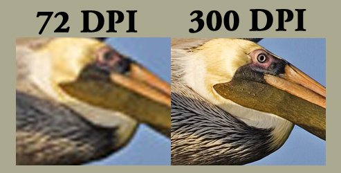
5. DPI
DPI stands for “dots per inch”. It’s a measure of resolution, and it denotes the total number of individual dots that fit in a 1-inch printed line. A higher DPI means a crisper printed image, but it also requires more ink and takes longer to print. There is no standard DPI, so make sure you check with your printer before you submit your design.
DPI stands in contrast to PPI, or “pixels per inch”. If you’re designing for print, 300 DPI is standard, and you probably don’t need to concern yourself with PPI.
DPI only applies to raster images. Not sure what a raster image is? Don’t worry; we’ll get to that later.
6. Large Format
Also known as “wide format”, “large format” refers to a large, industrial printer. Smaller large format presses print on paper sizes up to A2, and the largest large format printer can print up to 64 inches (that’s over 5 feet!) wide.
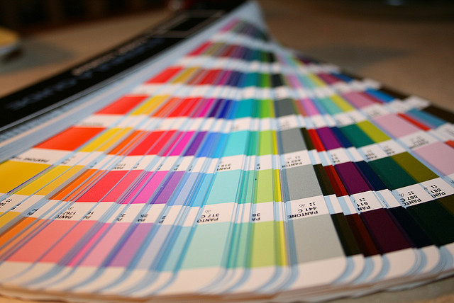
7. Pantone
Established in 1963, Pantone has spent over 50 years perfecting a universal system for understanding and matching color. They are the worldwide standard of color.
Every year, Pantone releases a “color of the year”. The Pantone Color of the Year predicts and informs color trends in fashion, design, and art. Pantone colors are identified by individual numbers. The Pantone Matching System (PMS) is based on the standardization of these colors, and it aims to ensure that colors can be printed consistently over different presses and substrates.
“Pantone coverage” is another important term to know – it refers to how accurately your printer can reproduce Pantone swatch colors.
8. Paper Finish
Paper finish essentially refers to paper texture. It’s characterized by “tooth”, or surface feel. The more tooth a given paper has, the rougher the surface. In addition to adding an element of texture to your design, tooth also helps ink adhere to paper.
There are a variety of different paper finishes available to designers, including smooth, linen, felt, laid, embossed, and vellum. Different finishes are better suited for different uses. Here are some examples.


The Paper Mill Store sells paper in several different finishes. Check out our selection by finish here.
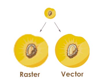
9. Raster versus Vector
“Raster and vector” – they almost sound like a crime-fighting duo reminiscent of Shaggy and Scooby. Fortunately, “raster” and “vector” are actually a bit more mundane.
Rasters are images made of pixels, with each pixel assigned a color value. They are resolution dependent, so when you resize a raster image you either stretch or compress the individual pixels. This is why rasters lose image quality when they’re resized. Common raster file types are .JPG, .PSD, .GIF, and .PNG.
Vectors are images made of geometric shapes and patterns. The relationship between the shapes and patterns is expressed by a mathematical equation, so vector images don’t lose quality when you resize them. Common vector image types include .AI and .EPS.
For a full explanation of common file types, including rasters and vectors, check out this post. Not sure when to use what file type? We have a post for that too.
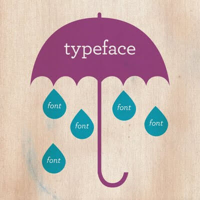
10. Typeface/Font
Despite being used synonymously, fonts and typefaces are not the same thing.
A typeface, also known as a font family, is a set of one or more fonts composed of characters (or “glyphs”) that share common design features.
“Font” refers to the different sizes, weights, and styles of an individual typeface. For example, Roboto is a typeface, but Roboto Condensed is a font. Arial is a typeface, but Arial bold, Arial 12 pt., and Arial italic 24 pt. are all different fonts.
For more information on fonts, typefaces, and how to pick the best one, check out this article.
Design 101
Armed with a little knowledge and little more elbow grease, any aspiring designer has what it takes to become a seasoned professional. Your style may not come to you immediately and it may take time to build up a professional portfolio, but with these terms in your back pocket, you’re off to a good start.
Sources
15 Printing Terms Every Designer Needs to Know. CreativeBloq. February 4, 2014.
Carney, Rob. 6 Key Terms Every Graphic Designer Should Know. CreativeBloq. January 29, 2015.
Jacci Howard Bear. Bleed. About.com.