Printing and preparing your own wedding invitations is one of the simplest ways to save money when planning your wedding. But as easy as it is to create your own wedding stationery, choosing fonts can be a daunting task. It’s not as easy as simply selecting your favorite font – you’ll need to find multiple fonts for different uses, and they all have to be easily readable, attractive, and coordinate well with each other. Phew! We’re stressed just thinking about it.
Choosing your fonts doesn’t have to be arduous – in fact, it can be one of the enjoyable aspects of wedding planning. There are tons of fun, classic, and even downright strange options to choose from, and they’re all available at the click of a mouse.
Font Selection Tips
There are a few things to keep in mind when choosing fonts for your wedding stationery, but overall the process doesn’t have to be difficult. Just keep these simple rules in mind, and you’ll have your fonts picked out in no time.
1. It All Starts With A Theme
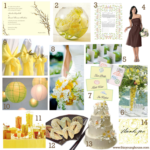
Choosing a theme will give you a rough idea of what to look for, which makes easier to wade through the seemingly endless supply of fonts. For example, those planning traditional weddings can avoid keywords like “cute”, “handwritten”, or “grunge”, but if you’re planning a whimsical wedding, these keywords could lead you right to that perfect typeface.
Try collecting images and ideas that appeal to you to create a mood board. Seeing everything you like together might point you in the direction of a theme or prevailing trend. And f you still aren’t sure about a theme, our wedding color collections might inspire you.
2. Use A Mix of Fonts
Using the same font for everything can get a little tedious. Instead, use multiple coordinating fonts to add an element of interest to your stationery and signage. Combining fonts can be as daunting as choosing fonts, but if you include these staples, it’ll be easier to find a matching set:
- A larger display font for titles and signs.
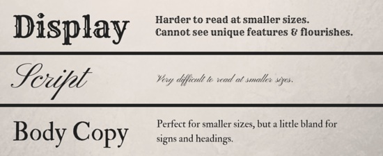
- A script font – script fonts look great on invitations and add an extra classy touch, but they can be difficult to read and may not be ideal for smaller things like placecards, so they aren’t suited for every use.
- A simple, easily readable font for body copy, such as menus and programs.
3. Consider Contrast
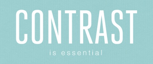
Contrasting characteristics, such as serif versus sans serif, or tall letterforms versus wide letterforms, add interest and also helps to create a visual hierarchy. Here are a few basic rules to keep in mind:
- Pick a theme and stick to it. If you opt for an elaborate script font for your signs, a whimsical handwritten font for your programs might seem a bit out of place.
- Mix tall, vertical fonts with wider horizontal fonts to create some visual interest.
- Use a combination of serif and sans serif fonts that coincide with your theme to differentiate between headings, signs, and smaller text.
4. Fonts Can Do Double Duty
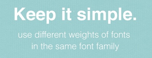
You can use the same font for multiple uses, depending on its readability.
If the font you choose for signs and headings is easily readable, there’s no reason why you can’t use it for smaller items such as placecards or programs.
5. Think About Your Guests
If your grandmother has to squint to decipher which table she’s sitting at, chances are your font is too small or too difficult to read. It may be your day, but giving a little thought to your guests’ experience can go a long way to making your wedding the most pleasant event of the season.
Crazy in Font
Selecting your wedding fonts may seem like an impossible task, but it doesn’t have to feel like one. Once you know roughly what you want and need, you can narrow down your choices and sort through the available options much quicker.
Whether you’re planning a traditional wedding or your tastes are little more whimsical, we’ve put together a few font suggestions for your wedding stationery – make sure to check out our favorite traditional, art deco, modern romantic, and whimsical font recommendations! And all of our suggested fonts are available for free, so feel free to use one or all of them, or to simply draw on them for inspiration.
And if you’re still feeling completely lost, our selection of fine wedding stationery might inspire you.
Happy font hunting!

