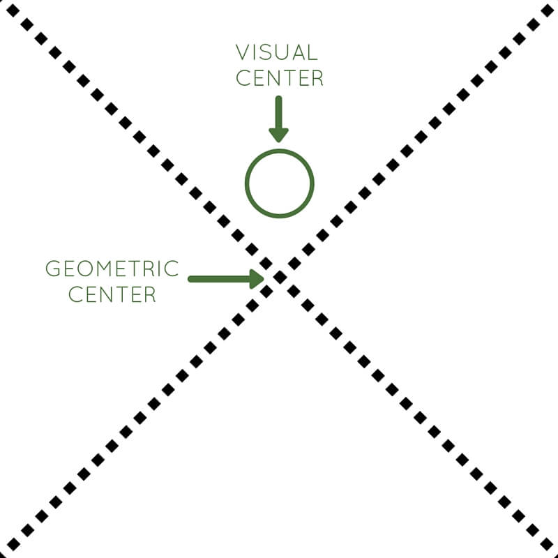
Graphic designers have a number of techniques at their disposal to help direct their reader’s eye towards their desired focal point. Gestalt principles, grids, and the rule of thirds are all effective tools for structuring your designs, but by far, the easiest way to draw a reader’s eye to your focal point is to place it where their eye will naturally go anyway. This spot is called the “visual” or “optical center”.
What Is the Visual Center?
The “visual center” of a page isn’t actually located at the geometric center of the page. In fact, the true visual or “optical” center of the page is located just slightly above the exact geometric center of the page. Unless you pull your readers’ attention elsewhere using other principles of graphic design, their eye will be naturally drawn to the visual center.

How Do I Find the Visual Center?
To locate the visual center of your page, draw two diagonal lines (real or imaginary) from corner to corner. The intersection of the two lines is the geometric center. The visual or optical center is located just slightly above the geometric center.
Why Use the Visual Center?
Placing your focal point on the visual center of your page has two main benefits:
1. It’s an easy way to emphasize your focal point.
In many countries and cultures, the human eye has a natural tendency to read from left to right. This means that your readers’ eyes will naturally begin scanning your design in the top left corner. As they work their way to the bottom right corner of your page, their eyes will pass right through the visual center. The principle works for countries and cultures that read from right to left, as well.

This movie poster incorporates the visual center by locating their focal point – the jumping character, just slightly above the geometric center of the page.
2. Your designs will feel balanced without seeming static or boring.
Symmetrically balanced designs are stable and orderly, but they aren’t always the most interesting. Instead of placing your focal point smack in the middle of your design, try placing it on the visual center instead. Placing your focal point on the visual center creates just enough tension to make your design interesting without being distracting or confusing.
Incorporating the Visual Center
It’s easy to design around the visual center of a page, and doing so is an incredibly effective method of emphasizing your focal point and communicating your intended message.
Here are our favorite ways to utilize the visual center:
- Use radial balance. In radially balanced designs, images and design elements emanate from a single focal point like spokes on a wheel. Simply place your focal point at the visual center. Learn more about radial balance.

- Bring even more drama and emphasis to your focal point by placing it on the visual center of your design.
- Use the visual center for secondary focal points to create a sense of balance and interest within your design.
- Place important copy on the visual center, such as event information, branding, or other information.
- Point your readers’ eye in the direction of your actual focal point by placing arrows or other directional elements on the visual center.
- Ignore the optical center entirely to create more tension and drama within your design, like you see in this invitation

Middle Ground
Tapping into the power of the visual or optical center of your page is one of the best ways to draw your readers’ eye to your focal point. And because the visual center is just slightly above the geometric center of the page, you don’t have to worry about creating a dull, static design.
Read More
Read the rest of our Design Principles series!
Part 1: Alignment
Part 2: Consistency & Repetition
Part 3: Gestalt Theory
Part 4: Rule of Thirds
Part 5: Balance

