Spring is (nearly) in the air, and that means wedding season is just around the corner. If your venue and other suppliers are booked, the months before your big day are the perfect time to turn your attention to considerations like your color palette, stationery, and decor.
From classic neutrals to your favorite colors to the trendiest shades of the season, choosing a style and color palette for your wedding can be a daunting task. To help you settle on a style, we’ve compiled a list of our favorite color trends for 2017. Whether you use these shades as base colors or accents, or even as examples of what you don’t want, we hope they help inspire you!
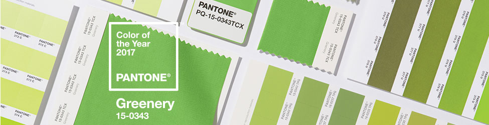
Pantone’s Color of the Year inevitably pervades every corner of fashion, design, and wedding planning. This year’s color, Greenery, is pleasantly punchy compared to 2016’s pastel tones and 2015’s rich Marsala. Greenery adds a burst of refreshing color and is sure to energize any event, especially spring weddings.
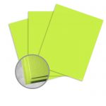
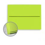
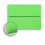
Greenery is an unconventional choice for wedding stationery, but its cheeriness and vivacity is sure to catch the eye of your loved ones. If you like how brightly Greenery pops compared to traditional muted shades, try using it as and outside-the-box base color for your palette. These papers and envelopes are perfect for DIY wedding stationery:
If you prefer a more understated palette, Greenery makes a lovely accent shade. Try pairing it with:
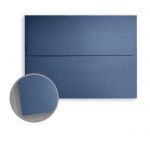
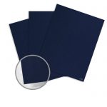
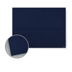
Navy blue is dapper and adds a touch of masculinity to your wedding color palette. This dark hue is also idea for fall or winter weddings. Incorporate navy into your palette with these papers and stationery options:
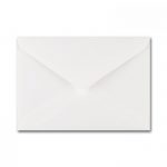
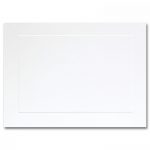
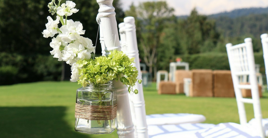
White is a clean and bright pairing for Greenery. This pairing will look lovely in any season, but it’s especially apropos for spring events. Check out these white papers, blank cards, and stationery suites:
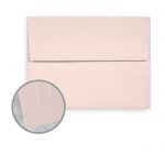
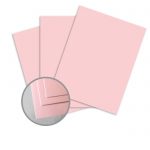
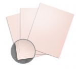
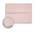
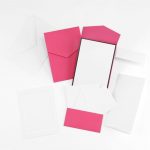
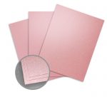
Blush is a classic wedding color, and it looks divine paired with the brightness of Greenery, especially for summer weddings. Add some blush pink to your stationery suite with these papers, cards, and envelopes:
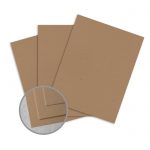
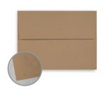
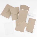
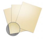
A neutral brown shade adds to the earthiness of Greenery. Try pairing these colors for a summer wedding. Incorporate this shade using Kraft papers for a rustic look:
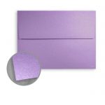
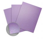
Bring Greenery back down to earth with a rich jewel tone like amethyst purple. This pairing is especially striking for autumn events. Check out these rich purple papers, envelopes, and invitation suites:
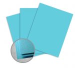
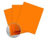
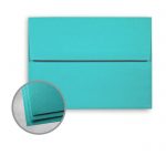
For a retro look, try pairing Greenery with bright blue or orange. This pairing is perfect for any season! Take a look at these blue and orange papers, cards, and envelopes:
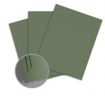
If you like the earthiness of Greenery but prefer a more subtle shade, try using a muted sage tone or a pastel green. It pairs beautifully with blush pinks and ivories to create a classic but modern palette, allowing you to stay on trend without going overboard on color.
If Greenery doesn’t appeal to you, try one of these alternative palettes:
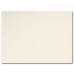
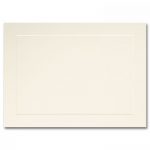
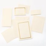
Vintage glamor is a popular trend in 2017, and these understated neutrals are a classic and sophisticated way to achieve that look. Add a touch of warmth using ivory stationery and accents – a bright white might appear stark or cold next to these subdued shades.
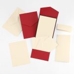
Strike the perfect balance between masculine and feminine by pairing a dark, dapper navy blue with a bright coral pink. Complement these shades with gold accents for added punch. For your stationery, try using and off-white or ecru paper:
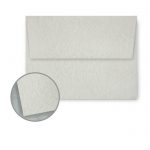
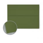
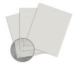
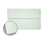
This dark, earthy shade is perfect for fall and winter weddings. It looks stunning paired with a neutral gray or off-white.
Neutral tones with bright accents are a big trend in 2017. These warm, breezy shades are lovely for a summer wedding or for couples who prefer classic neutrals but still want a bit of punch. They pair well with soft pinks or light purples, as well as clear, bright white.
Blush is trendy but timeless. This vintage shade pairs well with muted sage, gray, and blue tones, and you could even give a nod to Greenery by pairing it with a gentle pastel green. Try adding gold for extra glam.
Metallic accents are always a popular choice for wedding color palettes. They’re versatile, and just a touch of metal is a fantastic way to glam up any event.
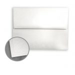
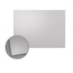
Gold and silver both pair extremely well with Greenery; gold adds a touch of warmth, while silver is a cooler, more contemporary option. Check out these metallic papers and stationery suites:
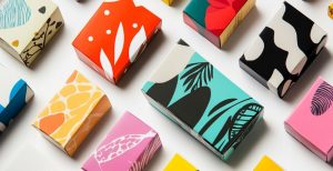
There are two trends dominating wedding stationery design this year:
Get inspired with our favorite wedding colors for 2017! Check out our other wedding resources:
with code 500SALE
with REWARDS
ORDERS OF $179+