Last Thursday, Pantone announced their 2016 Color of the Year. This year’s announcement broke the mold and contained a nice surprise for designers and color enthusiasts, when for the first time in the color authority’s history, Pantone recognized two colors for their cultural impact and significance:
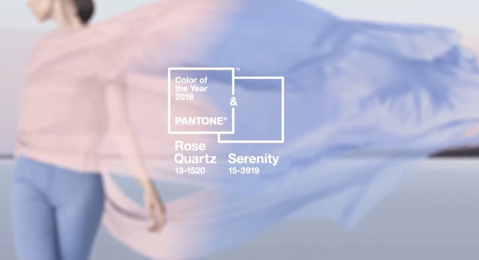
Rose Quartz and Serenity represent a “softer take on color for 2016”. Compared to Pantone’s previous rich, vivid color choices, Marsala and Radiant Orchid, this year’s dual tones reflect a sense of mindfulness and connection.
As consumers seek mindfulness and well-being as an antidote to modern day stresses, welcoming colors that psychologically fulfil our yearning for reassurance and security are becoming more prominent.
Rose Quartz and Serenity beautifully embody these themes, as Rose Quartz’s warm and embracing tones contrast the cooler, more tranquil Serenity to create a sense of balance and order.
Pantone’s Color of the Year reflects prevailing contemporary cultural moods and attitudes. Whatever color Pantone recognizes, it inevitably pervades color palettes in every discipline of design, from fashion design to interior decoration to graphic design.
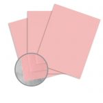
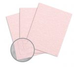
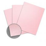
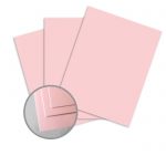
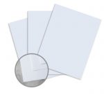
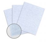
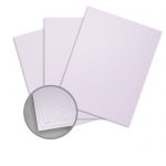
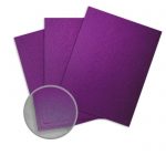
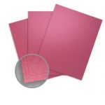
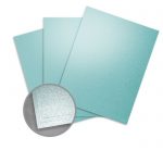
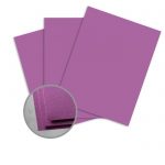
Graphic designers can incorporate Pantone’s Colors of the Year into their projects using these papers and card stocks in similar colors:
Rose Quartz
Paper
Serenity
Paper
Cardstock
Color Pairings
Green
Rich Brown
Silver
Hot Brights
Serenity Now
Pantone’s 2016 Colors of the Year are calming but warm and inviting. Their pastel departure from last year’s rich Marsala presents designers with a unique opportunity to incorporate a sense of vibrant airiness into their designs without over- or underwhelming their readers.
Read the full story behind Pantone’s 2016 Colors of the Year.


