To select their Color of the Year, Pantone sends a team out into the field for months to explore different trends, industries and influencers, discover where there is overlap in color selection, and finally winnow the trends down to a single shade. This shade encapsulates the cultural climate and mood of the year, acting as “a color snapshot of what we see taking place in our global culture.”
In previous years, their selections have included the mindful tones of 2016’s Rose Quartz and Serenity, the enriching red of 2015’s Marsala, and 2014’s inspirational Radiant Orchid.
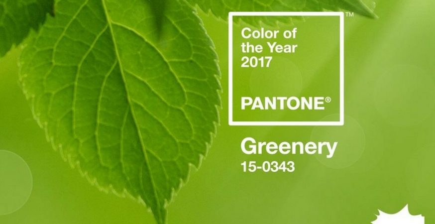
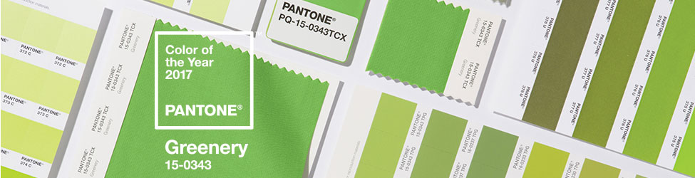
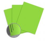
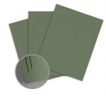
For 2017, they have chosen the “fresh and zesty” Greenery, a color that calms the mind and buoys the spirit, “evok[ing] the first days of spring when nature’s greens revive, restore and renew.”
“Greenery bursts forth in 2017 to provide us with the reassurance we yearn for amid a tumultuous social and political environment. Satisfying our growing desire to rejuvenate and revitalize, Greenery symbolizes the reconnection we seek with nature, one another and a larger purpose.” – Leatrice Eiseman, Executive Director of the Pantone Color Institute
Incorporate the hopeful, “life-affirming” shade of Pantone’s Greenery into your work with these paper and cardstock selections:
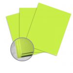
Paper

Card Stock

Color Pairings
Pair greenery with these complementary shades.
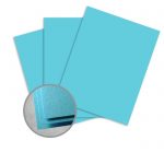
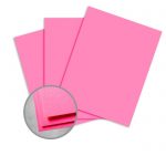
Blue
Bright sky blues add a natural radiance to your designs.
Paper

Card Stock
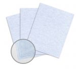
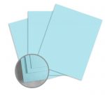
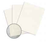
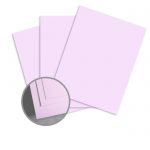
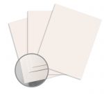
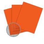
Calm It Down
This light, pastel shades tone down vivacious Greenery.
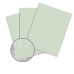
Paper
Card Stock
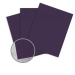
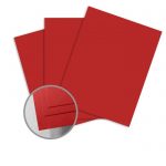
Moody Blooms
Complement the brightness of Greenery with these deep, evocative floral tones.
Paper
Card Stock
Read the full story behind Pantone’s 2017 Color of the Year.