When I first sat down to write about the history of typography, my plan was to write a quick, one-post overview. However, I quickly realized that the history of typography is far too rich and extensive to be accurately captured in a few hundred words. And so my blog post became the first entry in a series of posts that will explore the humble beginnings of the field of typography.
What Is Typography?
Before we get into the nitty gritty of movable type, printing presses, and types of type, I thought we should spend a bit of time understanding what typography actually is.
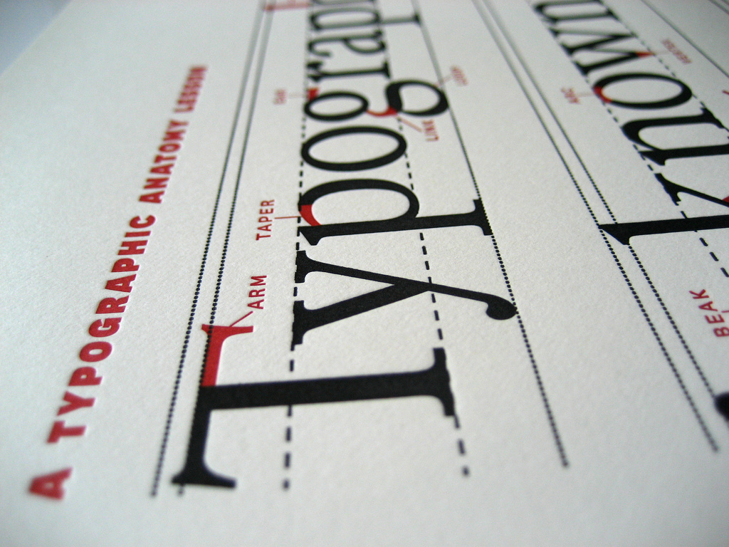
Typography is the study of type and typefaces. It’s a multi-faceted field that includes understanding the evolution of printed letters, as well as the art of arranging type in a way that benefits learning and recognition. Typography as an art form encompasses selecting a typeface, size, line length and spacing, and letter spacing. It also involves choosing a paper, ink, method of printing, and binding style.
Choosing the right type is an important aspect of communicating a message, and it’s not as easy as you might think.

Starting from Scratch
Many of the typefaces you will be familiar with through word processing software, such as Garamond, Times New Roman, and Baskerville, were actually designed and set hundreds of years ago. You may think they’re boring now, but they were the pinnacle of innovation and all the rage in the days of yore.
The origins of typography are anchored in the mid 15th century, when the invention of the printing press and the advent of printing using movable type necessitated the creation of a functional, readable typeface.

What is Movable Type?
Movable type is a system of printing that uses movable components to reproduce elements of a document. The world’s first movable type system was created in China around 1040 AD, but you may be more familiar with the name of the first Western printing press to use movable type – the Gutenberg press, built around 1450.
Before movable type, books and documents were copied out by hand or printed from hand-carved wooden blocks. Think you don’t have enough time to read a book? Try scribing one in the early 15th century. Phew.

Gutenberg
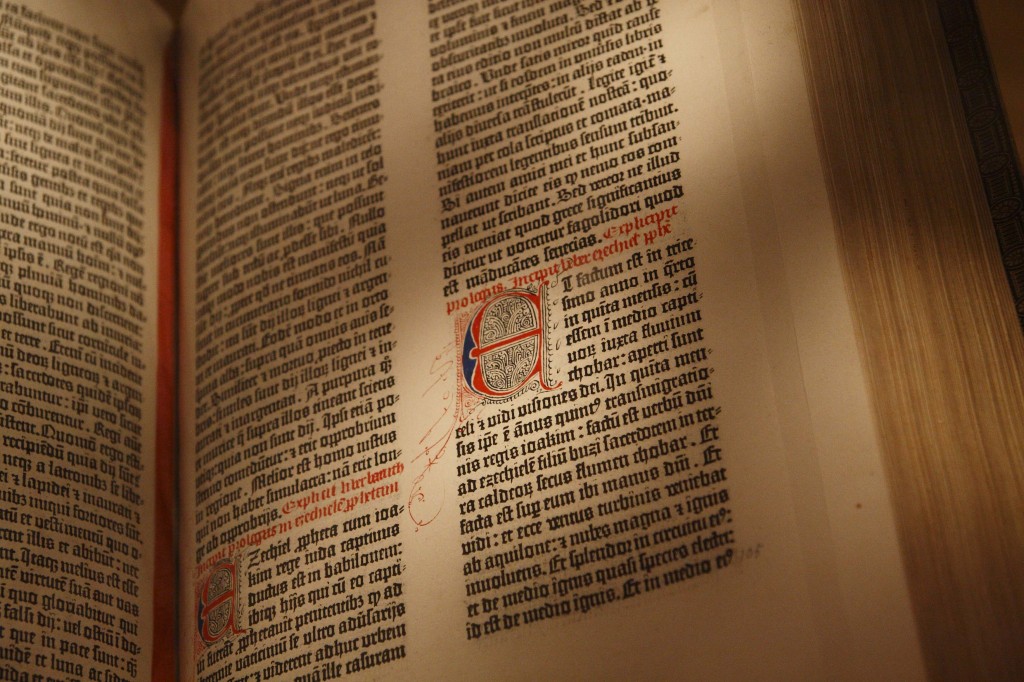
The superiority of movable type was established in Germany by Johannes Gutenberg, when he published the 42-line Gutenberg bible around 1455. It (unsurprisingly) had 42 lines per page, and no title page or page numbers.
The Gutenberg bible is printed in a type style called “black letter”, so called because of the darkness of the ink. Black letter is characterized by tight spacing and condensed lettering, which helped to reduce the amount of materials required to produce a book. Black letter, also known as “Gothic”, “Old English”, or “Textura”, became the first model for printer’s type.
The Gutenberg bible helped make books cheaper to produce and easier for the literate public to purchase. As a result of increased literacy and the desire for clear, legible type in more compact forms and greater quantities, within 15 years of printing the 42-line bible, the printing press was commonplace across Western Europe.

What Next?
Though the Gutenberg bible and Western movable type originated in Germany, typography and the printed word soon began flexing their muscles with more gusto a little further south. Many of today’s most recognizable typefaces originated in Italy. Stay tuned for our next instalment to find out more.
Keep Reading
Part 2 – Italian Inspiration
Part 3 – French Connection
Part 4 – If It’s Not Baroque, Don’t Fix It!
Sources
“Blackletter: The Gothic Hands 12-15th C.” Graphic Design History.
Preece, Warren E., Wells, James M. “Typography.” Encyclopedia Brittanica. 2014.


