Our journey through the history of typography continues in Italy. But before we dive into how Italy inspired a typographical revolution, let’s briefly recap how we got there.
The Highlights
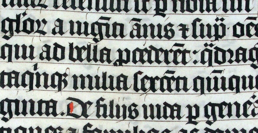
The Western printing press and moveable type were invented around 1450. Shortly after, a man named Johannes Gutenberg printed one of the most famous bibles of all time: the 42-line Gutenberg bible.
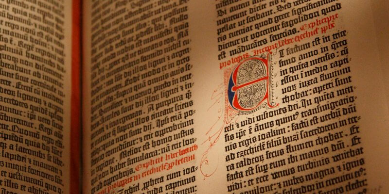
The Gutenberg bible was printed in a type style called “black letter”. Black letter helped reduce the amount of materials required to produce a book, which made books cheaper and easier for the literate public to consume.
Want to read the full first chapter? Read more on typography’s humble beginnings.
Moving South
Printing and type found their second home in Italy through the inspiration of German and German-trained craftsmen.
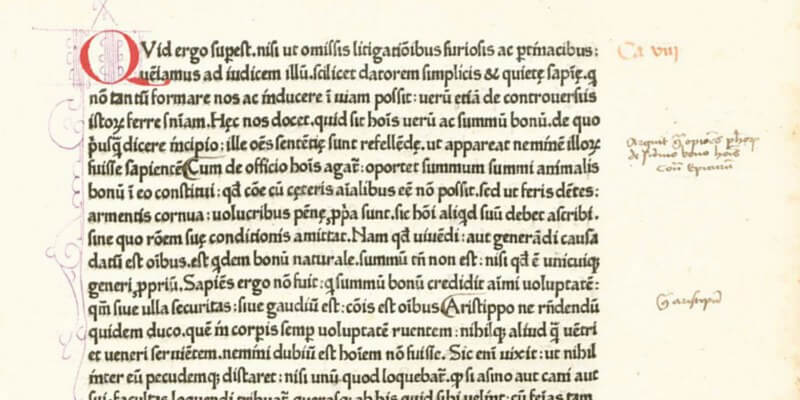
The first Italian press was opened in Subiaco in 1465 by two guys named Sweynheym and Pannartz. The first book they printed was Cicero’s De oratore. It was printed in an early type “Antiqua” that would eventually evolve into Roman type. We’ll learn more about Roman type later.
In 1469, first printing press arrived in Venice courtesy of two guys: Johann and Wendelin von Speyer (also known as Johann and Wendelin da Spira). They used a clear and legible typeface that moved typography one step closer to contemporary Roman type.
The von Speyer brothers held a monopoly on Venetian printing for over a year – then a new guy joined the party: Nicolas Jenson.
Jenson
Jenson set up his own printing press in Venice around the time when the von Speyer brothers’ monopoly ran out. He is credited with the invention of the first true Roman typeface, but he never used Roman for ecclesiastical or religious works. For those, black letter remained standard.
What Exactly is Roman Type?
Roman is one of the three major typefaces in Western typography (the other two are Italic and black letter).

Roman type is simple, straightforward, and unembellished. If black letter was created to mimic the prevailing style of handwriting, Roman was created to separate printed type from handwritten characters. Think about it: black letter was probably a lot harder to cut than handwrite – the sooner printers could get away from black letter, the better.
Black letter remained the standard typeface in Germany because of the Reformation, but Roman quickly became the prevailing typeface across the rest of Europe.
Italic
There was another person also printing in Venice at the end of the 15th century. This guy, Aldus Manutius, worked with a type designer named Francesco Griffo.
Griffo is credited with creating a more authentic Roman type that would eventually displace Jenson’s. Griffo also cut the first example of cursive type, which you might recognize as “Italic” type (from Italy…get it?).
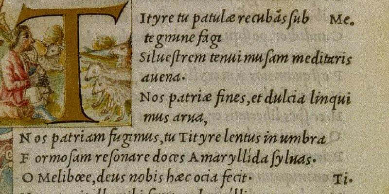
Griffo’s Italic typeface wasn’t perfect, and it’s often described as simply a slanted Roman. Nonetheless, it was unique for its slantedness, and it’s also the first time upper- and lowercase were combined in a single typeface.
Books On The Go
The new Italic type made its debut through the works of Virgil. This new Virgil ushered in an era where books were printed compactly enough to be carried easily, which was only doable because they were set in a type that was both economical and easily readable. The books were sold as cheaply as possible, and soon the new Virgils became the first pocketbook best-sellers.
Next Stop: France
So now we’ve been introduced to all three of the major typefaces: black letter, roman, and italic.
Next stop on our journey through the history of typography: France. Stay tuned!
Keep Reading
Part 1 – Humble Beginnings
Part 3 – French Connection
Part 4 – If It’s Not Baroque, Don’t Fix It!
Sources
The Editors of the Encyclopedia Britannica. “Roman.” Encyclopedia Britannica. 2014.
Wells, James M. “Typography”. Encyclopedia Britannica. 2014.