In Part 2 of our ongoing blog series about color theory, we took a look at active and passive colors and how to incorporate them into your creative designs. Part 3 will examine color from a different perspective by exploring the differences between additive and subtractive color.
Unlike other elements of color theory, such as active and passive colors, which outline ways to use and mix colors in your projects, additive and subtractive color modes describe how color is created. So before we can dig into additive and subtractive color, it helps to understand a little about how light and color work.
A Bit of Background
Light is made up of energy waves that are grouped together on a spectrum called the “electromagnetic energy spectrum”. Our eyes can only detect a small portion of this spectrum, which we call the “visible light spectrum”. At one end of the visible light spectrum are shorter electromagnetic waves that we perceive as blue; on the other end of the spectrum are longer waves that we perceive as red. Beyond these visible limits are shorter wavelengths such as ultraviolet light and x-rays, and longer wavelengths like infrared radiation and radio waves.
Red, green, and blue are the predominant colors of the visible light spectrum. These primary colors also form the basis of the additive color mode.

Additive vs. Subtractive Color
There are two methods of producing color: additive and subtractive. The additive color mode is primarily used when shades of light are used to create colors, while the subtractive mode is used when white light, such as sunlight, reflects off an object. Confused yet? Let’s jump in.
Additive Color (RGB)
Also known as RGB color, additive colors are created by mixing different amounts of light colors, primarily red, green, and blue (the primary colors of the visible light spectrum). Mixing different amounts of red, green, and blue produces three secondary colors: yellow, cyan, and magenta – the primary colors of the subtractive color mode.
Additive colors begin as black and become white as more red, blue, or green light is added. TVs, computer monitors, and other electronics use additive color – every pixel starts as black, and take on colors that are expressed as percentage values of red, green, and blue (hence “RGB”). So when you create a design on your computer, you’re using the additive RGB color mode.

Subtractive Color (CMYK)
Additive colors are created by adding colored light to black. On the other hand, subtractive colors are created by completely or partially absorbing (or subtracting) some light wavelengths and reflecting others.
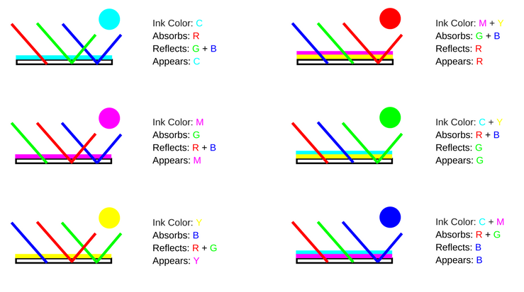
Subtractive colors begin as white. As you add filters to the white light, such as ink, this white light takes on the appearance of color. Photos, magazines, and any printed material use subtractive color.
The colorful objects we see in everyday life also gain the appearance of color using a subtractive process: an object, such as a flower or a printed sheet of paper, uses colorants such as pigments, dyes, or inks to absorb portions of the white light that illuminates the object, while reflecting other portions that we then perceive as color.
Learn more about the difference between RGB and CMYK color.
Additive and Subtractive Colors in the Printing Process
The differences between additive and subtractive color may seem subtle and unimportant for your everyday life – after all, color is color, right? Most of the time this is correct, but they are an important consideration when you’re designing for print.
When you design something on your computer, your screen will display your design in an additive RGB color mode, but offset printing methods uses subtractive CMYK color to create colors on the visible spectrum.
A good monitor can display “true” color, or about 16,000,000 shades and tints of every visible color, but the color output for printed materials is limited to a comparatively small portion of the visible light spectrum. When you print your design, the ink acts as a filter to subtract or absorb portions of white light, or allow that light to pass through and reflect off your paper in order to create perceptible colors.
Here’s how primary CMYK colors mix to achieve the full range of hues:

To reduce the risk of improper color rendering and ensure that your printed design appears as you see it on your screen, be sure to convert your design to CMYK color before you submit it to your printer.
Get more tips for preparing your designs for print.
Adding It All Up
Understanding additive and subtractive color may not help you decide which colors to use in your next creative project, but knowing how these two color modes differ is critical when you’re designing for print.
Read More
Part 1: Introduction to Color Theory and the Color Wheel
Part 2: Active versus Passive Colors
Part 3: Warm and Cool Colors
Part 4: Additive and Subtractive Colors (you’re here!)
Part 5: Color Harmonies


