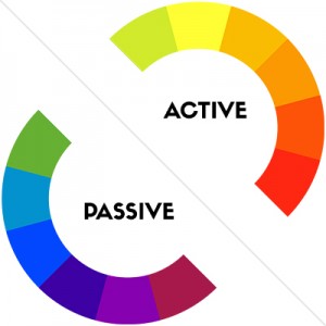
 Active or Passive: Active
Common Uses: Red is often used by restaurants to stimulate appetite. It also creates a sense of urgency, which is perfect for encouraging action or promoting a sale.
Emotional Associations: Power, passion, excitement, courage.
 Active or Passive: Active
Common Uses: Orange is an aggressive color, so it’s ideal for making design elements like calls to action stand out. Be careful when using orange – if you use it poorly, it can make your design feel frivolous or juvenile.
Emotional Associations: Playfulness, energetic, happiness, confidence.
 Active or Passive: Active
Common Uses: Nothing compares to yellow’s ability to grab attention. However, use too much yellow and you run the risk of causing visual fatigue.
Emotional Associations: Optimism, youthfulness, friendliness.
 Active or Passive: Passive
Common Uses: Green is a very soothing color. Use green to evoke a sense of calmness and tranquility, or to symbolize nature or prosperity.
Emotional Associations: Wealth, relaxation, nature.
 Active or Passive: Passive
Common Uses: Blue is widely loved, and is therefore a non-threatening, conservative color choice. It’s also a productive and non-invasive passive color, which makes it ideal for corporate communications. Experiment with different shades of blue – the wrong tone can make your design appear cold.
Emotional Associations: Security, trust, communication
 Active or Passive: Passive
Common Uses: Because of its association with royalty, purple is commonly used to create a sense of luxury. However, purple can also appear very whimsical, so be sure to use the right shade.
Emotional Associations: Creativity, wisdom, luxury