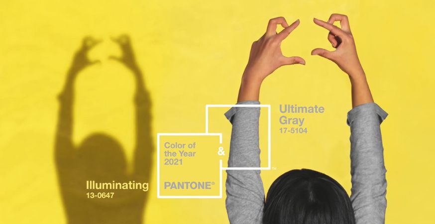
2021 is a year with so much going on that it gets not one but two Colors of the Pear from Pantone: Ultimate Gray (17-5104) and Illuminating (13-0647).

Every year, Pantone’s experts keep an eye on industries and trends in order to select the most commonly used and iconic color—or in some cases, colors. These highly-sought hues are a “color snapshot of what we see taking place in our global culture.”
Past years have seen color choices such as 2020’s calming Classic Blue, 2019’s warm and inviting Living Coral, and 2018’s futuristic Ultra Violet.
For 2021, they have chosen not one but two tones: Ultimate Gray, a color that is practical and solid, and Illuminating, a yellow tone that is hopeful and optimistic.
The union of an enduring Ultimate Gray with the vibrant yellow Illuminating expresses a message of positivity supported by fortitude. Practical and rock solid but at the same time warming and optimistic, this is a color combination that gives us resilience and hope. We need to feel encouraged and uplifted; this is essential to the human spirit.
Leatrice Eiseman, Executive Director of the Pantone Color Institute
Build the combination of reassuring optimism that Ultimate Gray and Illuminating bring to any projects using these paper and cardstock selections:
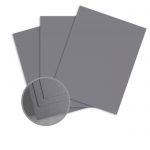
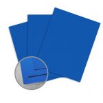
Ultimate Grey Paper
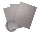
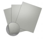
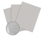
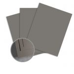
Ultimate Grey Cardstock
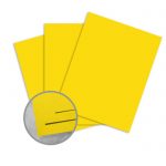
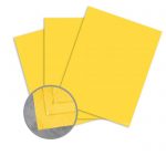
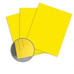
Illuminating Paper
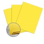
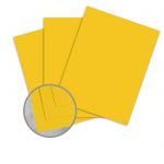
Illuminating Cardstock
Color Pairings
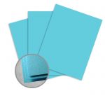
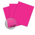
Pair Illuminating and Ultimate Gray with rich, vibrant hues to create a cheery, plumage-inspired palette:
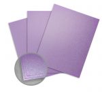
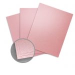
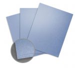
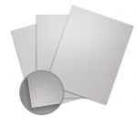
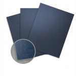
Build a metallic, futuristic palette using Illuminating and Ultimate Gray with these shimmery shades:
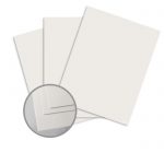
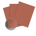
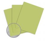
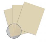
For more subdued color pairings, consider adding these natural tones to your palette:
Learn more about 2021’s two hues.