
Every year, Pantone explores trends across a variety of industries to figure out where these patterns intersect—and what color is seen commonly enough across all these areas to warrant becoming their annual Color of the Year.
Past years have brought us the refreshing and zesty shade of 2017’s Greenery, mindful tones of 2016’s Rose Quartz and Serenity, and the enriching red of 2015’s Marsala.
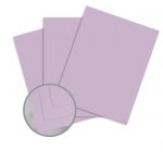
For 2018, Pantone is presenting us with Ultra Violet, a color that “communicates originality, ingenuity, and visionary thinking that points us toward the future.”

“We are living in a time that requires inventiveness and imagination. It is this kind of creative inspiration that is indigenous to PANTONE 18-3838 Ultra Violet, a blue-based purple that takes our awareness and potential to a higher level. From exploring new technologies and the greater galaxy, to artistic expression and spiritual reflection, intuitive Ultra Violet lights the way to what is yet to come.”
Leatrice Eiseman, Executive Director of the Pantone Color Institute
Introduce the dramatic and thoughtful hue of Pantone’s Ultra Violet into your work with these perfect paper and careful cardstock selections:
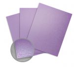
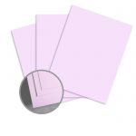
Paper
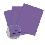
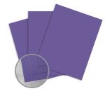
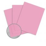
Cardstock
Color Pairings
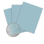
Pair Ultra Violet with these hazy smoky hues for a timeless, subtle palette:

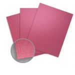
After excitement and drama? Try putting Ultra Violet with these saturated shades:
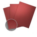
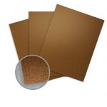
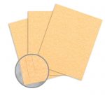
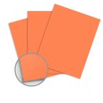
Recreate a desert sunset by adding Ultra Violet to a palette with these radiant warm tones:
Learn more about Ultra Violet and get its full color story.