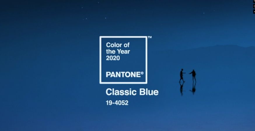
It’s that time of year again—Pantone is back with their annual Color of the Year. What’s Pantone’s pick for 2020? Classic Blue (19-4052)!

After reviewing trends across different creative sectors and taking note of the colors that keep popping up in home design, fashion, consumer products, and other influential industries, Pantone’s team picks out contenders before narrowing it down to the shade.
Past years have seen color choices like 2019’s Living Coral, 2018’s Ultra Violet, and 2017’s Greenery. For 2020, you can’t go wrong with Classic Blue.
We are living in a time that requires trust and faith. It is this kind of constancy and confidence that is expressed by PANTONE 19-4052 Classic Blue, a solid and dependable blue hue we can always rely on. Imbued with a deep resonance, Classic Blue provides an anchoring foundation. A boundless blue evocative of the vast and infinite evening sky, Classic Blue encourages us to look beyond the obvious to expand our thinking; challenging us to think more deeply, increase our perspective and open the flow of communication.
Leatrice Eiseman, Executive Director of the Pantone Color Institute
Incorporate the calm, confident tone of of Pantone’s Classic Blue into your work with these paper and cardstock selections:
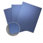
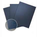
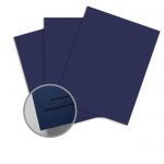
Cardstock


Color Pairings
Pair Classic Blue with a gradient palette of cool hues to warm tones to create a calming effect:


Recreate an early evening sky by adding Classic Blue to this collection of colors:


Looking for something more outside the box? Try putting Classic Blue with these untraditional and unique pairings:


Learn more about Classic Blue and get its full color story.