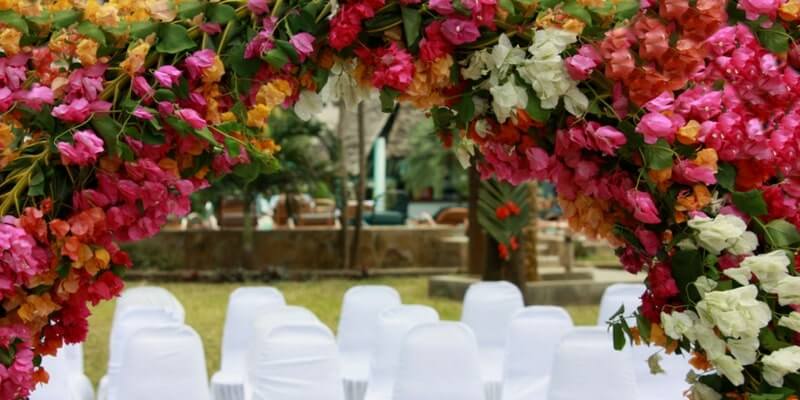
In the first part of our Autumn Wedding Guide, we took a look at four popular fall themes: Harvest, Foliage, Woodlands, and Halloween. In the second part, you’ll find all of our favorite fall hues.
Autumn is the perfect season for mixing bright hues with rich jewel tones and simple neutrals. Keep reading and get inspired:
Forest Colors
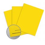
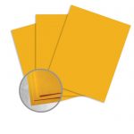
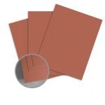
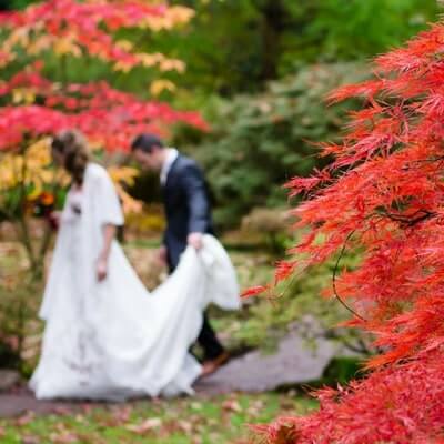
Bright red and yellow are classic autumn colors mimic the look of the changing leaves. For a more subdued look, try using a dusty mustard yellow and deep wine red.
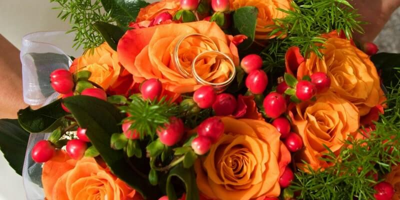
For a more understated feel, brown, orange and green are good alternatives. If you’re worried that your color choice might seem tacky, try incorporating one or two of these of these shades as an accent color. These invites by Brown Fox Creative offset traditional foliage hues with a modern navy blue:
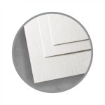
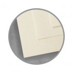
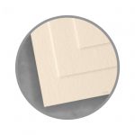
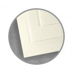
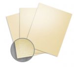
Ivory
This muted neutral is softer than bright white, and it pairs perfectly with darker fall tones like maroon, marsala, or any shade of green. Try using one of these ivory papers:
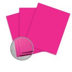
Magenta
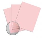
Strike a balance between bright summer shades and the subdued tones of autumn by using dark magenta. This color is both bright and rich, and it looks gorgeous next to a bright white or blush pink. You can also try it with orange to pare down on the triteness of this classic autumn hue. Or, for a darker and more dramatic alternative, opt for a plum shade.
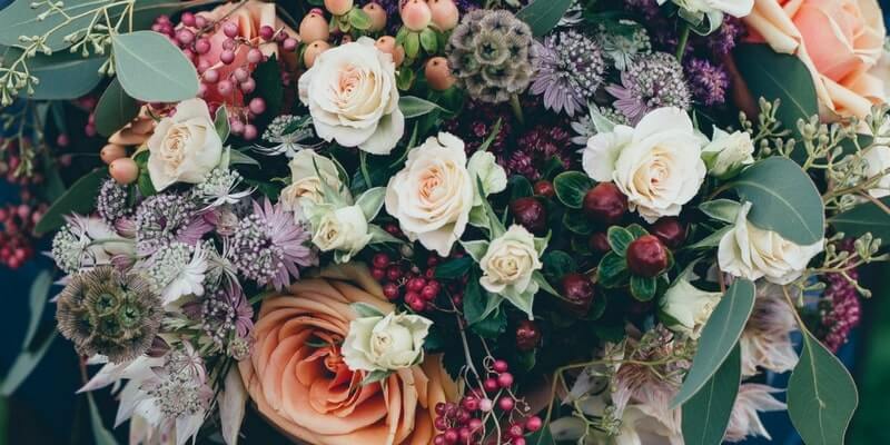
Take a look: These lovely invitations by Karri Lee Designs combine a trendy watercolor floral motif and hand-drawn typeface with a classic blush pink envelope:
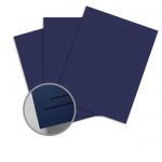
Navy & Gray
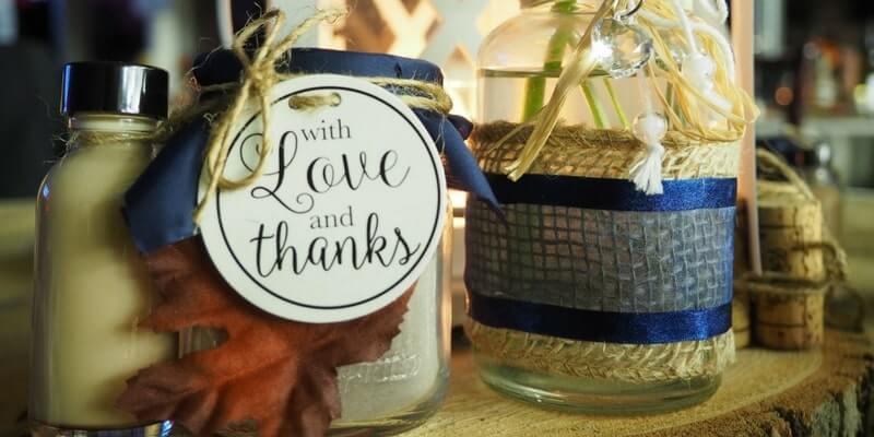
Navy and gray are sleek and seasonally appropriate without relying on traditional fall colors. Gray is a modern neutral that pairs well with other shades, while navy is a classic dark tone that lets other fall shades like brown, orange or mustard yellow pop.
For a brighter variation, try pairing bright yellow and royal blue – it’s a little more casual. Turn up the notch even further by using gold instead of bright yellow, like this gold card stock.
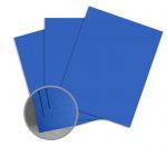
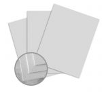
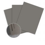
See these colors in action: This gorgeous suite by combines muted gray Kraft paper with ivory envelopes and a bright royal blue mat:
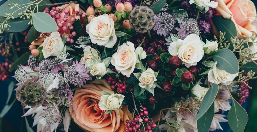
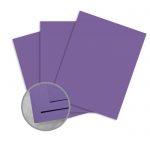
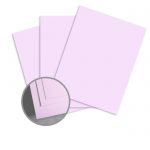
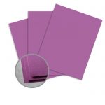
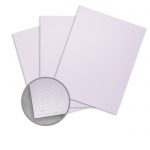
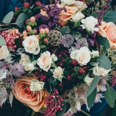
Lilac & Purple
These cool tones are floral and luxurious, and evoke the softness of a summer garden party with an added autumnal touch. Mauve is also a great choice for fall, and is a lovely muted tone that pairs well with ivory stationery and bright orange accents to stay on theme without being garish.
Check it out: This invitation suite by Marie & Co. Weddings combines shades of purple and and gold with a lovely floral motif to create perfectly seasonal fall wedding invite.
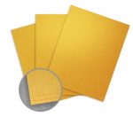
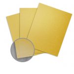
Gold
Gold is luxurious but still neutral, and is seasonal without being overwhelmingly so. It also pairs well with a lot of other colors, especially autumn colors like red, green, and bright magenta, which makes it the perfect sparkly accent to the rest of your color palette.

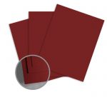
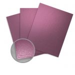
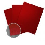
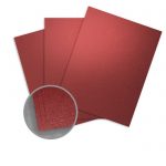
Burgundy

This wine-inspired hue is a rich and earthy shade that’s perfect for fall. It’s warm and sophisticated with darker undertones that are a bit more subtle than the traditional bright fall colors. If you want to add a punch of colour, try pairing it with ivory, gold, magenta, or bright orange. For a more muted effect, blush pink, lilac, and silver also look gorgeous.
Keep Reading the Autumn Wedding Guide
Read the rest of our Wedding Guide and get inspired with our favorite fall color palettes, as well as our expert paper and stationery suggestions!
Highlight the season with four of our favorite fall themes and motifs.
Set the tone for your event with modern and traditional seasonal hues.
Get our expert tips for designing fall wedding stationery.
Take a look at our wedding category for more inspiration and great DIY ideas for your event.