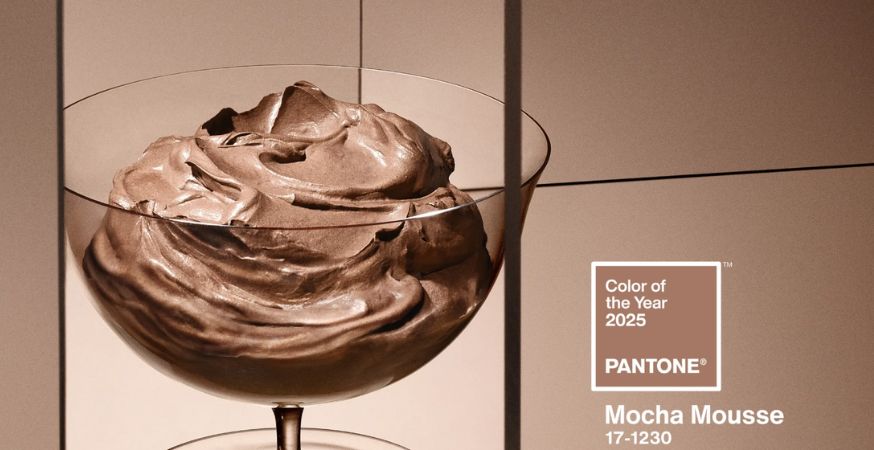
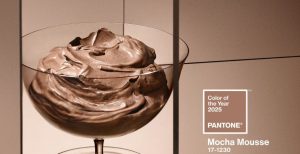
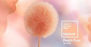
Pantone’s Color of the Year always sparks conversation, and 2025 is no different. With the unveiling of Mocha Mousse (17-1230), a rich and comforting brown hue, reactions have ranged from excitement to skepticism. Let’s dive into what makes this pick special—and polarizing—and explore how you can incorporate this trend-setting shade into your projects.
The Pantone Color Institute describes Mocha Mousse as “a warming, brown hue imbued with richness”, “answering our desire for comfort” by nurturing us with “its suggestion of the delectable qualities of chocolate and coffee”:
“Warming” and “discrete” may be apt descriptors for Mocha Mousse (17-1230), but the design community is not sold on Pantone’s Color of the Year 2025. Reactions have been mixed, with some color commentators expressing ardent support for Pantone’s pick:
Comment
byu/BlueLu from discussion
incraftsnark
Creative Bloq summarizes the opposing viewpoint, which is shared by many graphic designers and many fashionistas: “[If] your initial reaction to the colour was actually one of discomfort, you’re not alone. You don’t need a PHD in colour theory to see what it resembles.”
Print agrees, describing Mocha Mousse as “understated, even subdued, compared to the bold selections of previous years”, and offering the following hunch: “Perhaps this choice reflects a response to the chaotic and unpredictable events of 2024, offering a sense of calm and grounding in a time of upheaval”
Other commentators across social media agree:

Comment
byu/o_W1 from discussion
ingraphic_design
Comment
byu/o_W1 from discussion
ingraphic_design
Comment
byu/chiono_graphis from discussion
infemalefashionadvice
Whether you love it or hate it, the Pantone Color of the Year 2025 is here to stay.
Stay tuned as we explore the story behind this year’s pick, share tips for incorporating it into your designs, and highlight some of our favorite Mocha Mousse-inspired papers, card stocks, and envelopes to help you bring this trend-setting hue to life.
So Why Mocha Mousse?
At first glance, Mocha Mousse (17-1230) may seem like a simple, earthy brown, but it’s much more than that. With “much of the design world focused on themes of sustainability, simplicity, and connection” (according to Print), this rich hue has been carefully chosen to evoke a sense of warmth, grounding, and quiet luxury. It’s a color that feels familiar and comforting, yet (according to Pantone) it carries an undeniable elegance that elevates any project or design.
Pantone describes Mocha Mousse as “elevated yet approachable,” with a timeless appeal that bridges the gap between modern and traditional aesthetics. Its warm undertones call to mind the indulgence of chocolate, the aroma of freshly brewed coffee, and the organic beauty of the earth—creating a connection that feels personal and universal all at once.
Leatrice Eiseman, Executive Director Pantone Color Institute, emphasizes how Mocha Mousse resonates with our collective longing for stability and comfort:
"In a time when we seek both solace and refinement, Mocha Mousse provides a tactile warmth that envelops us in its richness, while also offering a versatile foundation for creative exploration."
Whether you’re designing for a bold statement or a neutral, calming backdrop, Mocha Mousse’s understated depth ensures it fits seamlessly into a variety of styles and palettes. Its ability to inspire creativity while exuding tranquility is what makes it a standout choice for 2025.
How to Use Mocha Mousse in Design
Whether you’re designing invitations, crafting packaging, or creating decor, this rich brown hue offers endless possibilities for inspiration.
Regardless of how you feel about this shade, one of the key strengths of Mocha Mousse is its versatility. It works as both a neutral foundation and as a statement accent shade, seamlessly complementing a wide range of color palettes. Use it as a primary color to create a cozy, inviting atmosphere, or pair it with bold hues like deep blues, greens, or terracottas for a dynamic and modern look.
Beyond its aesthetic appeal, Mocha Mousse is a practical choice for design materials. Its natural tone masks wear and tear on frequently handled items, making it ideal for projects like business cards, menus, or product packaging.
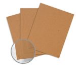
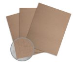
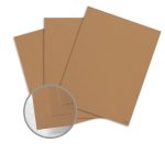
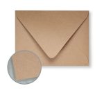
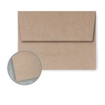
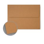
No matter where you stand on Mocha Mousse, this adaptable hue opens new creative opportunities. From elegant stationery to bold packaging, it’s a color ready to shine. Explore our curated selection of papers, card stocks, and envelopes that embody this trend-setting shade.
Paper
Perfect Pairings for Mocha Mousse
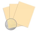
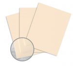
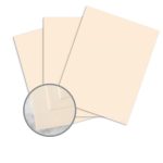
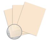
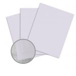
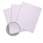
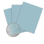
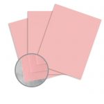
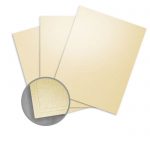
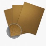
For softer, understated designs, Mocha Mousse pairs beautifully with pastel tones like peach, lavender, and light beige, creating a harmonious and tranquil aesthetic. Its warm undertones also make it a perfect match for metallic accents like gold or bronze, adding a touch of luxury to your projects.
Peach & Light Beige
Lavender & Pastels
Bring Pantone Colour of the Year 2025 to Life in Your Projects
Pantone’s Color of the Year 2025, Mocha Mousse (17-1230), invites us to embrace the warmth and elegance of a shade that feels both timeless and modern. Its rich, comforting tones offer endless creative opportunities, whether you’re crafting invitations, designing packaging, or exploring new ways to elevate your projects.
By incorporating Mocha Mousse into your work, you can bring a sense of grounded sophistication to every design. From pairing it with bold contrasts to using it as a neutral backdrop, this versatile hue is ready to inspire your creativity and leave a lasting impression.
Discover our curated selection of Mocha Mousse-inspired papers and cardstock to start designing with 2025’s most on-trend color today. Let this warm and inviting shade be the foundation for your most stunning projects this year.

