In Part 2 of the Ultimate Guide to Card Stock, we outlined the difference between basic and cut size and explored the importance of paper weight. Part 3 will continue our examination of all things card stock with a closer look at paper finishes and card stock colors.
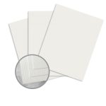
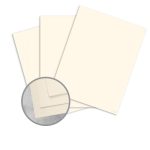
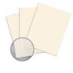
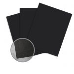
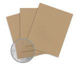
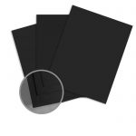
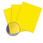
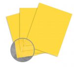
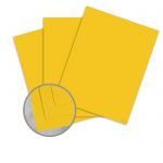
Cardstock is available in a wide variety of finishes and colors, making it possible for you to add texture and other appealing finishing touches that will heighten the impact of your creative projects. But, like selecting the right paper weight, choosing a finish and color can be anything but straightforward.
So, what exactly is a paper finish and how does it affect your cardstock selection? Let’s jump in.
What is Paper Finish?
Paper finish describes the surface or texture of a sheet of paper or cardstock. Finish affects the look and feel of the paper, but more importantly, it can impact printability and absorbency by dictating how the sheet will take ink. This is especially important for print and graphic designers and photographers.
Finishes are created during different stages of the papermaking process in a variety of ways, such as:
Attaching a design to the dandy roll. This is how watermarking is done and how laid finish paper gets its sheer lines.
The degree of wet pressing. Papers that will have a low gloss, such as a matte finish, require less wet pressing.
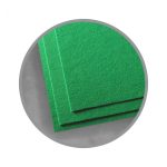
The use of felts or embossing rolls to add textures, such as felt or linen finish.
Calendering to increase the degree of smoothness. The greater the pressure applied during the calendering process, the smoother the sheet will be.
Supercalendering adds additional gloss to paper.
Coating can be added during the papermaking process, called on-machine coating, or afterward using a different machine, called off-machine coating, to add or enhance a finish. UV coatings provide a high level of shine, whereas an Aqueous coating lends paper a medium-gloss.
Coated and Uncoated Paper Finishes
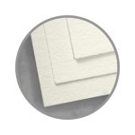
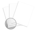
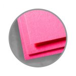
Whether a paper is coated or uncoated can affect its finish.
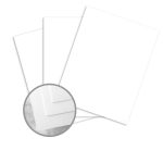
Coated card stocks are treated with a sealant that lends them specific characteristics, such as high level of glossiness and a stiffer feel. This coating gives papers a waxy finish with a varying degree of shine, provides protection from wear and tear, and reduces the level of ink that a sheet can absorb. By inhibiting ink absorption, the coating creates a crisper, higher quality image. These qualities make coated card stocks ideal for things such as:
Photography
Magazines
Art books
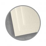
Uncoated card stocks have an untreated surface and are often less reflective than their coated counterparts. These papers usually lend a softer look to projects because the ink is absorbed into the paper, which diffuses its vibrance. Embossing often works best on uncoated papers because their finishes are softer and are less likely to crack. Their lack of coating also makes them easier to write on, making them ideal for use as:
Letterheads
Envelopes
Stationery
Both coated and uncoated papers have a range of finishes to choose from, but you’ll usually find more variety when it comes to texture with uncoated stocks.
Here are some of the most common paper finishes:
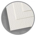
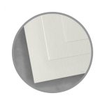
Embossed
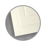
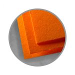
The embossed finish has a raised design that is pressed or hammered into the paper with a unique pattern. It lends an unusual texture to cardstock, making it ideal for use in scrapbooking, crafts, cards, invitations, weddings, and promotional materials.
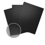
Gloss or glossy finish has a high level of shine, allowing it to reproduce colors beautifully. It is ideal for printing high-quality photos, brochures, images with lots of detail, or anything that requires image clarity and sharpness.
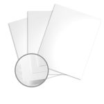
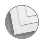
Laid finish has sheer, transparent lines running through the page that you can see when you hold it up to the light. It’s often used in business correspondence, lending a professional appearance to letterheads, reports, presentations, and stationery.
Lettra paper is a brand of paper specifically designed for Letterpress printing. It is thick and fluffy and is ideal for embossing, debossing and foil work.
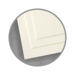
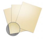
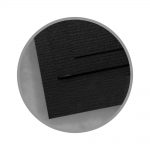
Linen finish has the look and feel of linen cloth. It adds a luxurious touch to personal stationery, business letterheads, fine restaurant menus, invitations, weddings, and greeting cards.
Matte finish has a subtle sheen that shows colors well while still producing an easy-to-read product. It adds a soft, professional look to images and eliminates fingerprints. It’s ideal for documents, photos or designs with writing such as tickets.
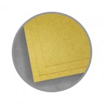
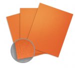
Metallic finish adds pizzazz to your projects. It ranges from a subtle shine to bold sparkle. Its pearly luminosity is perfect for stationery, invitations, weddings, and crafting.
Satin finish is a compromise between glossy and matte. It provides a higher level of readability than gloss and a more uniform print smoothness than matte while also enhancing the colors. It produces beautiful gallery-quality photographs, making it ideal for portfolios, photo albums, and scrapbooks.
Like satin, silk finish falls on the spectrum between glossy and matte. It has a slight sheen to it and displays images well, but still offers a high level of readability and is much easier to write on than a gloss finish paper. This makes it ideal for use in leaflets, brochures, booklets, projects with text or promotional materials that people might use to make notes on.
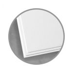
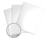
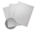
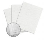
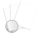
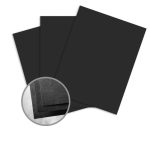
Smooth finish is smooth to the touch. A smooth surface produces a crisp image because it doesn’t scatter as much light. It’s perfect for everyday use and takes writing, foil stamping and embossing well.
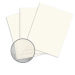
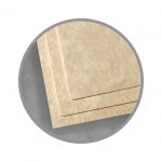
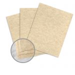
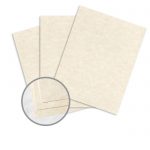
Vellum or parchment finish has a slightly rough texture and is designed to imitate the animal skin paper for which it was named. It lends a traditional, classic feel and a touch of ceremony to your business documents, newsletters, stationery, diplomas, awards, invitations, crafting, scrapbooking, embossing, stamping, and calligraphy.
Wove has a smooth finish that is slightly rough to the touch. This is likely the finish of the paper you buy for printing at home and writing on. It’s ideal for everyday use and office work.
Find a finish that works for you by browsing our full selection.
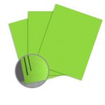
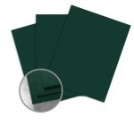
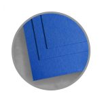
Coloring Outside the Lines
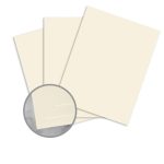
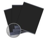
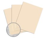
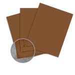
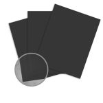
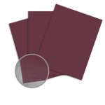
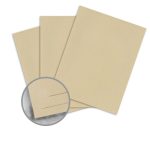
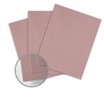
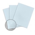
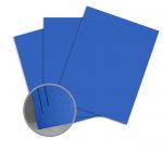
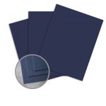
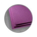
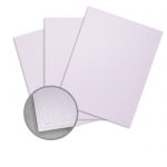
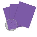
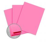
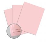
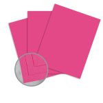
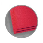
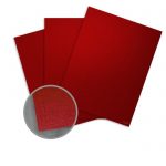
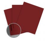
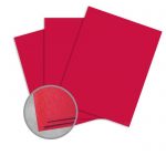
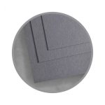
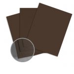
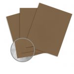
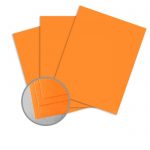
Different colors create different impressions. Colors are closely linked to concepts, emotions, and identity in our minds, and these associations can help you convey a certain tone with your work and, for brands, establish specific traits.
It’s not just the psychological impact you need to consider when selecting a shade for printing – you should also consider color theory when you’re planning out your project in order to understand how different colors of cardstock will affect the final product.
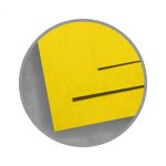
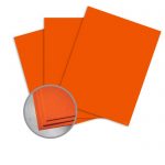
The shade of a color you choose can alter what that color is expressing. For example, a warm yellow might suggest friendliness, whereas an fluorescent shade might give the impression of urgency. Here are some of the most common color associations:
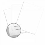
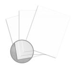
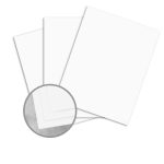
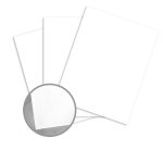
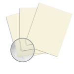
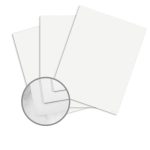
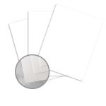
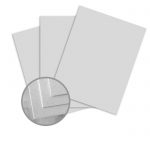
The whiteness of a paper alters the range of colors we perceive. For the most accurate color reproduction, choose a white cardstock.
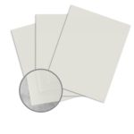
It’s important to note that bright white shades will likely have a blue tint to them, which may make the paper seem even brighter and more white to our eyes. If a tint of any color is obvious enough that you can detect it, it might affect color accuracy during printing. This is not necessarily a bad thing and can be used to create an even more interesting product, but it is important to remember that what you see on the screen will not always be the same as the printed result. Test runs are important, especially when you’re working with different colored papers.
Color and finish add a little something extra to your work and can help set expectations in the mind of your intended audience. What kind of impression do you want to leave them with? It’s easy to add some elegance to your invitations with a touch of texture and a subtle sheen or use a pop of color to evoke an emotional response to your work.