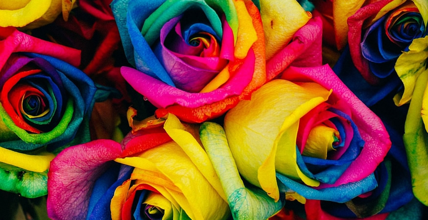
The temperature may be getting cooler, but the leaves are getting warmer – at least, their colors are!
The distinction between “warm” and “cool” colors has been in use since the late 18th century, and is an essential component of color theory.
Unlike other aspects of color theory (such as active and passive colors), the difference between warm and cool colors has nothing to do with their reflective properties, light absorption, brightness, saturation, or tint. The difference between warm and cool colors is based on the observed contrast in light between warm daylight or sunset colors and the cooler tones of an overcast day. The distinction is primarily emotional and psychological, and is dependent on the color’s position on the color wheel.
There is no commonly agreed upon “warmest” or “coolest” color, but peak contrast is said to be between red-orange and blue-green.
Let’s dig in!
Warm Colors

Warm colors range from shades of red to shades of yellow. These colors are generally considered to be “active” colors because they appear to advance from the page.
In design, warm colors are often used to convey messages of happiness and energy. They are also very stimulating colors, which makes them popular with restaurants.
PRO TIP: Warm colors pair well with neutrals, which can make warm tones appear brighter and more vibrant without overwhelming the eye of your reader. For this reason, simple backgrounds may also be preferable to complicated patterns.
Cool Colors

Cool colors range from shades of blue-green to blue-violet, including most shades of gray. Unlike warm colors, cool colors are generally “passive” colors, and appear to recede.
These calming and relaxing colors are often used to create a sense of harmony, reliability, and trust, and are therefore popular for business branding and communications.
PRO TIP: If you’re designing with cool colors, try combining multiple shades of the same color to create an intriguing palette without relying on too many other hues.
Tips for Designing with Warm and Cool Colors
Unless you’re designing in black and white, your projects will incorporate warm and cool colors. Keep your designs looking sharp with these tips:
- Seek a balance between warm and cool colors. Too many warm tones and you might overwhelm your reader; too many cool tones and you risk not standing out.
- Color temperature is always relative. Different shades of the same color can be warmer or cooler, such as a raspberry red compared to a crimson red, so a warm color can appear cool next to another warm color, and vice versa.
- Follow the 80/20 rule. If you’re aiming for a primarily warm palette, incorporate about 80% warm shades and use cool or neutral shades for the remaining 20%. If you want a cooler palette, simply switch the ratio!
- The juxtaposition of warm and cool colors can help create the illusion of a three dimensional design, even when printed on paper. This is because warm colors advance and cool colors recede. However, too much contrast will destroy the illusion as the eye competes to select a focal color, so be sure to balance the contrast of your hues appropriately.
Cooling Down
Color temperature can have a significant impact on the look and feel of your designs. Understanding the difference between warm and cool colors is key to creating evocative designs that are sure to make an impression on any reader.
Keep Reading
Learn more about color theory:
Part 1: Introduction to Color Theory and the Color Wheel
Part 2: Active versus Passive Colors
Part 3: Warm and Cool Colors (you’re here!)
Part 4: Additive and Subtractive Colors
Part 5: Color Harmonies


