So far in our ongoing series about Color Theory, we’ve introduced you to the color wheel, warm and cool colors, active and passive colors, and additive and subtractive colors. Now that you have a good understanding of the different types of colors, we can turn our attention to how to use and combine these colors to create an appealing, effective design.
The trick to creating an attractive color scheme is to employ color harmonies. When it comes to creating color harmonies, like most aspects of color theory, the color wheel is the most valuable tool in your design tool kit. These established combinations are based on their position on the color wheel, and create a satisfying balance of colors by relying on harmonies that are instinctively pleasing to the eye. There are six color harmonies commonly used in design:
- Complementary colors
- Split complementary colors
- Analogous colors
- Triadic harmonies
- Tetradic harmonies
- Monochromatic harmonies
Before you start choosing colors, start by thinking about your message: what are you trying to communicate? Once you understand the purpose of your design, you can select a palette using a color combination that will help convey your desired meaning.
Let’s take a closer look at each of these harmonies:
Complementary
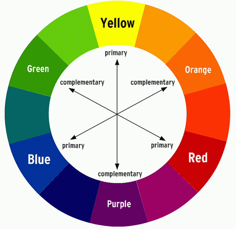
Complementary colors are located opposite to each other on the color wheel.
This opposing relationship creates high contrast, which makes this color harmony is one of the most difficult to successfully implement, especially for new designers. This contrast is especially high when the colors are used at their full saturation. The vibrant look of a complementary harmony is ideal for making something stand out or drawing attention to your focal point, but be careful using complementary colors in large doses – they can easily appear overwhelming to the eye. If you find the contrast too strong, shade (add black) or tint (add white) to your colors to make them feel more muted and less aggressive.
When to Use Complementary Colors
- To draw attention to your focal point.
- To express boldness and inspire action.
- Avoid using complementary colors right beside each other, especially for text-based compositions – the effect can be hard on the eyes, and will also render text illegible or difficult to read.
- For youthful, lively projects.
Split Complementary
Instead of using two complementary colors, this variation uses one base color and the two colors adjacent to the directly opposing color on the color wheel.
A split complementary color harmony still offers contrast like a standard complementary color scheme, but it creates less tension by using colors analogous to the true contrasting hue. This harmony is less aggressive and more versatile, making it a great choice for new designers.

When to Use Split Complementary Colors
- If you’re a new designer and want to experiment with complementary harmonies.
- When you want to make an impact, but don’t want to be too flashy.
Analogous
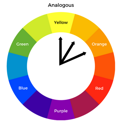
Analogous colors are located next to each other on the color wheel.
This low-contrast combination is calm and often found in nature, making it one of the most instinctively harmonious color pairings. It creates an almost monochromatic look that is similar to the popular ombre trend, but is a little more dynamic. Create balance in your design by choosing one base color and using two or three analogous colors as accent shades, and try to stick to using only warm or only cool colors to avoid complicating the harmony. To add more visual interest, use shades and tints.
When to Use Analogous Colors
- To add visual interest to a monochrome color scheme.
- You are seeking a calm and unified look that won’t distract from your primary message.
- To complement natural subject matter or create a connection with nature.
Triadic
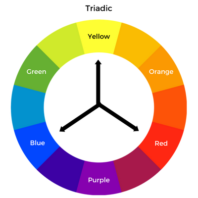
A triadic color harmony employs three colors evenly spaced around the color wheel.
Triadic harmonies are often vibrant, but without the sometimes-jarring look of a complementary color scheme. To help keep your design balanced, let one color dominate and use the others as accent colors, similar to a split complementary harmony. Try using one dark color, and a paler shade of the other two colors. Tints and shades can help create a sense of calm and tranquility, while full chroma hues are ideal for more youthful concepts.
When to Use Triadic Harmonies
- To create drama and contrast without appearing too in-your-face. Dial down the drama using tints and shades.
- For compositions that require more than two colors.
- To grab viewer’s eye without creating tension.
- For bright designs that employ full chroma colors.
Tetradic
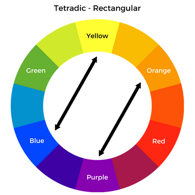
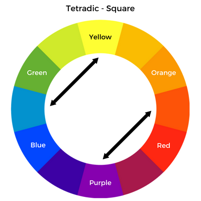
There are two types of tetradic harmonies: rectangular and square. These harmonies use four colors arranged in two complementary pairs.
Tetradic harmonies offer the most variety and tend to be very eye-catching, and as a result work well with flashier subjects. However, because they involve four different colors, it can be difficult to strike an effective balance. The best way to employ a tetradic harmony is to let one color dominate and reserve the three remaining colors for accents or secondary elements. You should also strive to balance warm and cool colors to avoid appearing garish or overwhelming.
When to Use Tetradic Harmonies
- Designs with color-coded elements, such as signage or transit maps.
- To create a type hierarchy. Use the darkest color for body text, and the three remaining colors for headings and subheadings.
- For showier subject matter.
Monochromatic
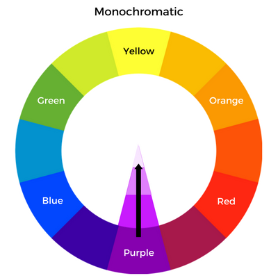
Monochromatic harmonies use a single color shaded or tinted to various values by adding black or white.
A monochromatic palette creates a simple, clean aesthetic. It offers the greatest sense of unity and is the easiest to create with the least room for error, but it can lack visual interest if there isn’t enough contrast between light and dark hues.
When to Use a Monochromatic Harmony
- To create a calm and serene design.
- To convey reliability.
- For text-based compositions. Use dark shades for text and headings, and lighter shades for background. Save the brightest variation for graphic accents.
Harmonize with Me
Whether you opt for a simple monochrome palette or experiment with eye-catching complementary or versatile tetradic harmonies, color harmonies can help you create a cohesive and attractive color palette.
Read More
Part 1: Introduction to Color Theory and the Color Wheel
Part 2: Active vs. Passive Colors
Part 3: Warm and Cool Colors
Part 4: Additive and Subtractive Colors
Part 5: Color Harmonies (you’re here!)


