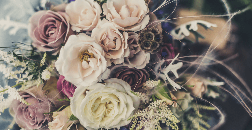
Spring and summer are known for their vibrant hues and muted blush tones, but winter is the perfect opportunity to incorporate rich, darker colors into your wedding palette, or opt for a monochrome look without feeling cold and out of place.
Keep reading and get inspired by these winter colors:
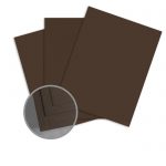
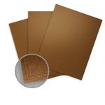
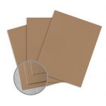
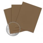
Chocolate Brown
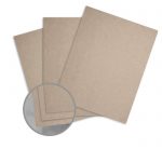
This evergreen-inspired hue adds a hint of drama to your winter wedding. It pairs well with any shade of green, ice blue or darker indigos, and bright red accents. Try using it as a matte to add contrast to your invitations, programs, or menus. If a chocolate brown is too dark for you, opt for a lighter sheet of Kraft paper.
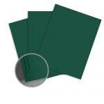
Green
A bright forest green is a classic choice for a winter wedding. Forest greens pair perfectly with blush pink to create a vintage vibe, as well as with copper shades reminiscent of seasonal cinnamon sticks, or bright red for a festive look. For a muted look, try using a subtle shade of sage green; for a more modern palette, pair a green shade with ivory, silver, navy blue, or gold.

This evergreen-themed place setting by Finer Details combines dark forest green with burgundy accents (alongside subtle berry graphics on the table numbers) and gold-edged plates and flatware to create a distinctly winter feel:
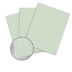
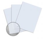
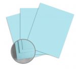
Ice Blue
A light shade of ice blue is a winter classic. It’s a great base color for your stationery suite, or if you’ve opted for an all-white palette, it can also add a hint of dimension to your monochrome look. It also pairs well with bright red, silver, sage green, ivory, and even blush pink. For a warmer look, opt for an ice blue with a hint of teal.
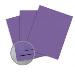
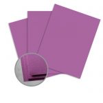
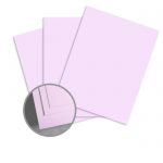
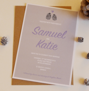
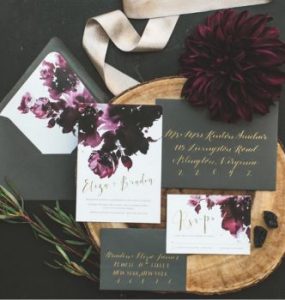
Purple
This rich jewel tone is warm and luxurious, and is a bit of an unconventional choice for a winter wedding, where blues and silvers reign supreme. It pairs nicely with gray and black, gold for a touch of warmth, or shades of green for pops of color. Darker shades, like the dramatic hue used by Paper Amy below, are perfect for matting your invitations, programs, and menus.
These eye-catching invites incorporate a rich purple laser-cut design:
For a more understated alternative, try using a darker plum tone, or a pale mauve or lilac.
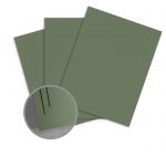
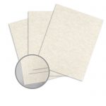
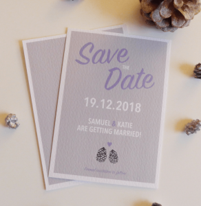
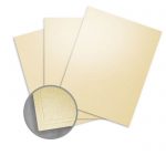
Taupe
The peaceful neutral is slightly rustic, but is a classic choice that pairs well with many color palettes. For a warmer look, opt for a beige shade with peachier undertones.
These invites by Let Love Sparkle Design pair taupe with a light purple:
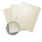
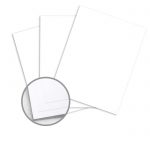
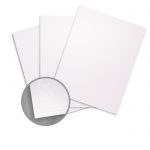
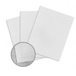
White
White is the cornerstone of many winter wedding color palettes. An all-white look is clean, sophisticated, and dramatic, especially when offset with ivory, silver, or gold accents. If you’re going for a monochromatic look, texture is your best bet for designing a stellar stationery suite. Wrapping your invites in a smooth satin ribbon like these invites by DK Wedding Designs adds texture:
You could also try pairing a smooth white sheet with pearly metallic white or even translucent vellum to add dimension. For contrast, you could also incorporate dark greens or bright reds.
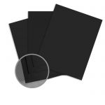
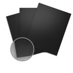
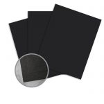
Black
Black may not be the traditional choice for a winter wedding palette, but it adds serious dramatic contrast, and it’s totally on-trend for 2018. It may be dark, but black is a neutral tone that will pair well with just about any other color.
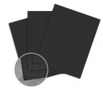
Not convinced? Here’s some more inspiration:
Black is the perfect base color for a New Year’s Eve wedding. These invites by The Story of Us use the classic combination of black and white accented with silver to set the tone for this NYE wedding:
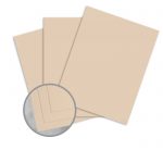
Blush Pink
A warmer blush pink offers a refreshing take on classic winter pastels like ice blue. It may seem like a typical spring or summer hue, but when paired with bright red berries or dark forest greens, blush pink is perfect for winter. It also pairs nicely with brown, gold, grey, lilac, and sage green to create a vintage look.
For a little more oomph, you could also use a hot pink or raspberry shade.

This invitation suite by ABBA Design pairs blus pink with gold and burgundy, as well as a stylish hand-drawn typeface:
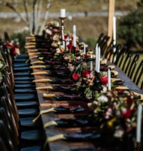
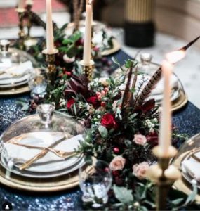
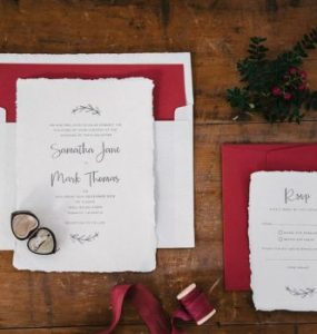
Red
Bright red is a quintessential festive shade, and is a great accent color for many winter color palettes. On the other hand, muted burgundies or maroons offer a slightly more modern alternative with a bit of a vintage vibe. Tread lightly when pairing with green if you want to avoid looking too Christmassy.
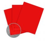
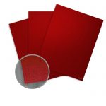
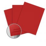
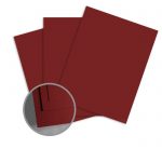
Whichever shade you choose, red pairs nicely with white, black, and gold. Here’s some inspiration:
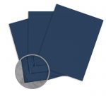
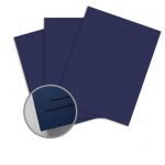
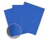
Indigo
This dramatic, elegant shade is chic and modern, and it pairs well with a number of popular winter colors, including gold, silver, taupe, and gray. It’s also perfect for a New Year’s wedding, especially with gold accents. For a brighter look, opt for a royal blue tone instead.

These blue petal sachets by Bubble and Berry incorporate a number of coordinating colors, and are an environmentally-friendly alternative to throwing rice:
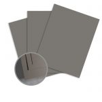
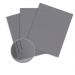
Grey
If you love the look of a monochrome palette, look no further than grey. From dark charcoals to light, smoky shades and bright whites, grey is perfect for achieving a sophisticated monochrome look. It also pairs well with blush pink, navy blue, and taupe. To jazz it up a little, add silver or gold accents.

These elegant invites by TCT Design Firm use a soft grey mat and envelope liner alongside a bright white stock embellished with pale blue floral motifs. The understated color palette and simple design evoke a subtle wintery look that’s perfect for the snowy season.
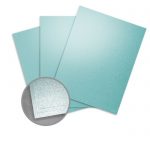
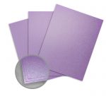
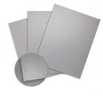
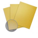
Silver and Gold
Burl Ives had it right—everyone wishes for silver and gold. These classic metallic tones are perfect accent shades for any winter wedding color palette. They add a touch of glamor, especially for evening weddings when they’ll really sparkle, and can be used as little or as liberally as you desire. These invites by Raspberry Rose designs feature a glittery silver border:
This gorgeous paper flower wall by the Crafty Sagittarius combines shimmery gold paper with the classic combination of black and white:
Take at look at these popular silver and gold papers:

Keep Reading the Winter Wedding Guide
Read the rest of our Wedding Guide and get inspired with our favorite winter color palettes, as well as our expert paper and stationery suggestions!
Highlight the season with four of our favorite winter themes and motifs.
Set the tone for your event with modern and traditional seasonal hues.
Get our expert tips for designing winter wedding stationery.
Take a look at our wedding category for more inspiration and great DIY ideas for your event.