Did you know that the human eye can distinguish between approximately 10 million colors, but your computer monitor can display millions more?
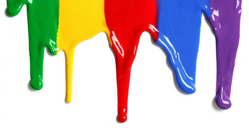
Color is about much more than just staying inside the lines like we’re taught as kids; color is inherently subjective, and it’s a complicated aspect of design. Check out Smashing Magazine’s great three-part series on color theory to learn more about how we perceive colors and what different colors can signify. For now, we’ll focus on a few design-specific color terms to get you started.
Color Depth
Color depth refers to how many colors and shades can be displayed by your monitor’s screen. Color depth is usually measured in “bits”.
Bits
“Bit” is an abbreviation for “binary digit”, which is the smallest unit of measurement used to quantify computer data. A bit contains a single binary value of either 0 or 1.
Each of the primary colors (RGB) is assigned a number of bits to describe its color depth. If a color has more bit depth, more colors can be displayed.

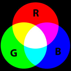
RGB
In the RGB color model, the primary colors are red, blue, and green. Every color displayed on your screen will be made up of different intensities of these three colors, typically measured on a scale of 0-255.
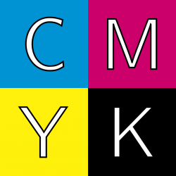
CMYK
CMYK is a four-color model used for almost every printed material. In the CMYK model, the primary colors are cyan, magenta, yellow, and black. Every printed color is created by mixing different intensities of these four colors, typically measured on a scale of 0-100.
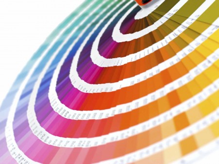
Pantone
Pantone is considered the worldwide standard of color. Established in 1963, Pantone has spent over 50 years perfecting a universal system for understanding and matching color. Their Matching System is based on a set of standard colors that can be mixed to print colors consistently across different printing presses and substrates.
Pantone colors are identified by individual numbers, with each number followed by a C, U, or M, indicating which color corresponds to coated, uncoated, or matte paper.
Monotone & Duotone
Monotone images are created by printing a grayscale image in a single color that isn’t black. For example, on a CMYK press, a monotone color could be magenta, yellow, or cyan. Duotone images are grayscale images printed using multiple colors.
Monotone and duotone printing is often used to create an artistic feel, or to add an antique or vintage flair.

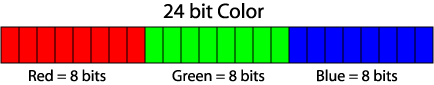
True Color
“True” color is also known as 24-bit color.
Each primary color (RGB) has 8 bits (for a total of 24 bits), and each primary color has 256 shades. If you multiply 256 x 256 x 256, you get more than 16.7 million bits, which is well over the 10 million colors our eyes can actually perceive.
Color Me Happy!
Color (or lack thereof, if you opt for classic black and white!) is an integral part of any design project. It can be used to evoke emotion, communicate a message, or provoke a reaction. Understanding basic color terminology will help you get the most of the colors you choose to use in your next design project.
Shop The Paper Mill Store’s paper and cardstock by color to get inspired for your next project.