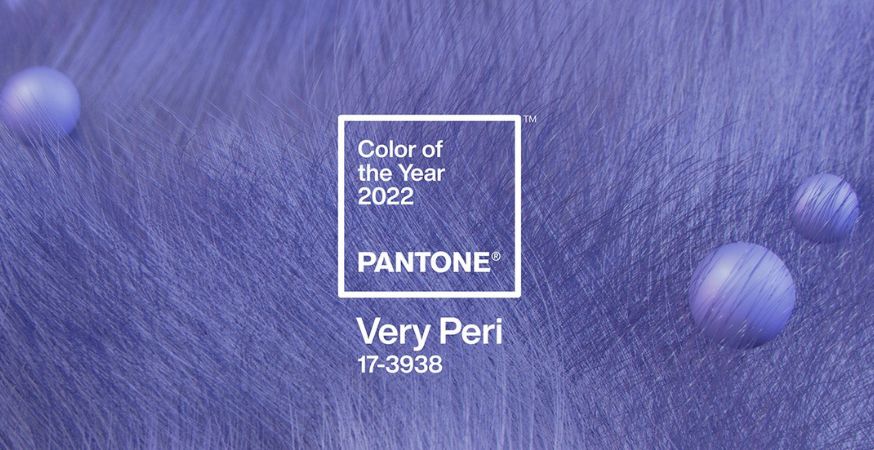
2020 introduced us to the much needed calming Classic Blue, and 2021 brought us resilience and optimism with Ultimate Gray and Illuminating. In 2022, Pantone is back to selecting a singular shade to represent the next year’s color trends: Very Peri (17-3938).

After spending months sifting through trends across every influential industry ranging from entertainment to textiles and industrial design, Pantone’s expert color team select one colour (or sometimes two) that will dominate the year to come. Very Peri, their selection for 2022, is a “red violet infused blue hue” that displays “a carefree confidence and a daring curiosity,” encouraging us to be inquisitive and creative.
As we move into a world of unprecedented change, the selection of PANTONE 17-3938 Very Peri brings a novel perspective and vision of the trusted and beloved blue color family, encompassing the qualities of the blues, yet at the same time with its violet red undertone, PANTONE 17-3938 Very Peri displays a spritely, joyous attitude and dynamic presence that encourages courageous creativity and imaginative expressions.
Leatrice Eiseman, Executive Director of the Pantone Color Institute
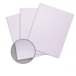
Add a pop of Very Peri to your projects with these carefully curated papers and cardstocks:

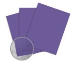
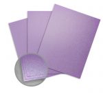
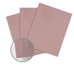
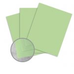
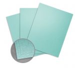
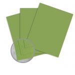
Cardstock


Color Pairings
Add Veri Peri to this warm and cool mix of colors to create a balanced palette:


Create a harmonious, nourishing palette by pairing Very Peri with these nature-inspired tones:


Build an understated and sophisticated color palette around Very Peri with these subtle shades:

Learn more about 2022’s Very Peri.