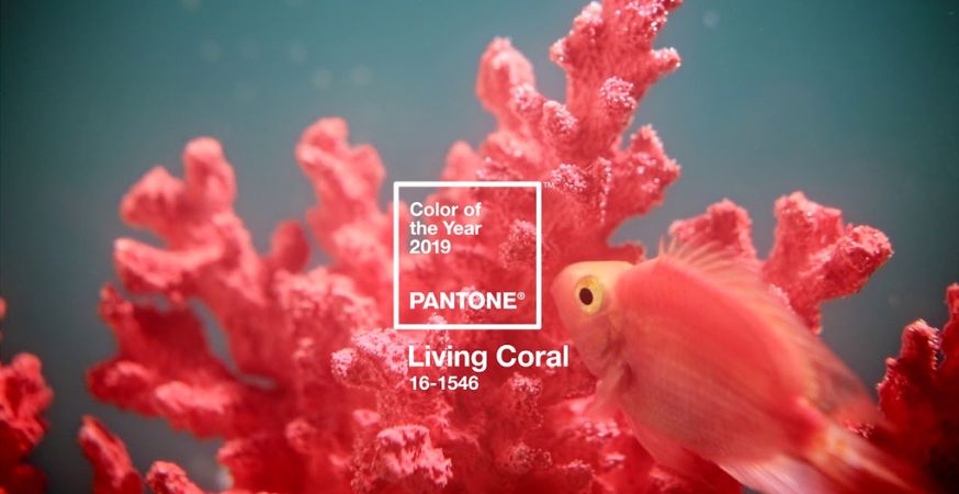
Pantone continues to dazzle us with 2019’s color of the year: Living Coral (16-1546).

To select their Color of the Year, Pantone sends a team out into the field for months to explore different trends, industries, and influencers, discover where there is overlap in color selection, and finally winnow the trends down to a single shade. This shade encapsulates the cultural climate and mood of the year, acting as “a color snapshot of what we see taking place in our global culture.”
Previous winners include 2018’s moody Ultra Violet (18-3838), 2015’s rich, deep Marsala (18-1438), and 2012’s fresh and fun Tangerine Tango (17-1463).
For 2019, they have carefully selected the “vibrant, yet mellow” Living Coral, which “embraces us with warmth and nourishment to provide comfort and buoyancy in our continually shifting environment.”
Color is an equalizing lens through which we experience our natural and digital realities and this is particularly true for Living Coral. With consumers craving human interaction and social connection, the humanizing and heartening qualities displayed by the convivial PANTONE Living Coral hit a responsive chord.
Leatrice Eiseman, Executive Director of the Pantone Color Institute
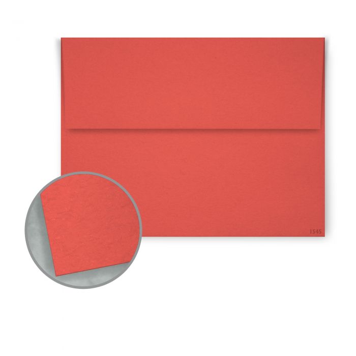
Incorporate the bright, yet comforting, coral color into your projects with these premium Keaykolour envelopes:
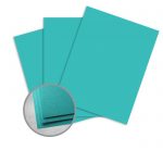
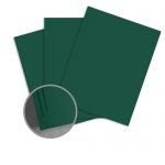
Color Pairings
Experiment with these complementary shades to elevate your finished product:

Read Pantone’s full story about the beautiful Color of the Year to learn even more about Living Coral.