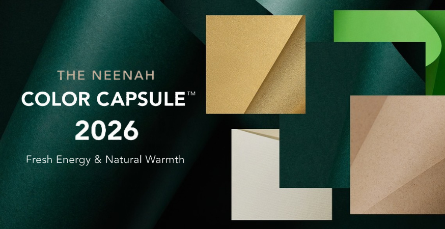
Color trends are always shifting as designers and brands look for new ways to express personality and purpose. After last year’s emphasis on depth and rich color, the mood for 2026 leans fresher: bold accents paired with warm, grounding neutrals. Neenah Color Capsule™ 2026 pulls that direction into a focused set of coordinated colors and finishes that feel current, not cookie-cutter.
This capsule brings together five colors from five of Neenah’s most recognized brands, combining tactile texture, bright color, and a subtle pearlescent finish. The result is a palette that can be used as a complete system or split into components to support individual projects, all while keeping your print pieces connected.
The Palette at a Glance: 5 Colors, 5 Brands, Multiple Finishes
Warmth, bright accents, and nature-inspired shades make up this palette for 2026. Each color plays a distinct role, so you can carry the look across print, packaging, and brand touchpoints without overthinking it.
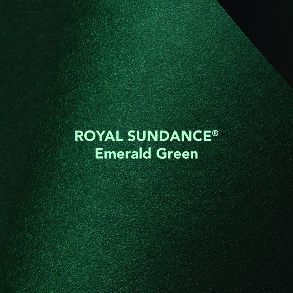
Royal Sundance® Emerald Green
Royal Sundance® Emerald Green: A deep green that has enough presence to anchor a design. This shade is grounded and elegant, whether you use it for a cover, a background, or a bold insert.
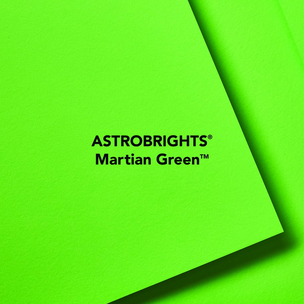
Astrobrights® Martian Green
Astrobrights® Martian Green: This is the attention-grabbing shade in the collection, delivering a crisp, high-impact, modern accent. This green is great for a clean pop of color.
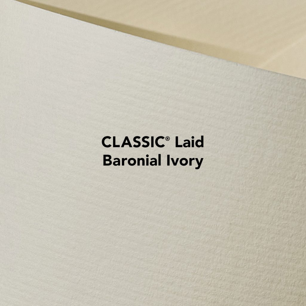
Classic® Laid Baronial Ivory
Classic® Laid Baronial Ivory: Evidence that neutrals don’t need to be boring, this is a warm, creamy alternative to white that adds texture and depth without overpowering bold accents.
Environment® Desert Storm
Environment® Desert Storm: A reliable neutral with a natural tone. This is a timeless shade that serves as a strong foundation.

Neenah® Pearl Flaxen
Neenah® Pearl Flaxen: Great for highlights, covers, or packaging that needs a little something extra. This offers a soft shimmer that catches light without overpowering the rest of the palette.

Why this works in print: When you choose these five appealing colors, you’re creating contrast and harmony, along with a mix of finishes, making it easier to create variety while keeping your pieces cohesive.
How to Use The Color Capsule in Real Projects
If you want inspiration you can put to work right away, try these print-friendly combinations:
- Brand systems & campaigns: Build a core palette with Emerald Green and Baronial Ivory, then add Martian Green for energetic accents. This combination feels calm and grounded, yet engaging.
- Packaging: Use Desert Storm as the natural foundation, then elevate with Pearl Flaxen for premium highlights on labels, wraps, or insert cards. The mix of finishes makes layering texture and color feel intentional rather than busy.
- Premium print sets: Use contrast strategically. Pair a bold green cover with a softer neutral, or introduce Pearl Flaxen for section dividers or inserts.
Across applications, the key is balance: grounded neutrals, intentional contrast, and finishes that do part of the design work for you.
Sampling & What’s Next: Color Play Print Sample
Color Capsule 2026 is a collection built for experimentation, texture, and print pieces that leave a lasting impression. Ready to see how the colors and finishes work together? Order samples today.
Astrobrights – Neenah Paper Brightly Colored Text Paper and Cover Paper Sample Swatchbook and Professional Graphics Tool
The Naturals: Environment & Royal Sundance – Neenah Paper Text Paper and Cover Paper Sample Swatchbook and Professional Graphics Tool