If you’ve ever taken a quiz like this one, you know that some logos are easily recognizable and some are a bit more obscure.
A logo is a “sign, symbol, trademark, or badge that conveys the identity or ownership of a product, company, campaign, or concept in as memorable a way as possible” (source). That means that the logos you can easily identify are doing their jobs correctly – they quickly and clearly convey a distinct identity.
A Brief History of Logos
Logos have existed in some form for longer than you might think. For example, coins often feature an identifying image that links them to their homeland. A coat of arms is another good example, but instead of linking an image to a geographic region, it links an image to a specific family.
The logo as we know it emerged during the industrial revolution. As the advertising industry grew and started combining typography with imagery on a single page, companies suddenly realized that they had to identify themselves somehow as the creators of their mass-produced products. Enter the modern logo.
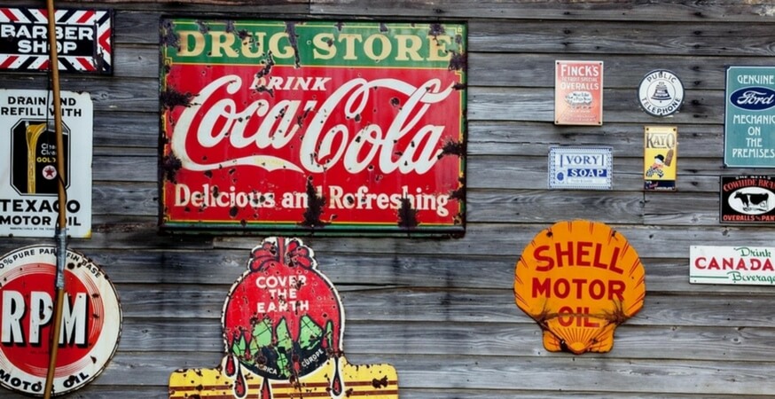
Most of today’s iconic logos were born in the 19th century, such as Coca-Cola in 1886 and Pepsi Cola in 1898. Watch them evolve in this infographic.

1800s
Based on the constraints of printing in the 1800s, logos were always designed in black and white for easy reproduction.
A color printing method called chromolithography was patented in 1837. This resulted in the increased use of color advertisements by the end of the century, but the focus remained on creating intriguing, detailed black and white designs.
1900-1930s
Many of today’s top brands were present in the early 20th century. These brands were represented by logos that were as equally recognizable then as they are today, such as Coca-Cola and Shell.
Different company’s logos looked very similar and did little to differentiate themselves from their competitors. Many logos were script-heavy and featured sweeping curves.
The early 20th century also saw the advent of more colorful logos, including Pepsi-Cola, United Airlines, and BMW.
1940s
In the 1940s, color abounds! Many brands, such as Shell, adopted the colors they still use today. Logos were also large and took up as much space as they could.
There was a shift in media consumption as well – radio was the most common form of media, but television was being hailed as the technology of the future.
1950s
Many brands rebranded and began to feature a sleeker design, with smooth curves taking the place of hard angles.
Typography also saw a shift towards heavier, bolder designs.
1960s
Advertising came of age in the 1960s (just think of Don Draper and Mad Men).
The “new advertising” was “irreverent, humorous, self-deprecating, ironic, and resonant” (source), and it took its cues from television, including large visuals and minimal copy.
1970s
Logos in the 1970s mirrored the prevailing cultural attitudes and aesthetics of the decade, such bold colors, bubbles, and slightly italicized text.
Logos received even more colorful upgrades, and “positioning” emerged as the primary ad strategy. Ads began to focus on their brand’s merits in comparison to their competitors, and logos began to evolve apace.
1980s
Like the 1960s, logos in the 1980s reflected the prevailing medium of the decade – in this case, computers.
Logos began to feature a modern, technological aesthetic and typography used big, rounded letters.
1990s
The 1990s saw a continuation of 80s trends, including geometric shapes and bright colors.
As mass media technology expanded and the internet grew, consumers began to realize that they had more choices. Out of this choice emerged something called “integrated marketing communications”, which includes the full range of marketing activities, such as sales promotion, public relations, and online advertising. Suddenly it was especially important to have a strong, recognizable logo displayed across all of your marketing efforts.
2000s
Early 21st century logos prepared for the coming mobile revolution by switching to simple designs that used fewer gradients and less detail, making them easier to render and quicker to load.
The goal for these logos is immediate recognition – that’s why we see a reduction in the number of identifying features such as names and initials. For example, British Petroleum switched to their current logo and eschewed their old initial-based design (shown below, BP in 1989 vs. 2000). Some companies even adopted or retained a “retro” look in the hopes of creating an emotional connection through nostalgia.
Predicting the Future
Logos will continue to evolve as the face of marketing and advertising adapts to the capabilities of online and mobile advertising. Advertising, including logo design, will always mirror the technological potential and prevailing cultural preferences of their time. All we can do is sit back and enjoy the ride.
Sources
“1940s War, Cold Ware and Consumerism.” Ad Age. March 28, 2005.
“History: 1950s.” Ad Age. September 15, 2003.
“History: 1960s.” Ad Age. September 15, 2003.
“History: 1970s.” Ad Age. September 15, 2003.
“History: 1980s.” Ad Age. September 15, 2003.
“History: 1990s.” Ad Age. September 15, 2003.
“Graphic Design Lessons – A Short History of Logo Design.” ArtyFactory.
“The 2000s, by the Numbers.” Ad Age. January 5, 2010.