If your graphic design projects are getting a little repetitive, check out SuzyQ’s 10 design tips for great scrapbook pages. Yes, you read that correctly. Good design is good design, regardless of whether your documenting your dog’s half birthday or creating a multi-page press kit for a new product launch. So don’t scoff at scrapbookers – Suzy’s tips are not only perfect for scrapbooks, they’re also great for creating a cohesive, visually appealing graphic design project.
SuzyQ created a simple infographic to outline her 10 suggestions.
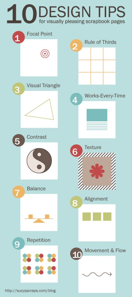
Not Just For Scrapbooking
Here’s our take on her tips, from a design perspective:
1. Focal Point
Chances are you already know what the focal point of your project is or should be, whether it’s a logo, product photo, or offset quotation.
Your focal point can help you determine how to fill the rest of your page, including how much copy to include, what colors to use, how to frame your object, and what typefaces will add to or detract from the purpose of the page.

2. Rule of Thirds
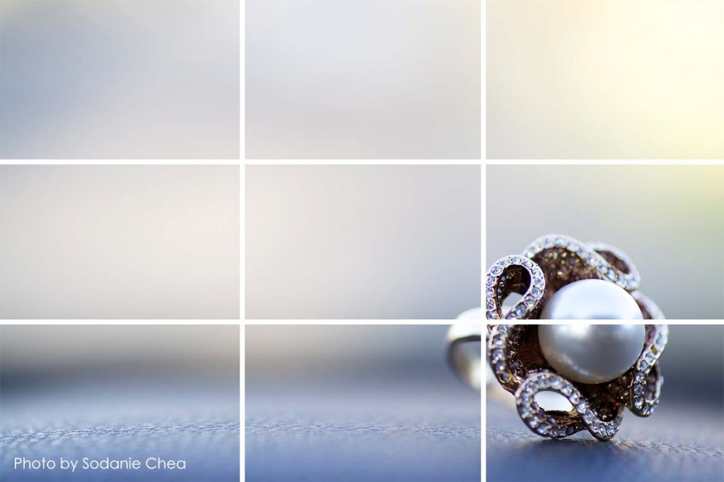
I remember learning about the rule of thirds in my grade eleven photography class. It was one of my favorite design principles because it’s so easy to remember and implement, and yet so effective at producing great, engaging photos.
Try placing your focal point at one of the intersections. It helps draw your readers’ eye to your focal point, and it makes for a more interesting design.
3. Visual Triangle
The “Visual Triangle” is similar to the rule of thirds, except instead of dividing your project into 9 equal parts, you draw an invisible triangle between three areas of emphasis.
The visual triangle helps to guide the readers’ eye between each element, including your focal point. You can also use a visual triangle to direct your reader’s eye to your focal point.

4. Works-Every-Time Layout
Place your focal point at the center of the page, use a plain background in a neutral color that emphasizes the colors present in your focal point, and place any copy below the photo. Use simple, easy-to-read typefaces that won’t distract your readers.
The block format of the Works-Every-Time layout will help focus your readers’ eye, and it’s geometric lines will keep the focus where you want it – on your focal point
5. Contrast
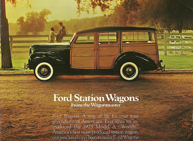
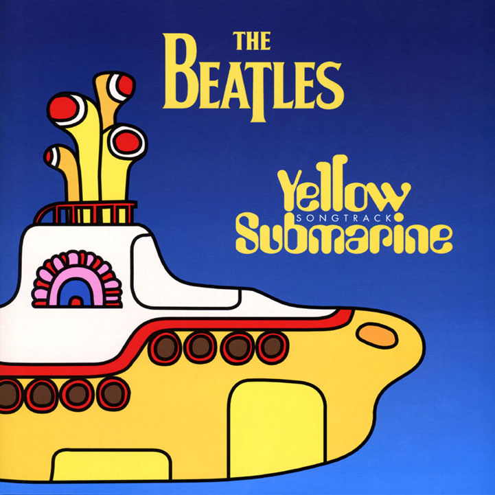
Using contrasting elements like different patterns, colors, typefaces, and textures, can help you emphasize different elements of your design project. Contrast helps to catch the viewer’s eye and keep them interested.
The Beatles’ Yellow Submarine album artwork uses two contrasting colors: yellow and blue.
If you’re not sure how to incorporate contrast into your design, check out this guide.
6. Texture
Incorporating different textures is a great way to employ contrast as a design element. Try experimenting with different paper finishes, such as X, Y, and Z, paper weights, and printing techniques.
Check out these textured business cards for inspiration!
7. Balance
It’s important to visually balance the elements of your design project so that no one item distracts your readers from your project’s focal point. You can create a sense of balance by considering the size and positioning of your different elements and using a balance of dark and light colors.
These wedding invitations are a great example of a balanced design.
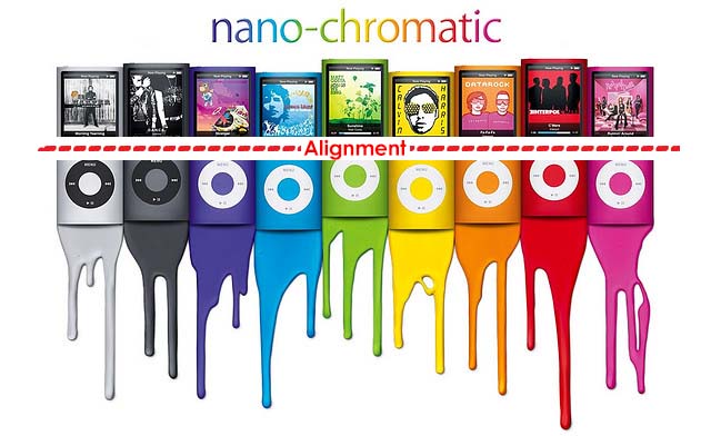
8. Alignment
Nothing in your design should look as if it were placed there on a whim. Every aspect of your project should be deliberate – including alignment. A properly aligned project looks more professional and harmonious, and will help your readers concentrate on your message.
The principle of alignment suggests that you connect the different elements of your project using an invisible line or by using the rule of thirds.
9. Repetition and Rhythm
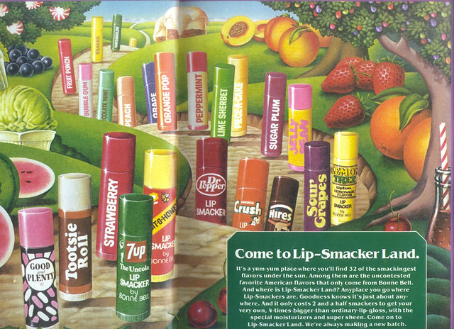
Try repeating the same or similar elements throughout your design project to create a sense of unity and continuity.
Repetition can help your readers see the different elements of your design as part of a cohesive whole, which aids in comprehension and visual appeal. Just be aware of using too much repetition – it can make you seem lazy and cause your audience to lose interest.
10. Movement and Flow
Movement and flow help direct the reader’s eye through your project. Movement can be directed along lines, edges, shapes, color, and text.
Lines, edges, shapes, and color can create a more subtle sense of movement through a project, while using different typefaces and sizes of type can help direct your reader’s eye and communicate a hierarchy of information.

Good Design is Universal
SuzyQ’s 10 tips for creating visually appealing scrapbook pages are easily applicable to a variety of design projects. The principles of good design are universal – incorporating any of these ten tips into your paper crafts or graphic design projects will help create a pleasing page that effectively communicates your message.
Sources
“Graphic Design: Elements and Principles of Visual Design.” NHS Designs.
Reynolds, Garr. “The Big Four: Contrast, Repetition, Alignment, Proximity.” Presentationn Zen. 2008.
SuzyQ. “10 Design Tips for Visually Pleasing Scrapbook Pages“. suzyQscraps. February 6, 2013.


